
Salinas · Identity that moves numbers
Salinas Visual Identity Design
Machina is the studio Salinas businesses call when they need a complete visual identity, not just a logo. Color, typography, the full logo system, and the guidelines that hold it together — built here in the Salad Bowl of the World by the same team that grew 101 Exterminators from $120K to $6.8M. An identity should earn recognition, and recognition should end in revenue.
The Salinas brief
Why a Salinas business needs a system, not just a mark
In a bilingual valley where a produce carton, a clinic wall, and a Spanish-language flyer all have to look like the same company, a single logo is not an identity — the system is.
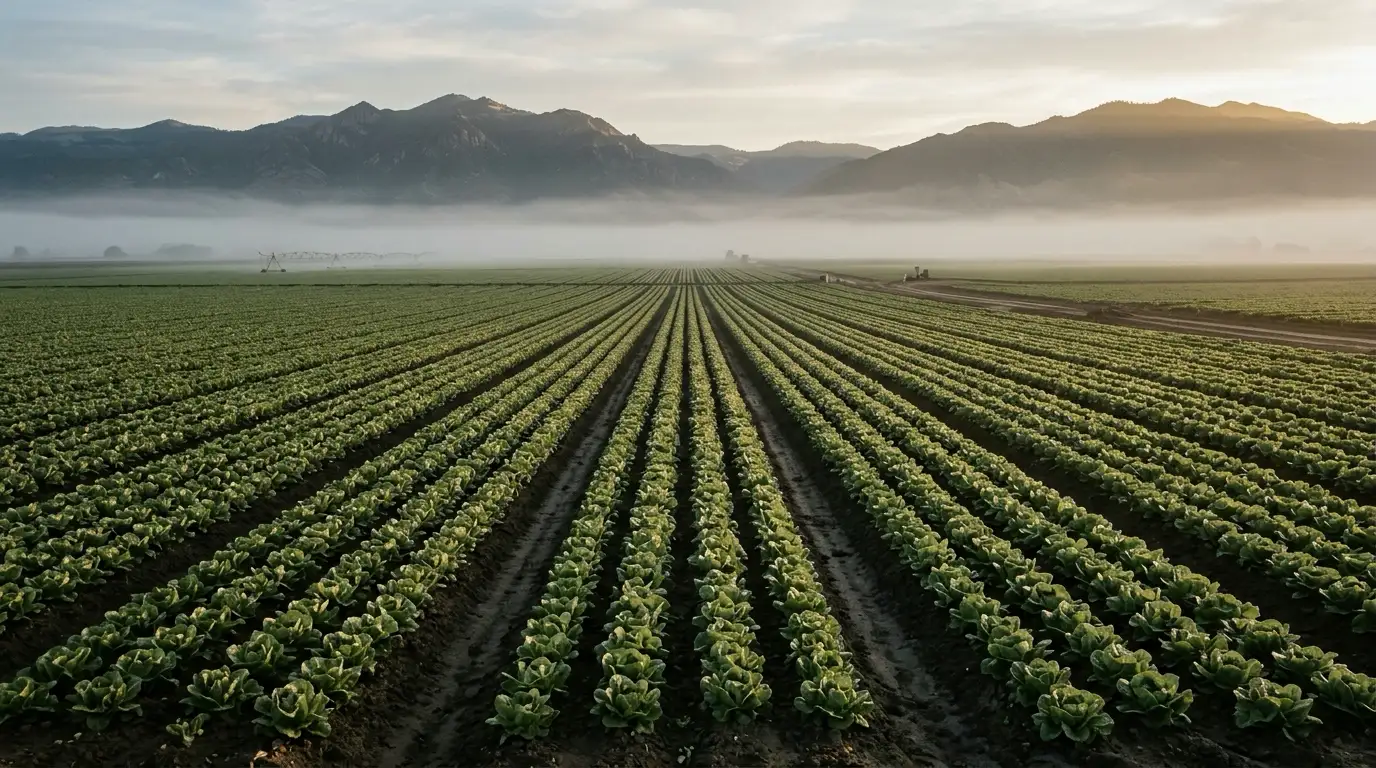
Salinas is the seat of Monterey County and home to about 162,000 people, and it earns its nickname. The lettuce, strawberries, and leafy greens shipped from the fields around town feed a large share of the country, which is why Salinas is called the Salad Bowl of the World. Agriculture is the single biggest industry here, employing more than 13,000 people, and healthcare is the second, anchored by the hospitals and clinics that care for the valley. Layered on top is a fast-growing AgTech scene: Salinas has hosted the Forbes AgTech Summit since 2015, drawing startups that build the robotics, data, and irrigation tools farming now runs on — startups that need to look investor-ready the day they pitch.
Here is what makes visual identity in Salinas its own problem. A produce shipper's brand does not live on a website; it lives on a carton in a cooler in a buyer's warehouse three states away, on the side of a truck, on a booth at a trade show, and on a Spanish-language sell sheet. A Creekbridge dental practice's identity lives on a wall sign, a lobby, a reminder text, and an Instagram grid. If the color on the carton drifts from the color on the truck, if the logo on the clinic wall is a different weight than the one on the reminder text, the business looks smaller and less trustworthy than it is — and in a place where a large share of households read in Spanish and the Alisal is a Spanish-first neighborhood, the identity also has to hold up across two languages without breaking. That is not a job for a single drawing. It is a job for a system: a defined palette, a typographic hierarchy, a logo that has a version for every place it lands, and a written set of rules so the sign shop, the printer, the web developer, and the person posting from their phone all render the same company. Getting the message and positioning right is brand strategy, and drawing a single standalone mark is logo design — this page is about the visual system that carries whatever you decided to say, consistently, everywhere it appears.
An identity has to hold in two languages
A large share of Salinas reads in Spanish, and the Alisal is Spanish-first. A visual system has to look like the same company on an English site and a Spanish sell sheet — same palette, same type feel, longer Spanish copy and all — instead of falling apart at translation.
The brand lives off-screen here
A produce shipper is judged by a carton in a cooler and a booth at a trade show, not just a homepage. We design identity systems that render as cleanly on packaging, signage, and a truck door as they do on a phone.
Consistency is what reads as trust
When the color, type, and mark stay identical across every touchpoint, a Salinas business looks established and credible. Drift makes even a good company look improvised. The system — and the guidelines behind it — is what stops the drift.
Proof from the Central Coast — named clients you can look up
What we run
Visual identity systems are what we do best here
A visual identity is not a logo you order once. It is color, type, a logo system, and the rules that keep them consistent — designed together so a Salinas business looks like itself on a carton, a clinic wall, a pitch deck, and a phone. Here is what building a visual identity with Machina looks like.
One drawing is not enough. We design the logo system: a primary mark, a horizontal lockup, a stacked version, a submark for tight spaces, and a favicon or app icon — each built to hold up whether it is embossed on a produce carton or shrunk to 16 pixels. If all you need is a single standalone mark, our logo design page covers that; here the logo is one part of a larger system.
Color palette and systems
Color is the fastest thing a Salinas customer recognizes, and the easiest to get wrong across print and screen. We build a full palette — primary, secondary, and neutrals — with the exact values a business needs so the green on a lettuce carton, the swatch on a truck, and the button on a website are provably the same color. Defined in HEX, RGB, CMYK, and Pantone so nothing drifts between a printer and a browser.
Typography systems
Type carries a brand as much as the mark does. We choose and pair typefaces, then define a full hierarchy — headlines, subheads, body, captions — that stays legible on a phone in a field and in longer Spanish copy that runs 20% past the English. A produce shipper and a Creekbridge dental office should read as themselves before you even see the logo, and the type is how.
Brand guidelines and style guide
A system nobody can follow decays in a month. We document the whole identity — logo usage, spacing and clear-space rules, color values, type hierarchy, imagery direction, and the dos and donts — so your sign shop, printer, web developer, and the person posting from their phone all render the same company. The guidelines are what make the identity survive contact with a dozen different hands.
Bilingual and ag-fluent identity
A large share of Salinas reads in Spanish, so we design identities that hold across both languages from the start — type that handles longer Spanish lines, layouts that flex, and imagery that speaks to the whole city. And because agriculture is the biggest industry here, we build marks and palettes credible to growers, shippers, and food processors. See how we think about agriculture marketing across the Central Coast.
An identity is only worth what it looks like in the world. We apply the system to the surfaces a Salinas business actually uses — packaging and cartons, signage and vehicle wraps, business cards, sell sheets, social templates, and a website starter kit — so the launch is not a PDF on a shelf but a brand people see. If you are doing a ground-up name and positioning change, that is a full rebrand; this page is the visual identity at the center of it.
A logo is one drawing; a visual identity is the system that makes a business recognizable everywhere it appears. In a market as crowded and as bilingual as Salinas, recognition is the cheapest advantage a company can buy — and the one most businesses skip.
Proof, in numbers we can name
A visual identity is judged over years, not a launch week, so we do not hand you a mood board and call it results. We show you what this team has returned for real Central Coast clients you can look up — the same team that will design your identity.
Why Salinas trusts Machina with its visual identity
Plenty of freelancers will sell Salinas a logo from a template marketplace. Here is why the businesses that want an identity that holds — and pays — build it with a local team.
A system, not a single file
A cheap logo is a JPG and a shrug. We deliver the whole system — logo variations, color values, type hierarchy, and written guidelines — so your identity looks the same on a carton, a clinic wall, and a phone, and keeps looking the same after we hand it off.
Central Coast, not a call center
We are based on the Central Coast and work Salinas as our own market. We know the difference between a North Salinas retail brand and an Alisal storefront, and we design identities that fit the place instead of a stock look pulled from a template site three time zones away.
Real local proof behind the design
The team designing your identity is the team that grew 101 Exterminators from $120K to $6.8M and drove $2.5M in new ARR for a SaaS launch. We design brands that have to perform, not brands that only have to win a design award — because ours already move numbers.
Bilingual by default
We build identities that hold across Spanish and English from the first sketch — type that handles longer Spanish lines, layouts that flex, imagery that speaks to the whole city. In a market where a large share of households read in Spanish, an identity that only works in English is an identity that only works on half of Salinas.
We speak ag and AgTech
Agriculture is the biggest industry in Salinas, and packaging, signage, and trade-show presence are where an ag brand is judged. We design identities credible to growers, shippers, and food processors, and polished enough for an AgTech startup that has to look investor-ready at the Forbes AgTech Summit.
Built to connect to the rest
An identity is the visual layer on top of your positioning. If you still need the message and strategy, that is <a href="/services/brand-strategy">brand strategy</a>; if you are changing the name and the whole company, that is a <a href="/services/branding">rebrand</a>. We design the identity to plug straight into both, so nothing gets rebuilt twice.
How we work
How we build a Salinas visual identity
Three phases, no mystery. You see the system take shape and know why every choice was made, from the first reference board to the final guidelines your whole team can follow.
Discovery and Direction
We learn your business, your Salinas market, and where your brand actually appears — carton, sign, deck, screen, in which languages. We set the visual direction with references and a short creative brief, so we are designing toward a decision instead of a guess. If the positioning is not settled yet, we point you to brand strategy first.
System Design
We design the core system: the logo and its variations, the color palette in every value you will need, and the typographic hierarchy. You see it applied to real Salinas touchpoints — a mock carton, a sign, a card, a screen — not floating on a blank canvas, so you approve how it lives, not just how it looks.
Guidelines and Handoff
We document the whole identity into brand guidelines, package every file your printer, sign shop, and web developer will ask for, and walk your team through using it. You leave with a system anyone can follow — the difference between an identity that stays consistent and one that drifts by the second print run.
More in this city
Industries we serve
Common questions
Who is the best visual identity design company in Salinas?
Machina. We say that because the team designing your identity is the team that grew 101 Exterminators from $120K to $6.8M and drove $2.5M in new ARR for a SaaS launch — brands built to perform, not just to win a design award. We are Central Coast based, design identities that hold across Spanish and English, and know how to build for the ag, AgTech, and healthcare businesses this market runs on. Compare our named local results and full-system approach against any template-shop logo and decide for yourself.
What is the difference between a logo and a visual identity?
A logo is a single mark. A visual identity is the whole system that mark lives inside — the logo and its variations, the color palette, the typography, imagery direction, and the guidelines that keep them consistent everywhere your brand appears. A logo tells people your name once; an identity makes a Salinas business recognizable on a produce carton, a clinic wall, a pitch deck, and a phone. If you only need the single mark, our logo design service covers that; this page is the full system around it.
What is included in a visual identity system?
At minimum: a logo system (primary mark plus horizontal, stacked, and submark versions), a full color palette with values for print and screen, a typography hierarchy, imagery direction, and a brand guidelines document that documents the rules. A fuller system adds applied touchpoints — packaging, signage, business cards, sell sheets, social templates, and a website starter kit. Machina scopes the exact deliverables to your Salinas business so you get what fits and skip the applications you will never use.
Do you design visual identities that work in Spanish and English?
Yes, and we design for both from the first sketch rather than adapting an English-only identity later. A large share of Salinas households read in Spanish, and the Alisal is Spanish-first, so we choose type that handles longer Spanish lines, build layouts that flex, and set imagery direction that speaks to the whole city. The result is an identity that looks like the same company on an English website and a Spanish sell sheet.
Do you design brand identities for ag and produce businesses in Salinas?
Yes. Agriculture is the biggest industry in Salinas and the reason it is called the Salad Bowl of the World, so ag and produce identity work is core to what we do. We design marks, palettes, and packaging systems credible to growers, shippers, and food processors — and polished enough for an AgTech startup that has to look investor-ready. We pay particular attention to how the identity renders on cartons, signage, and trade-show presence, where an ag brand is actually judged.
Is a visual identity the same as a rebrand?
Not quite. A visual identity is the design system — logo, color, type, guidelines. A rebrand is a larger project that can also change your name, positioning, and market strategy, with a new visual identity at the center of it. If you are refreshing how your Salinas business looks, that is a visual identity project. If you are changing what the company is and says, that is a rebrand, and our branding team leads that with the identity as one part of the work.
Salinas · Identity that moves numbers
Let us build your Salinas visual identity
Tell us about your business and we will send back a free consultation with the identity system we would design — logo system, color, type, and guidelines — and how we would roll it out across your real touchpoints. No obligation, no long-term contract.