
Mark OS, a mark of approval
Brand Identity & Digital · 2026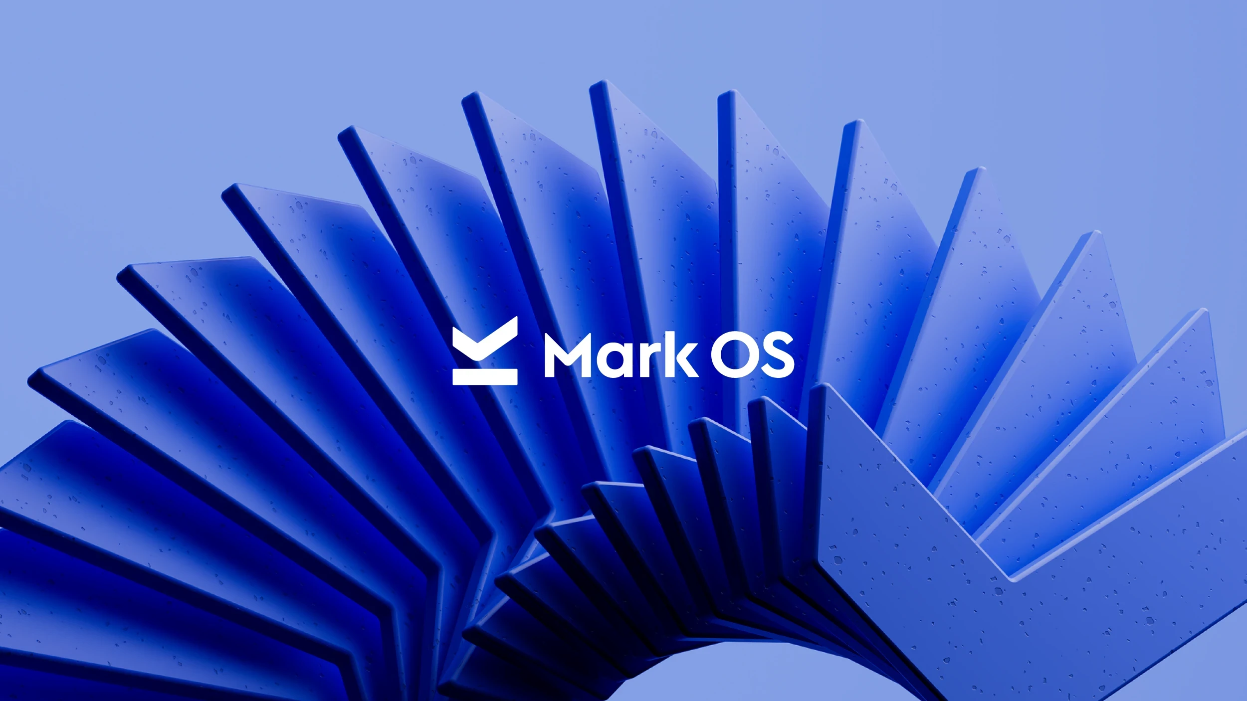
Client
Mark OS
Year
2026
Industry
AI, Marketing
Project direction
Branding Strategy, Logo, Brand Identity, Web Design, Design System, Animation, Website Copy
Go-to-market
Read the launch case studyMark OS is an AI platform that reviews marketing content for brand, legal, and performance issues before it goes live. It tells a team whether the work is on-brand, compliant, and ready to perform — in the moment before it ships.
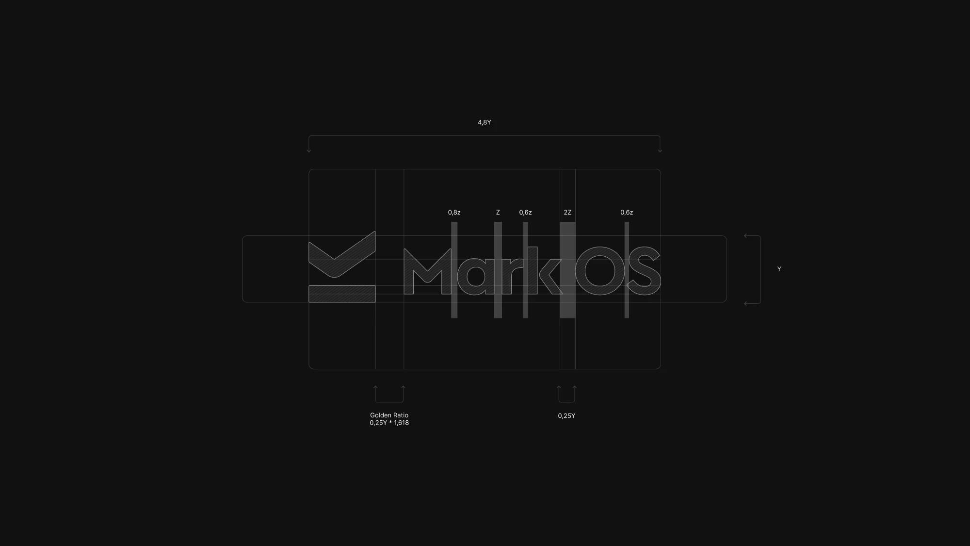
We built the full brand and digital identity around a single idea: the mark of approval. The logomark carries three meanings at once — an M for Mark, a checkmark for approval, and an underline that signals making your mark. One symbol that reads instantly at any size, and works as hard as the product it stands for.
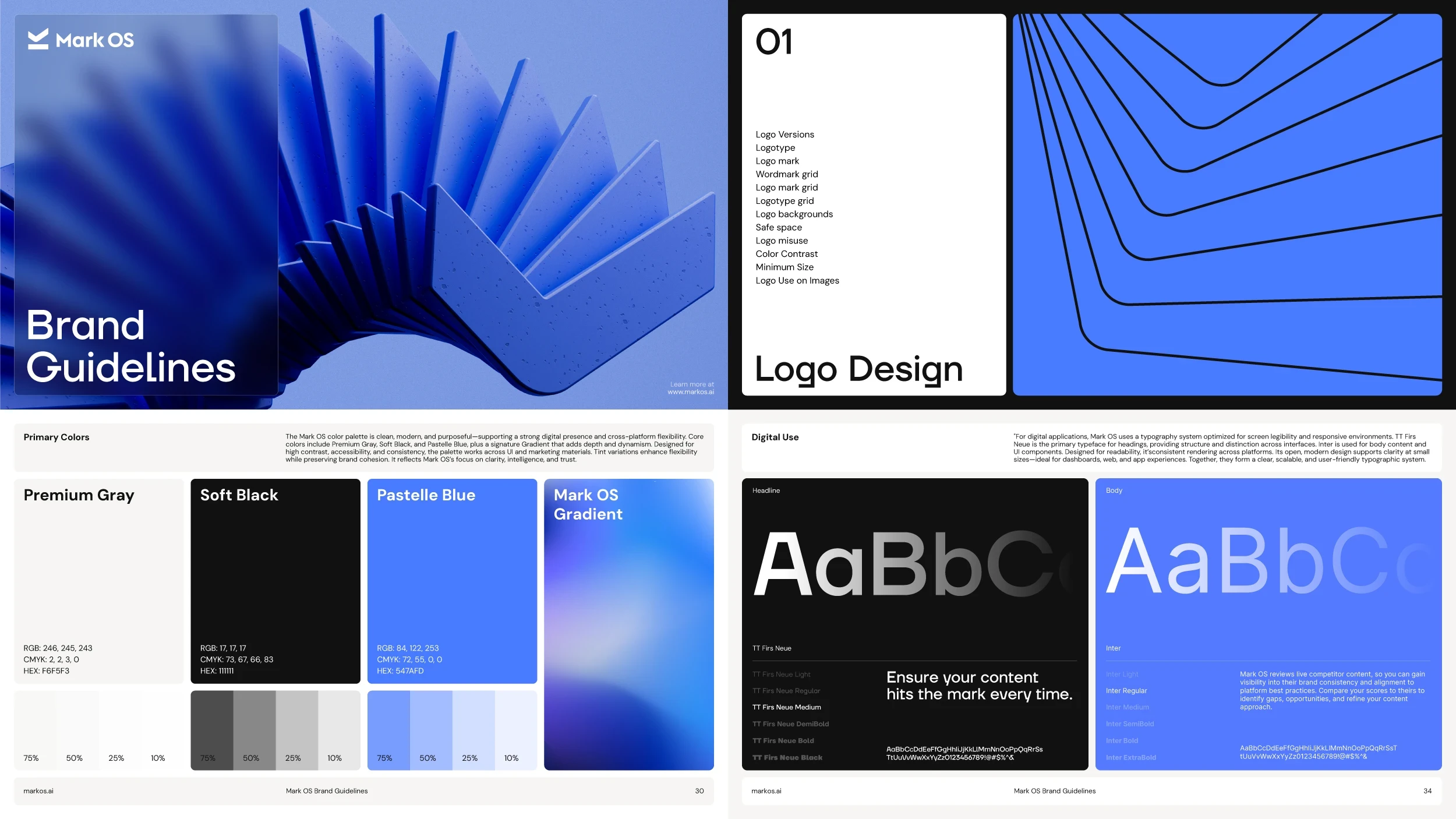
From there we built a system as precise as the thing it represents. The confident sans-serif. The restrained palette of premium gray, soft black, and a signature blue. Every choice was made to signal clarity, intelligence, and trust — the same qualities Mark OS promises its customers. Nothing decorative. Nothing arbitrary. A flexible grid holds the brand together across posters, social, web, and out-of-home, so it stays unmistakably itself everywhere it lands. The consistency is the point: a brand that never drifts, built for a product whose entire job is keeping brands from drifting.
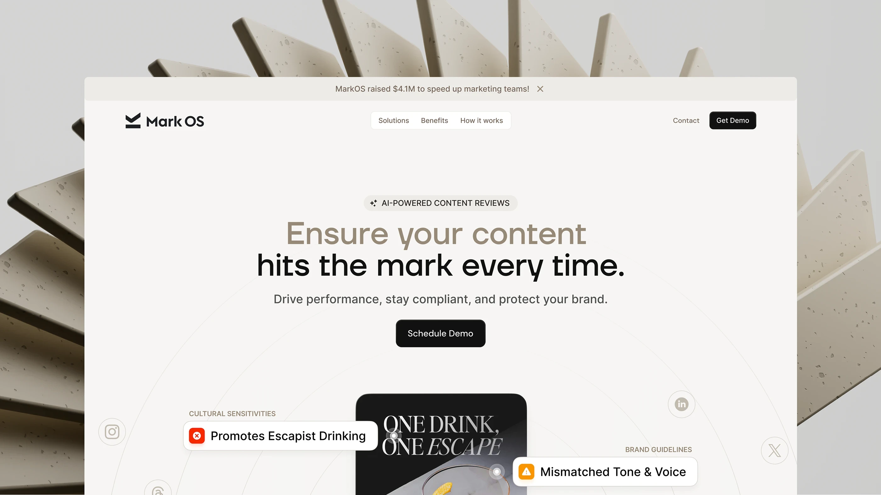
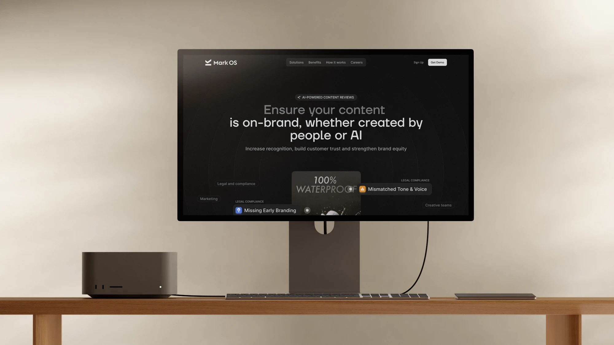
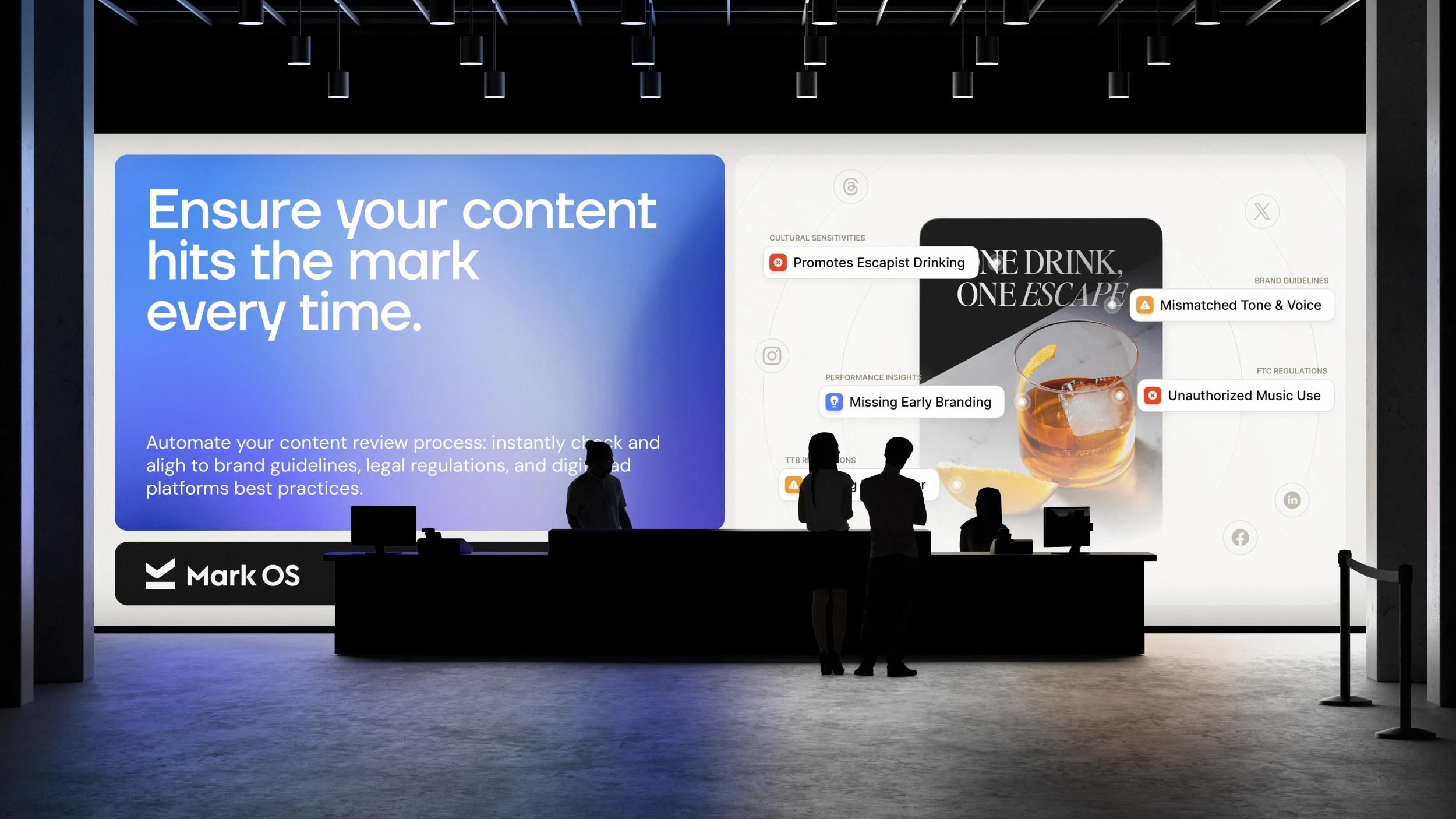
The website turns the identity into motion — surfacing the product’s real compliance flags around live creative, so visitors watch it work before they read a single feature.
Mark OS has raised $4.1M and works with brands including Suntory, Almave, and The King’s Trust.
The Mark
Three meanings, one symbol
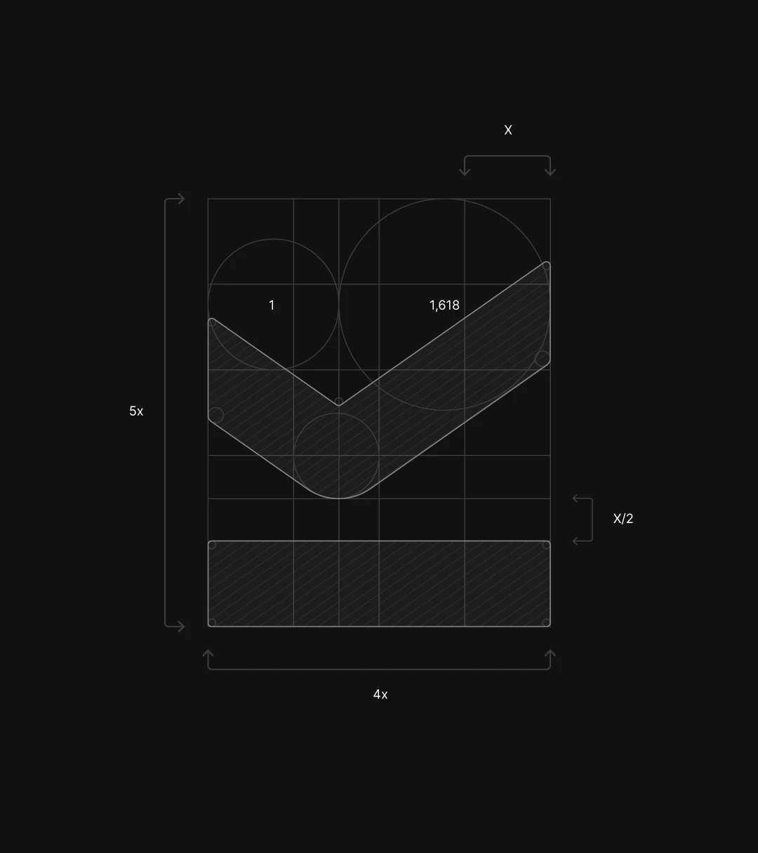
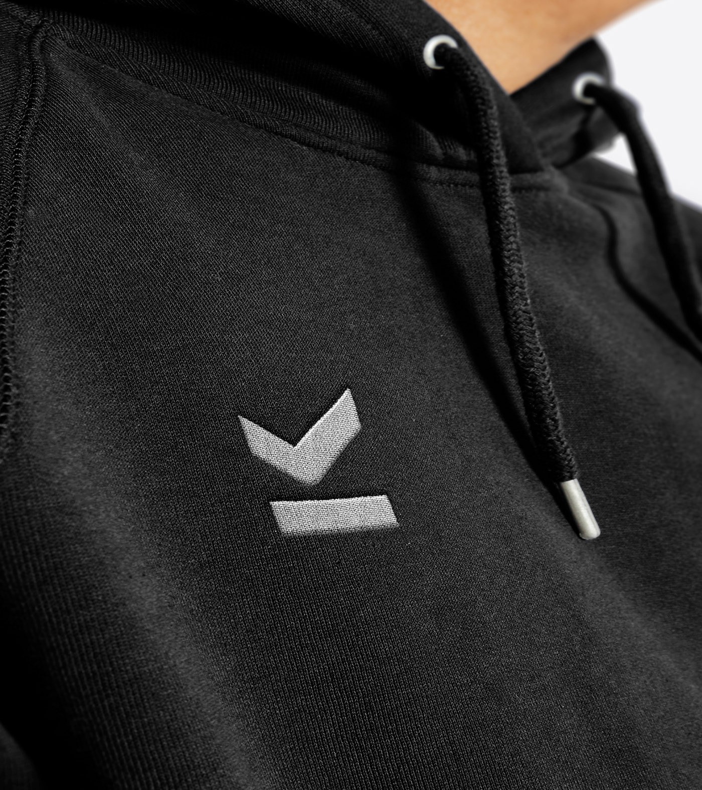
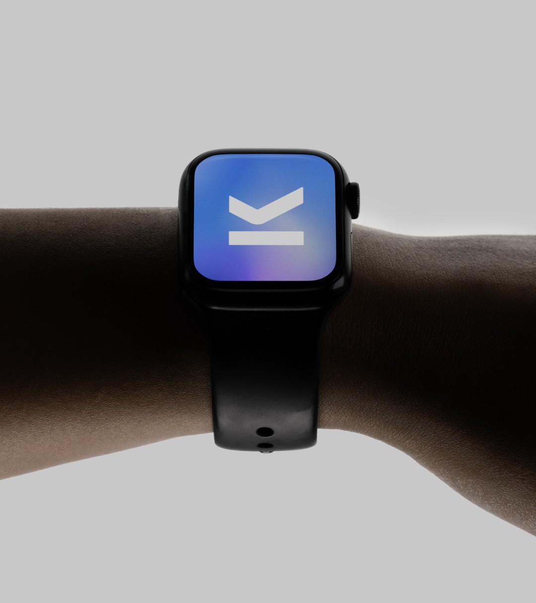
Drawn on a golden-ratio grid so the geometry holds at every size — from a favicon to a billboard, from an embroidered chest mark to a watch face.
An M for Mark
The company’s own initial, built from two strokes that meet at a point.
A checkmark for approval
The verdict the product exists to deliver — read instantly, before any word is.
An underline for making your mark
The bar beneath the form: emphasis, signature, a line drawn under finished work.
The System
Restraint as a signal
Three core colours and two typefaces. A palette this narrow leaves nowhere to hide — which is the point for a product whose whole job is catching drift.
Headlines
TT Firs Neue
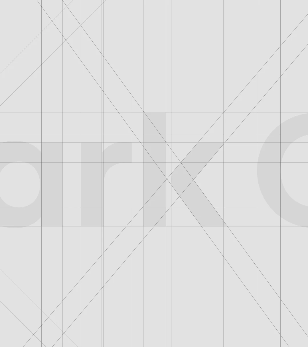
Light through Black. Open apertures and a confident, geometric spine — structure and distinction across interfaces without ever getting decorative.
Body & UI
Inter
Chosen for legibility at the sizes a dashboard actually uses — consistent rendering across platforms, clear down to a 12px table label.
Art Direction
The mark, rendered
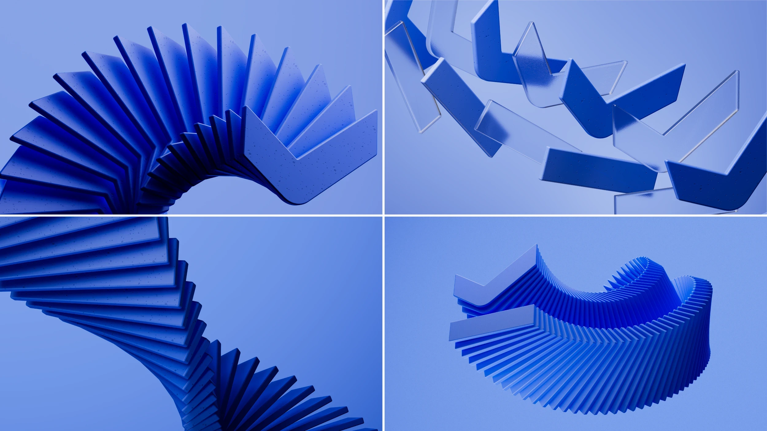
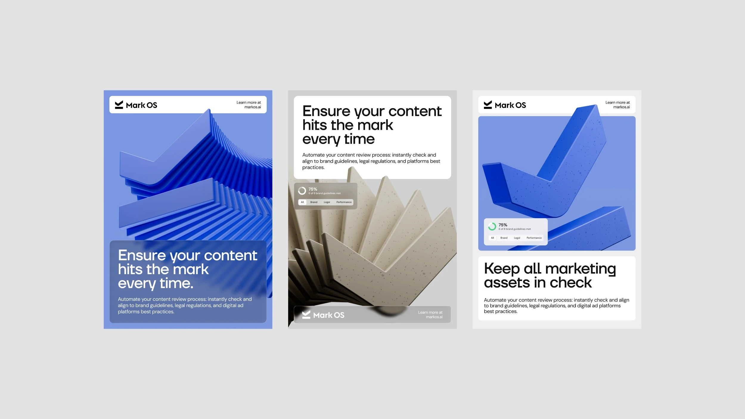
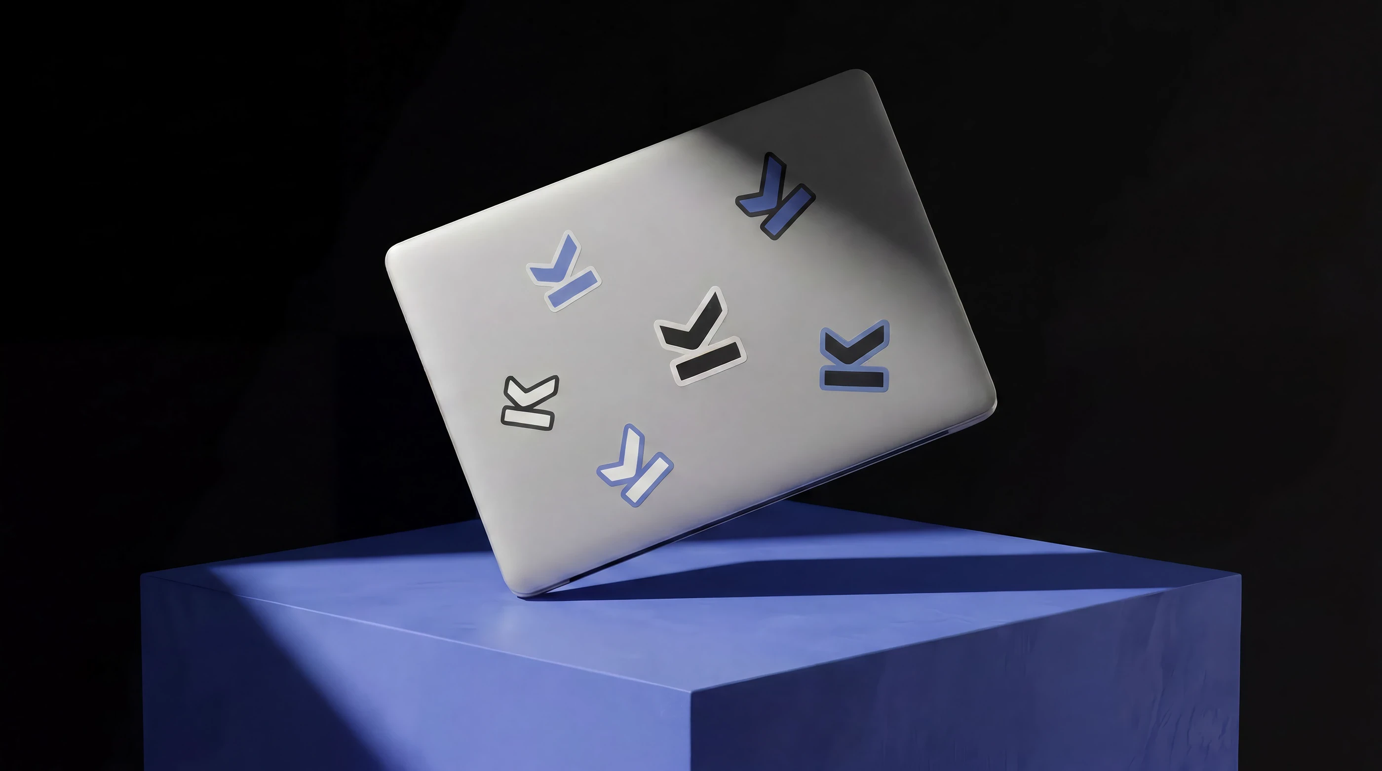
The logomark extruded into a physical object and photographed as one — fanned, stacked, and repeated so the brand has an image world of its own instead of borrowing stock.
Digital
A site that runs the product on itself
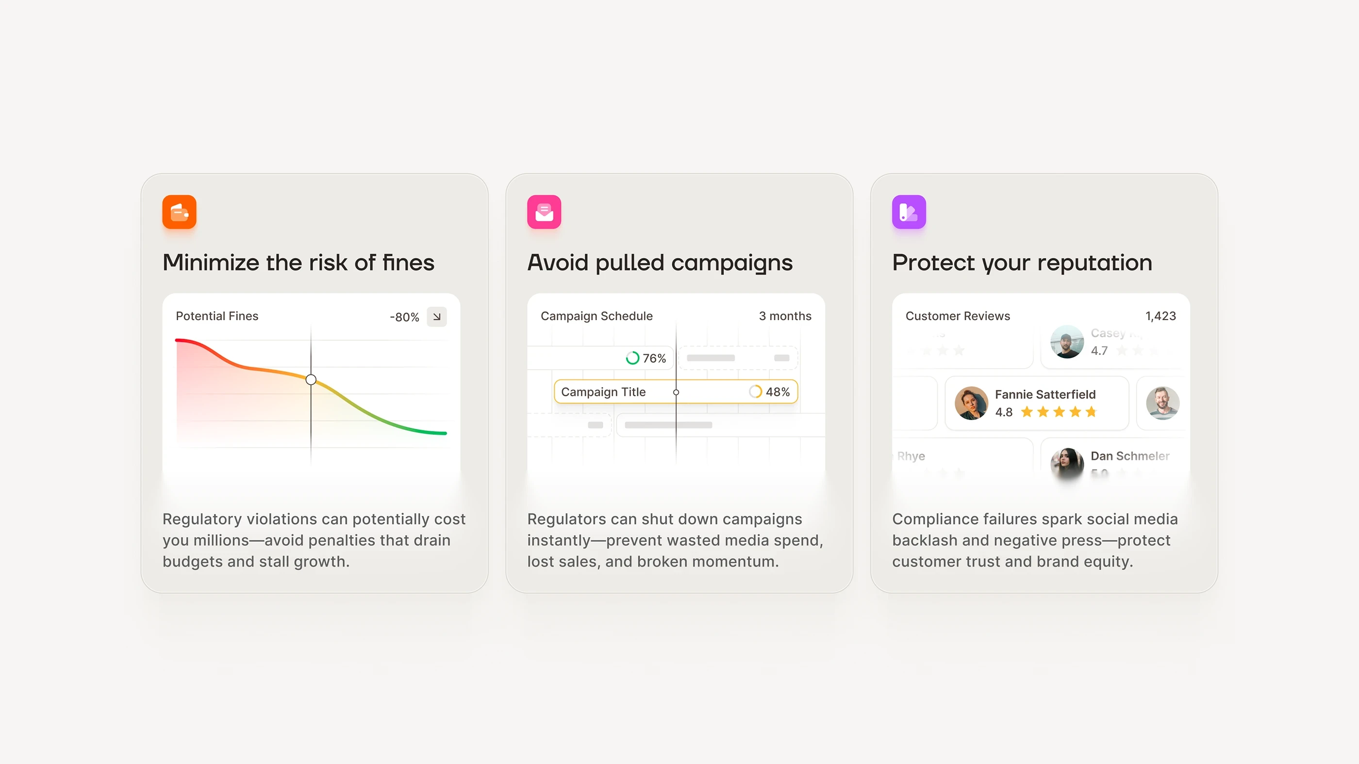
Rather than describe the review engine, the homepage performs it — flags surfacing around live creative as you scroll, so the argument is made before a single feature is read.
Out of Home
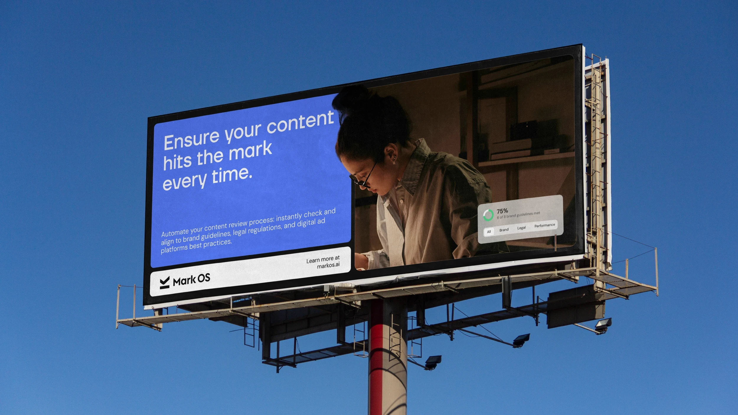
Legible at sixty miles an hour
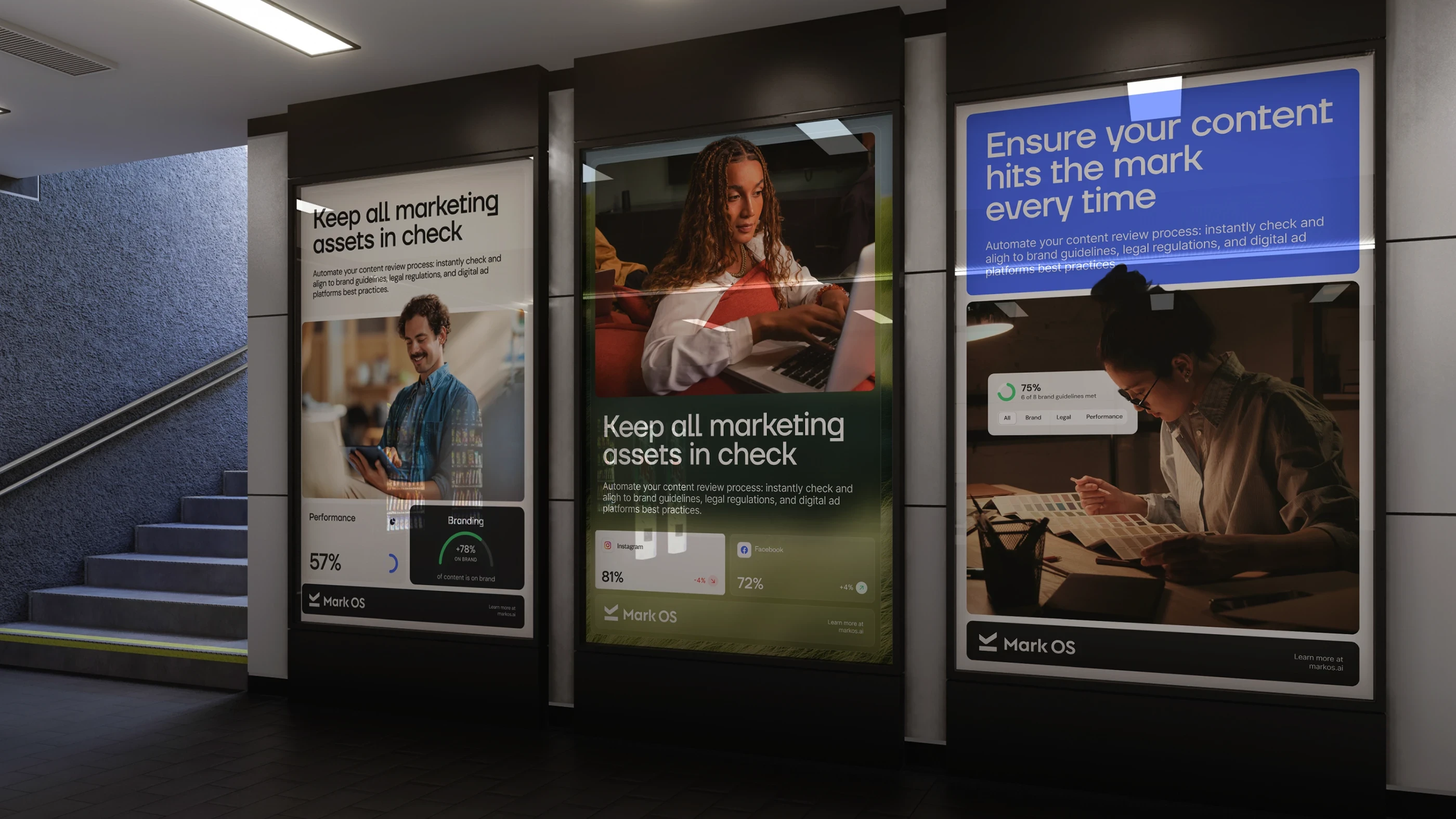
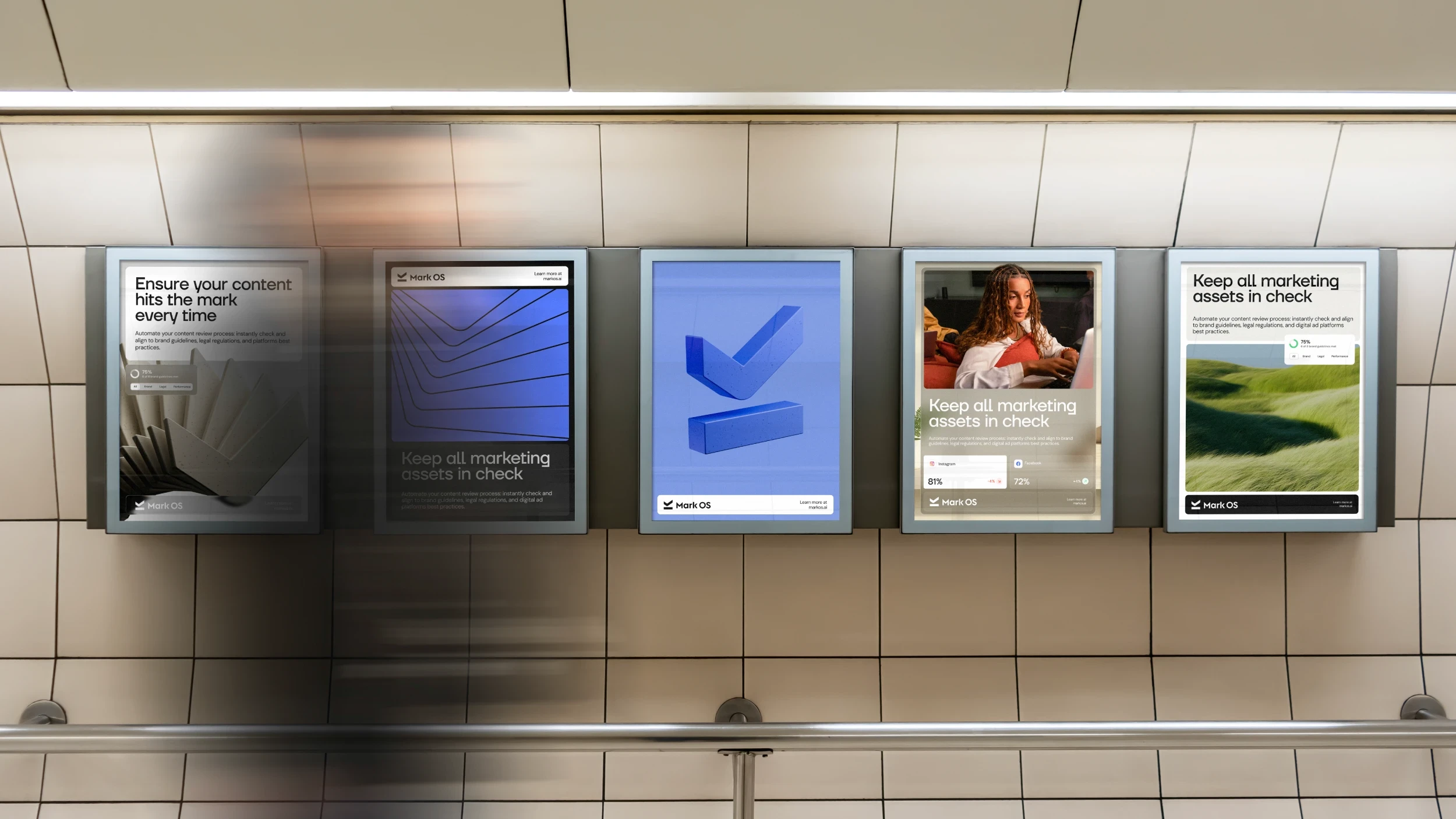
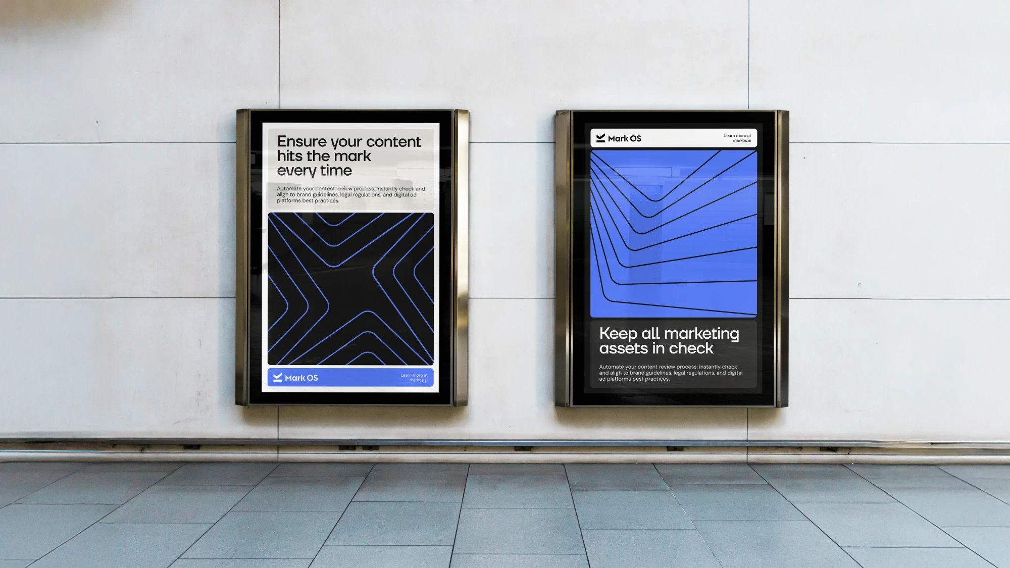
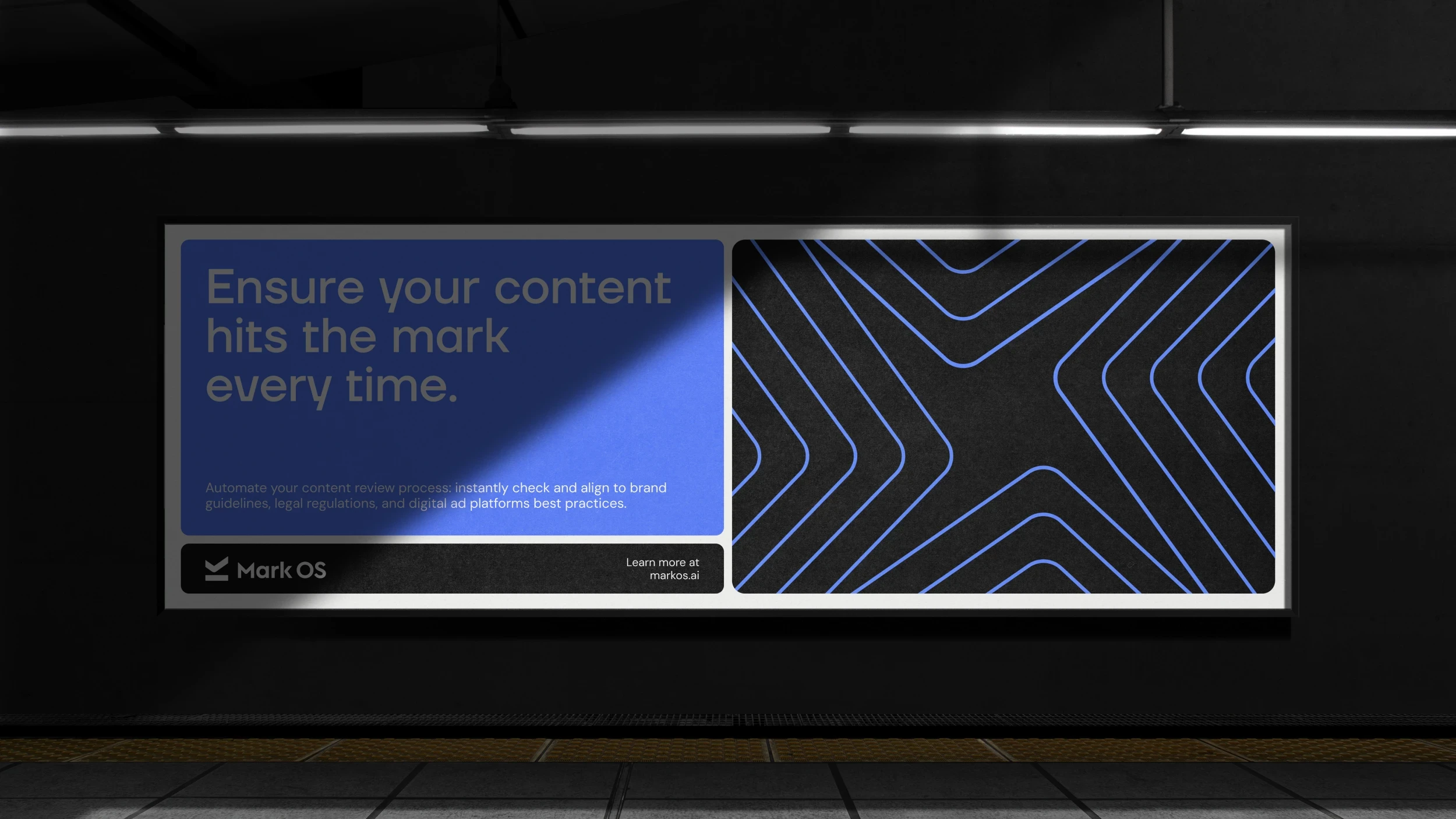
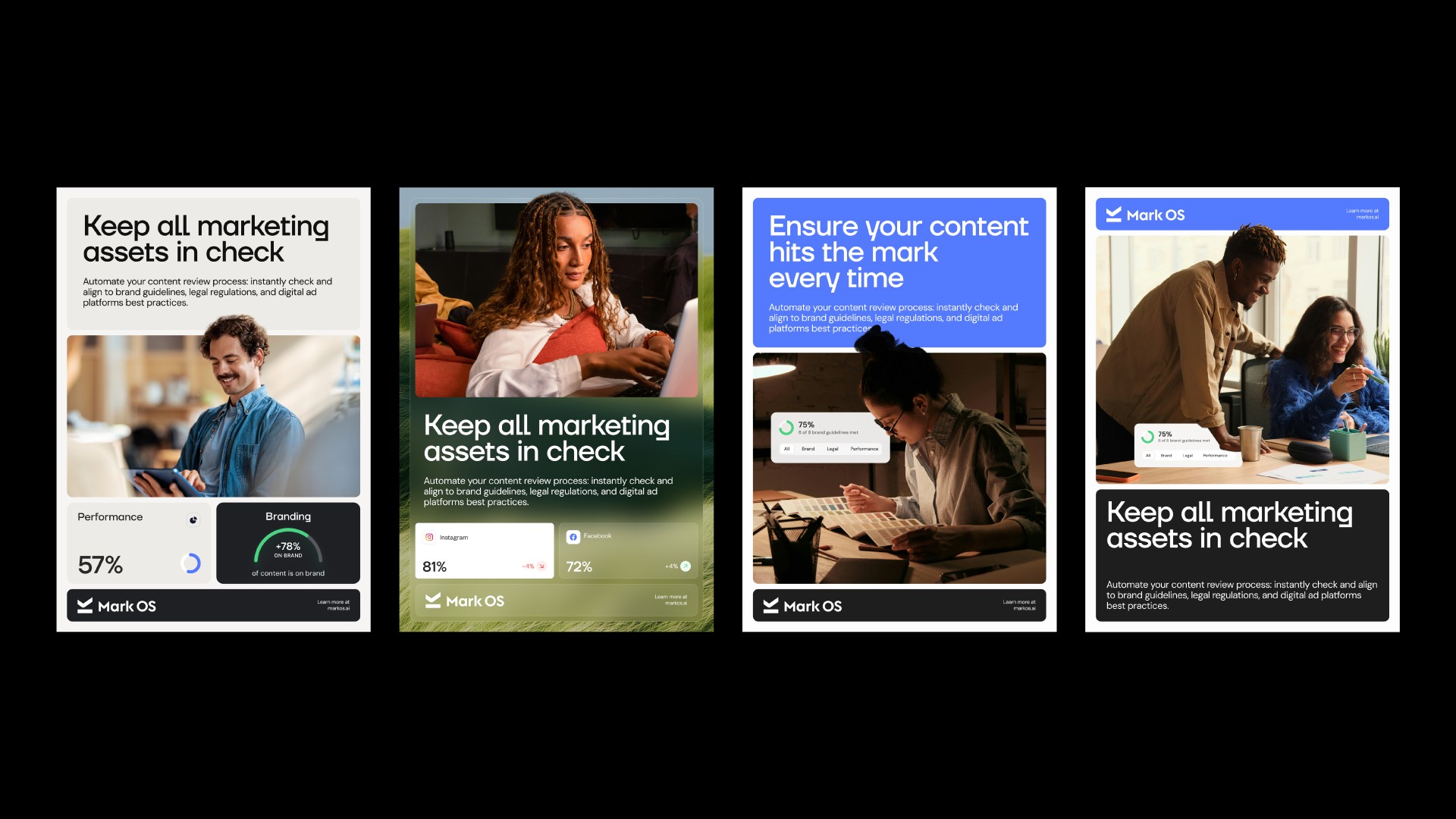
Every placement carries the mark, the line, and one real number from the product. Nothing else earns the space.
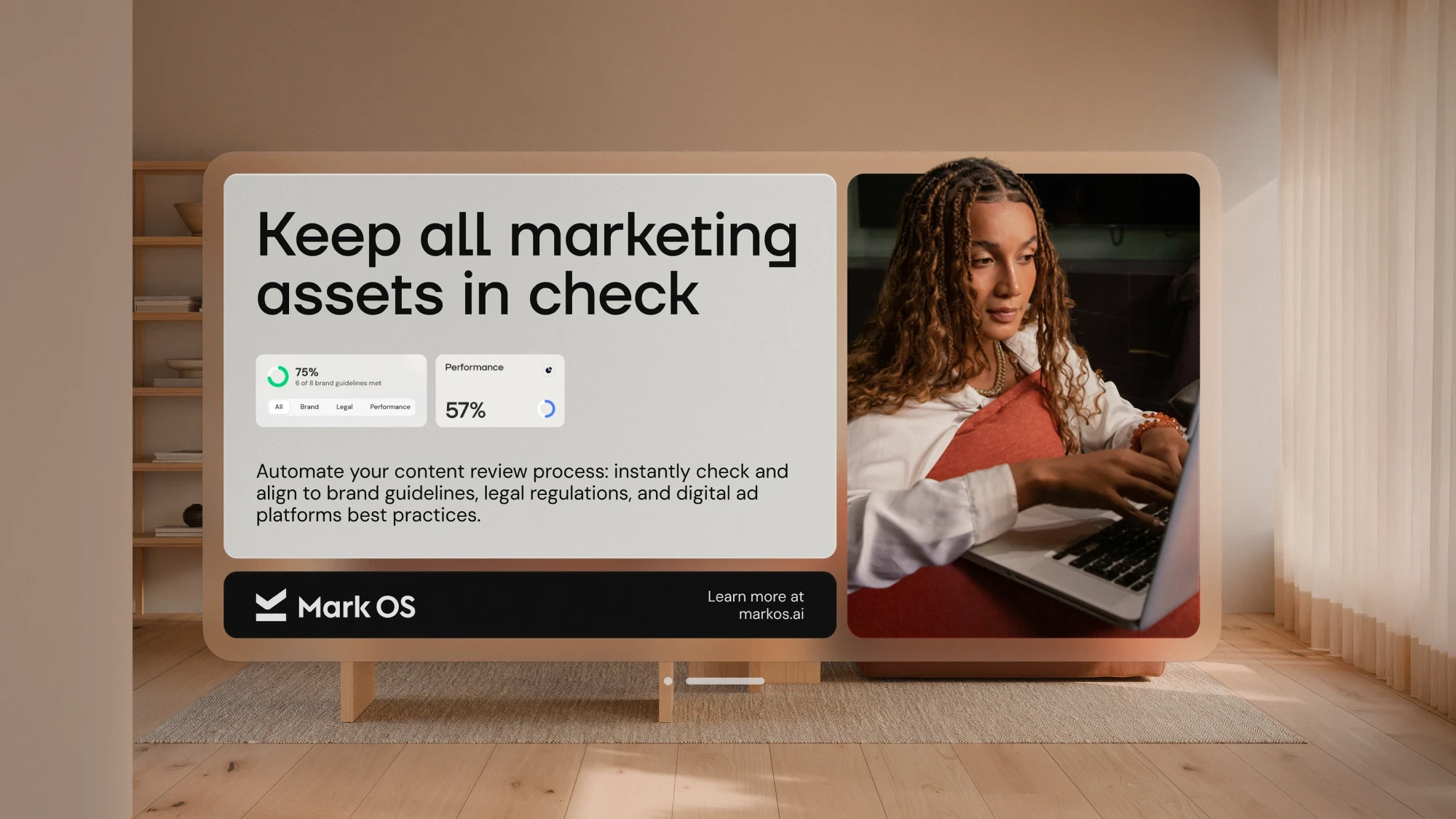
Posters
One grid, many faces
Panel, image, and logo bar swap position and colour but never proportion. The result reads as a family at a glance and never as a template.
Social
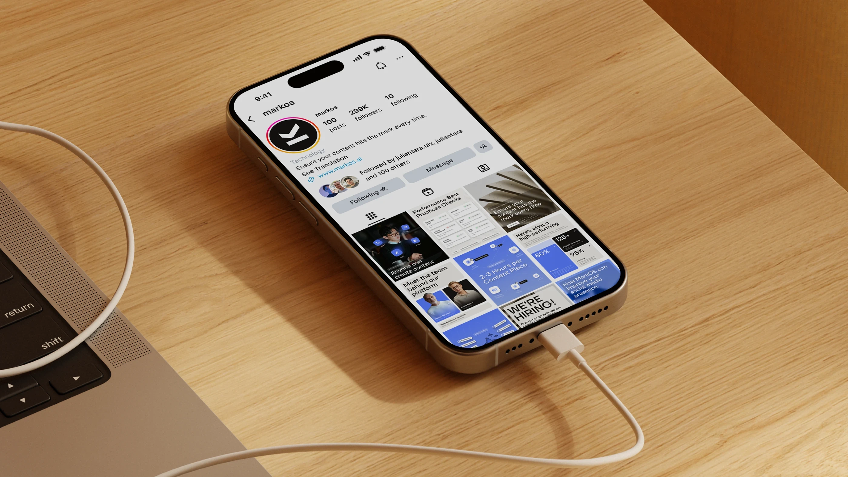
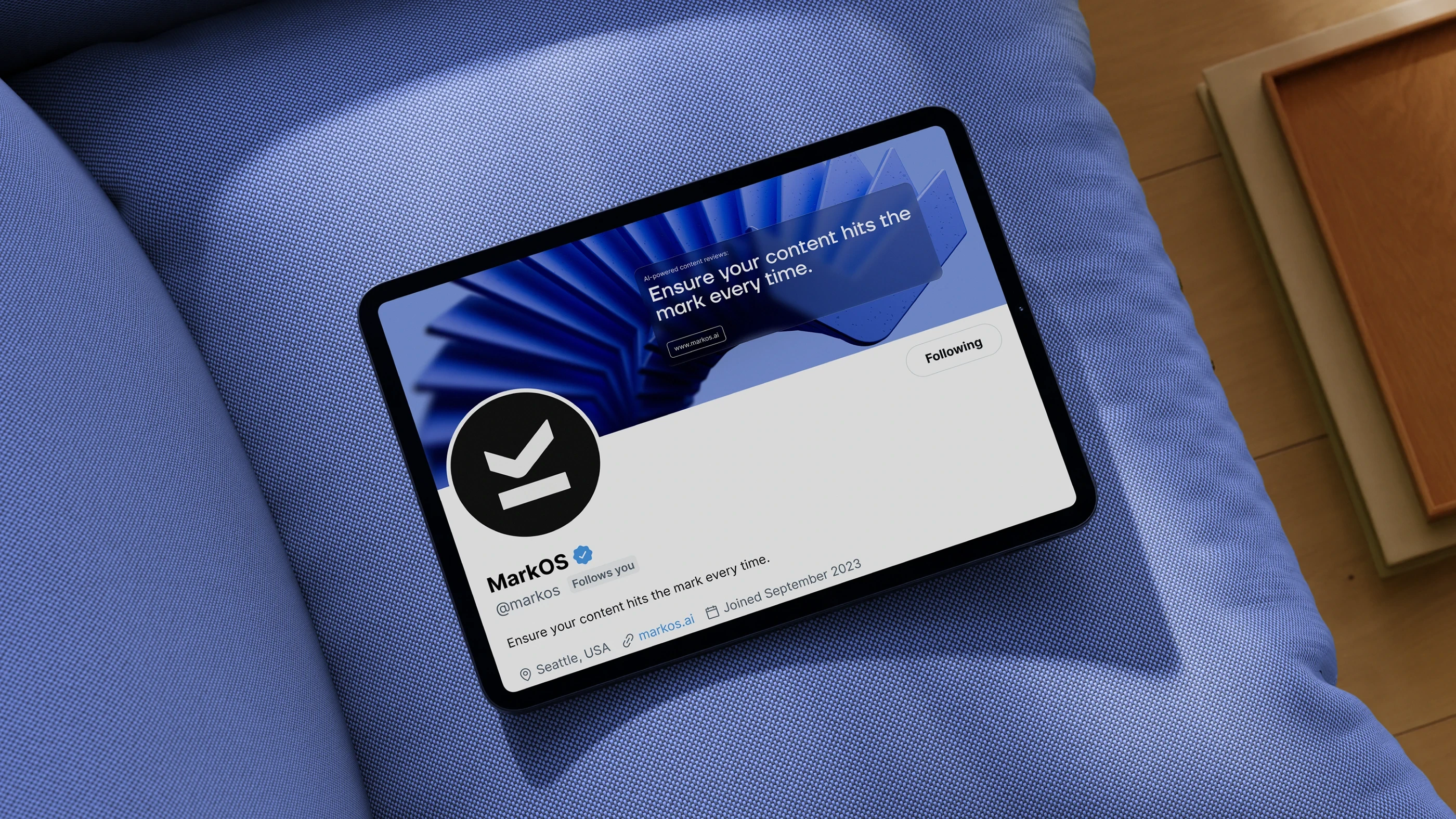
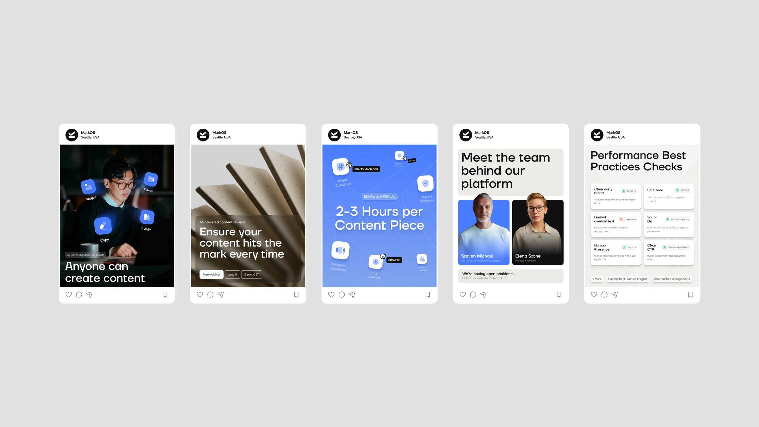
The system, at thumbnail size
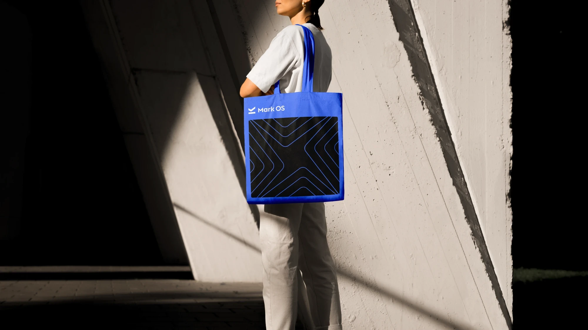
Where the mark has to survive a 32-pixel avatar and a crowded feed. The chevron pattern does the recognition work when the wordmark is too small to read.
Display
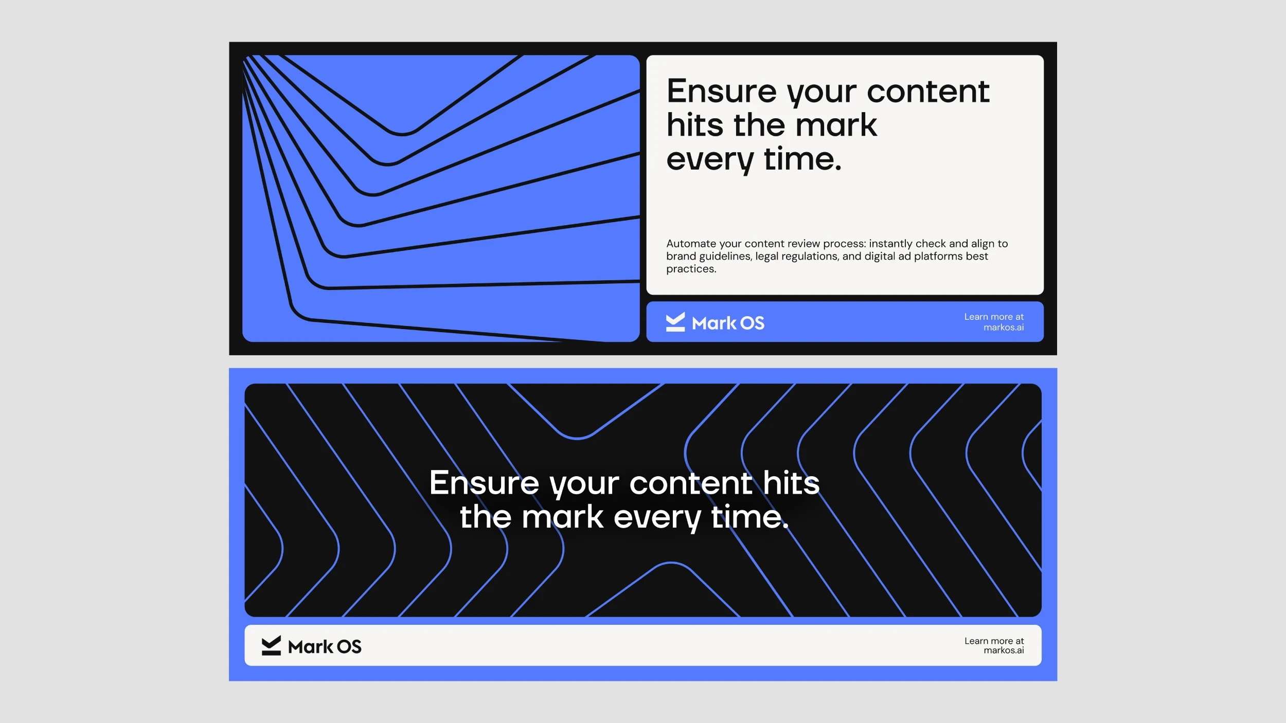
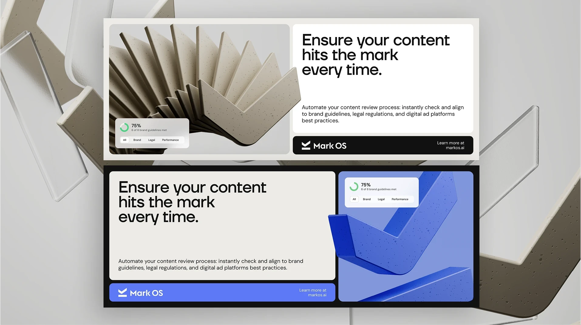
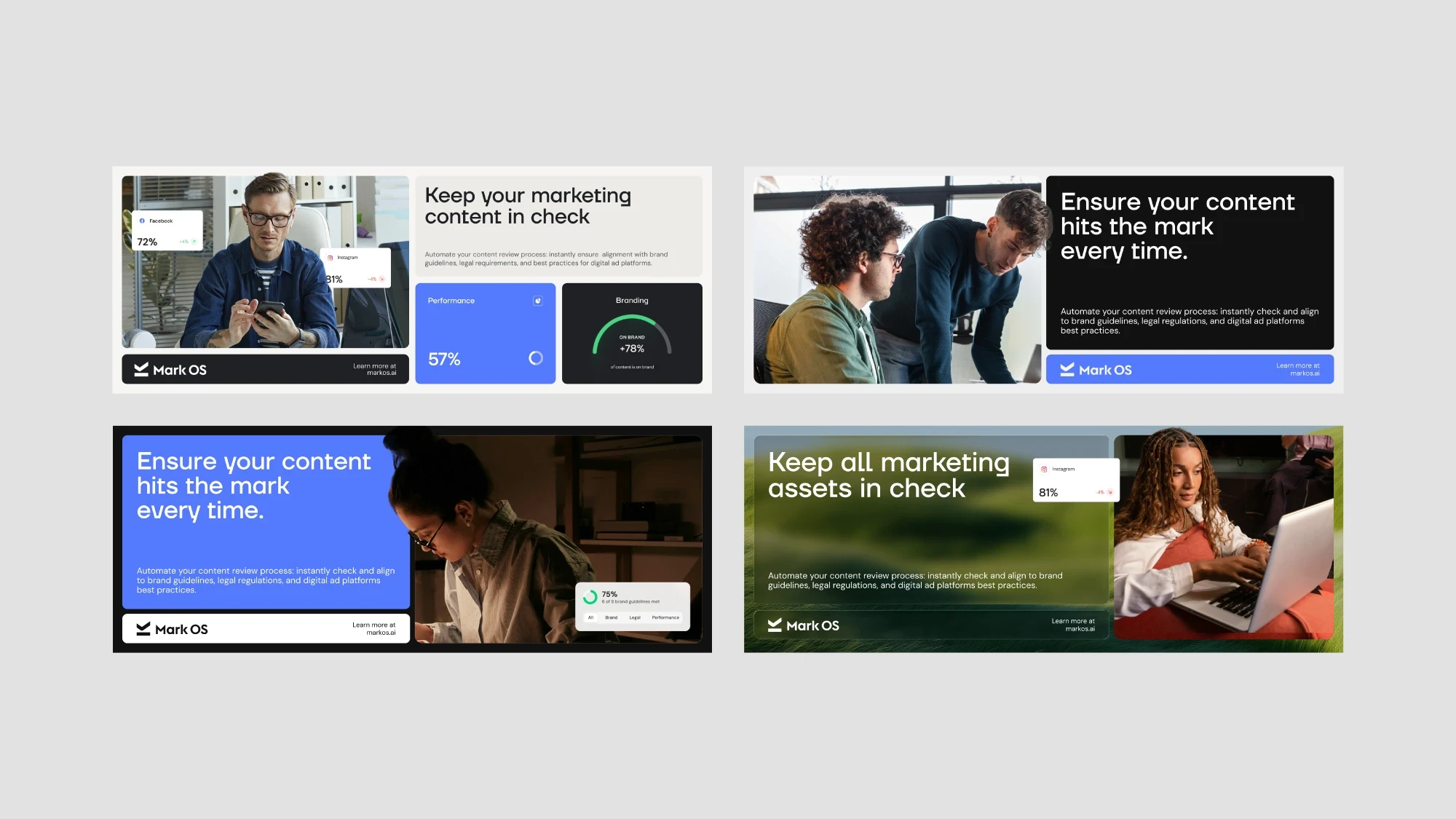
Banner units that still look like the brand
The hardest test in the system: fixed IAB dimensions, no room to breathe, and still recognisably Mark OS.
In Hand
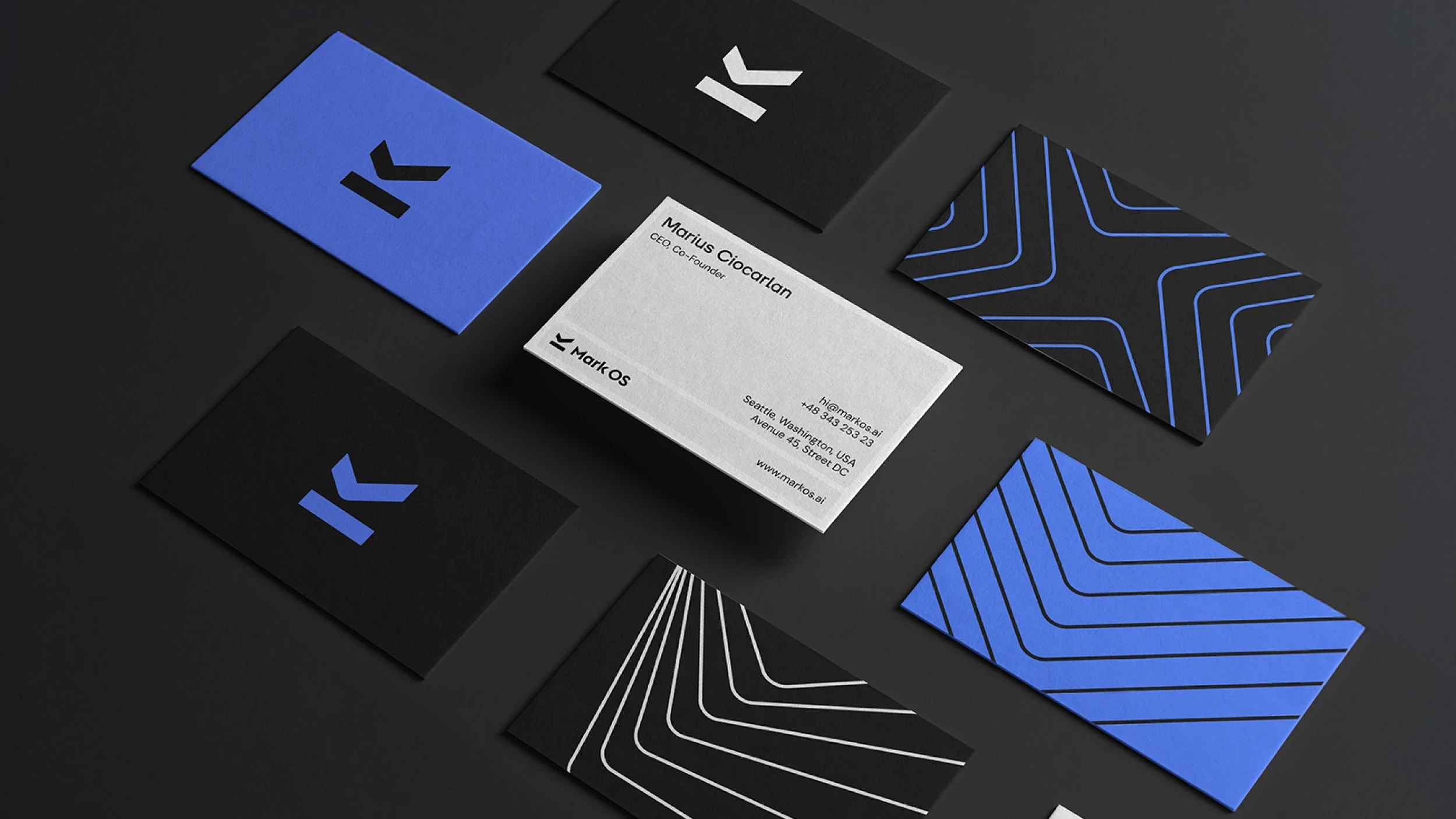
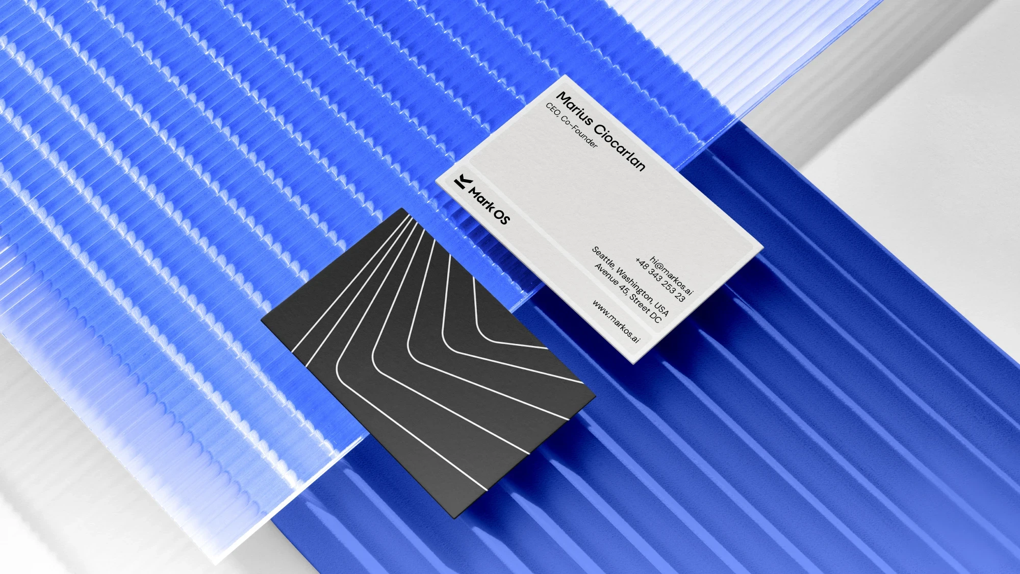
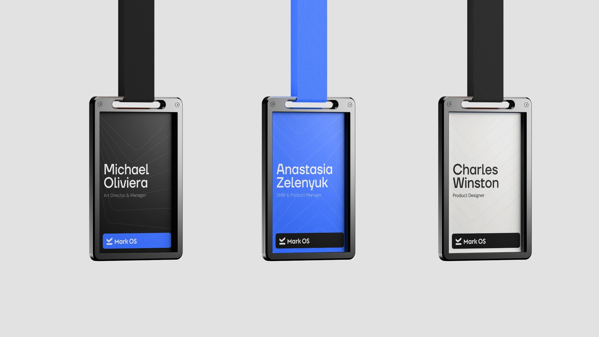
Where a brand stops being a file
Stock, thread, and anodised metal. The mark was drawn to survive all three — a single-weight form with no gradient to lose and no detail too fine to emboss.
The Engagement
What we did for Mark OS
Mark OS came to us for a launch, not a deliverable — strategy and identity through to the site, the copy, and the demand behind it.
The go-to-market that carried this identity into the world — positioning, launch, and demand — is written up in the Mark OS launch case study.