

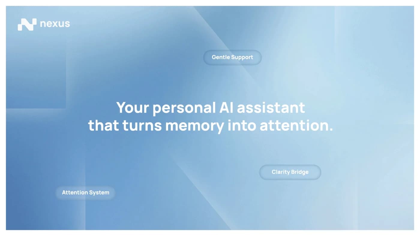
An assistant that turns memory into attention
The app
Nexus is a personal AI application that turns calendar commitments and the reminders people set themselves into timely, meaningful attention. The job it does is moving someone from mental overload to calm clarity — so the brand had to feel like relief, not another notification.
Design decisions
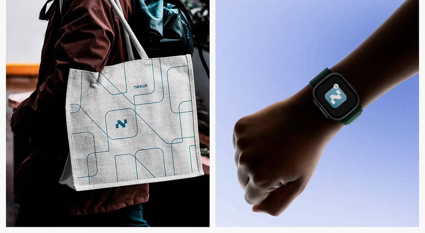
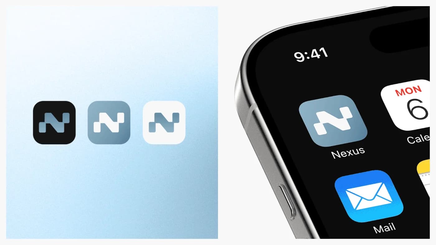
The identity is built from geometric shapes and lines for structure and flow, softened by gradients so it reads light rather than clinical. The weight sits on the custom mark: two forms meeting, which is the product's whole argument — connection, and things held together.
The launch film
One minute, from the pressure of remembering to the relief of being reminded
- Client
- Nexus
- Year
- 2026
- Type
- 2D animation
- Duration
- 0:59
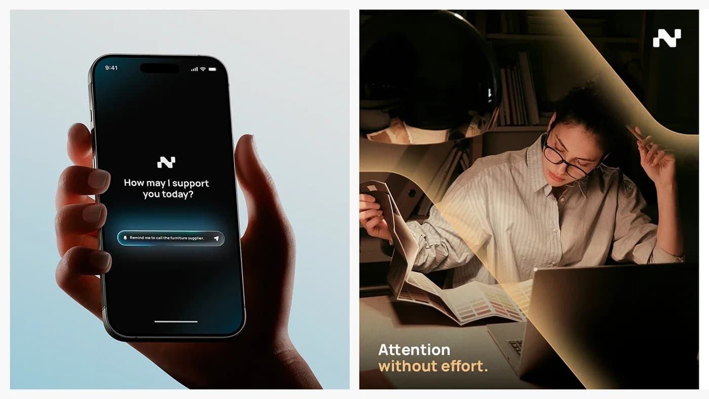
The film is the primary launch asset, and it carries an emotional arc rather than a feature list: the pressure of holding everything in your head, then the relief of the right thing arriving at the right moment, drawn from commitments the app already knows about.
It is built to work as the hero across Instagram Reels, TikTok and YouTube, where it has a second or two to land both the feeling and what the product actually does before a thumb moves.
Making it was an exercise in animating text and interface moments so they carry meaning instead of just demonstrating a screen. The result is a refined graphic style that matches the calm the product is selling.

A mark that has to survive being small
Most of this brand's life is spent at the size of an app icon on a crowded home screen, or a notification glanced at while doing something else. So the mark was drawn to hold its shape at that scale first and scale up second — and the line system it generates gives the identity somewhere to go on everything larger.

Out-of-home campaign
The product, caught in the moment it would have helped
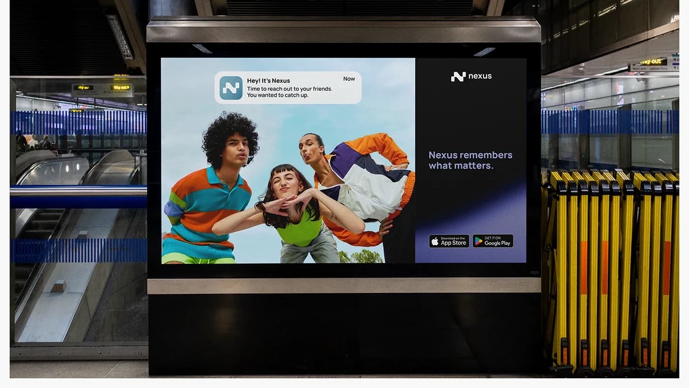
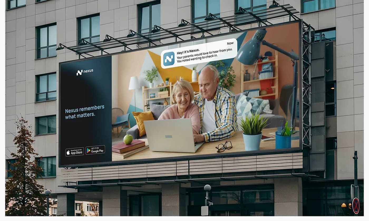
The campaign puts Nexus into real life rather than onto a device. Each execution shows the app surfacing one reminder that turns an ordinary situation into a connection someone meant to make — a call home, a friend overdue a catch-up, the dog that was promised a treat.
The notification does the arguing. It positions Nexus as a quiet presence that remembers what matters, which is a harder claim to make in a headline than to show in a scene.

What it is built to do
Three jobs, and how each one is meant to earn its place
The identity
Built to read as distinct and calm in a category that mostly signals intelligence by looking busy — so Nexus is recognised as thoughtful rather than as another assistant.
The film
Built to drive first engagement and downloads by telling an emotional story that lands with the people it is for: anyone carrying more than they can reliably hold.
The out-of-home
Built for reach rather than response — high-visibility placements in everyday environments, reinforcing Nexus as a quiet, supportive presence.
Branding & design
Launching something that needs a brand around it
Identity, launch film and the campaign that carries it — built together, so the product arrives sounding like one thing.