

Edelweisshof, alpine heritage on a Napa hillside
Brand Identity · Concept · 2026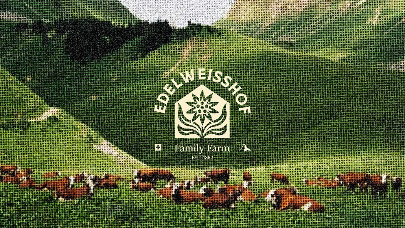
Project
Edelweisshof Family Farm
Type
Self-directed identity concept
Year
2026
Sector
Farm, food & agritourism
Scope
Brand Identity, Logo, Pattern Design, Packaging, Merchandise, Art Direction
Edelweisshof is a contemporary Swiss-Californian family farm that asks visitors to reconnect with the land through slow living, local food, and hands-on farm life. Set in the hills of the Napa Valley, it runs on traditional craft and seasonal rhythm: guests harvest produce, care for the animals, and eat the bread, honey, and cheese made on site.
The identity sets alpine heritage beside a modern, minimal aesthetic. The crest takes the pitched gable of a Swiss chalet, the ridgeline of a California mountain, and the edelweiss that belongs to both, and folds them into one form — the lineage and the address carried by a single shape.
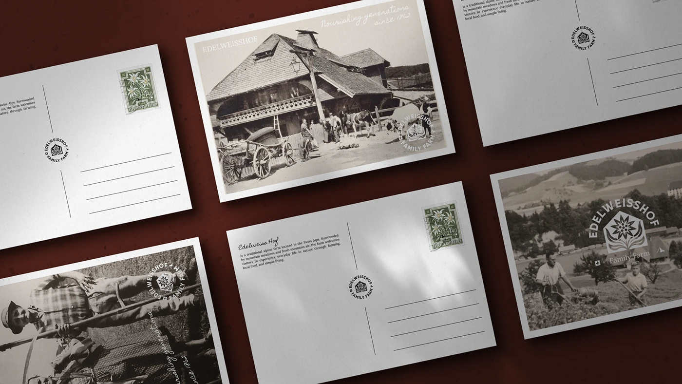
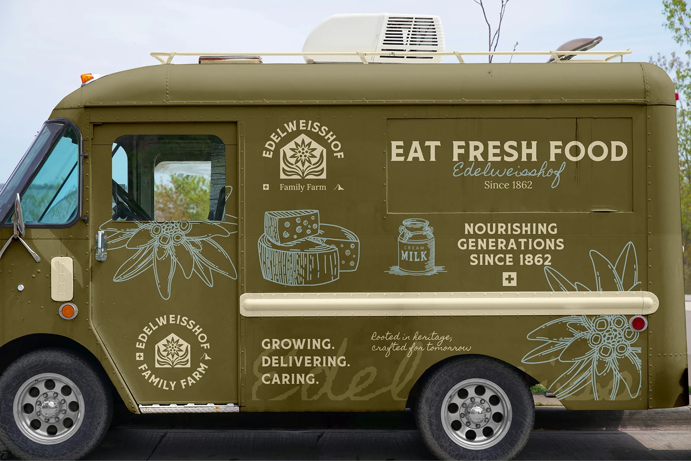
Natural colour, clean typography, and considered packaging hold it together everywhere the farm shows up: postcards and a delivery van, produce boxes and preserves, workwear and the tote that goes to market. The system is deliberately quiet. It is a brand for people who came to slow down, and it would be working against itself if it shouted.
Edelweisshof is a self-directed concept — an identity we developed in house to work a set of ideas through, not a live client engagement.
The Palette
Four colours, all of them found outside
Moss off a hillside in late summer, the bone of a printed flower, the pale blue of enamelware and cold air, and an oxblood dark enough to stand in for black. Nothing here is a brand colour in the corporate sense — each one already existed on the farm.
Pattern ground, vehicle, bread bags
The mark, label fields, type reversed out
Seals, cheese and bread labels, enamelware
Print colour, archive backdrops, workwear
The Identity
A crest for a chalet, a ridgeline, and a flower
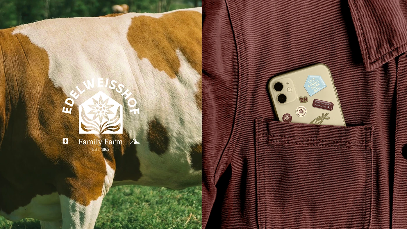
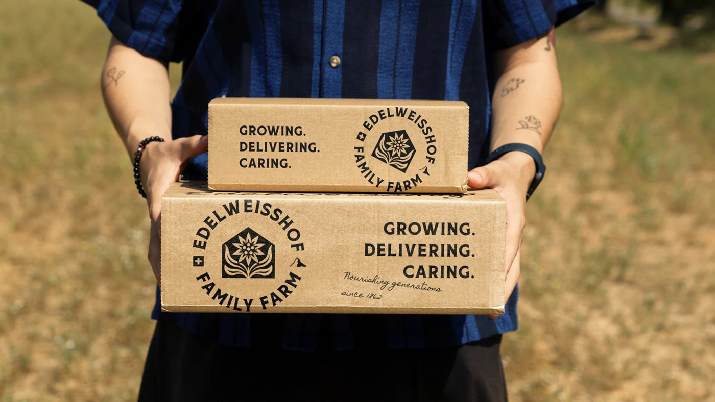
The mark reads three ways at once — the pitched gable of a Swiss chalet, the peak of a Californian ridge, and the edelweiss that grows on both. Ringed by the name and an est. 1862 line, it behaves like a maker's stamp rather than a logo: as comfortable on a postcard corner as on a van door or the flank of a cow.
The Pattern
One flower, repeated until it becomes cloth
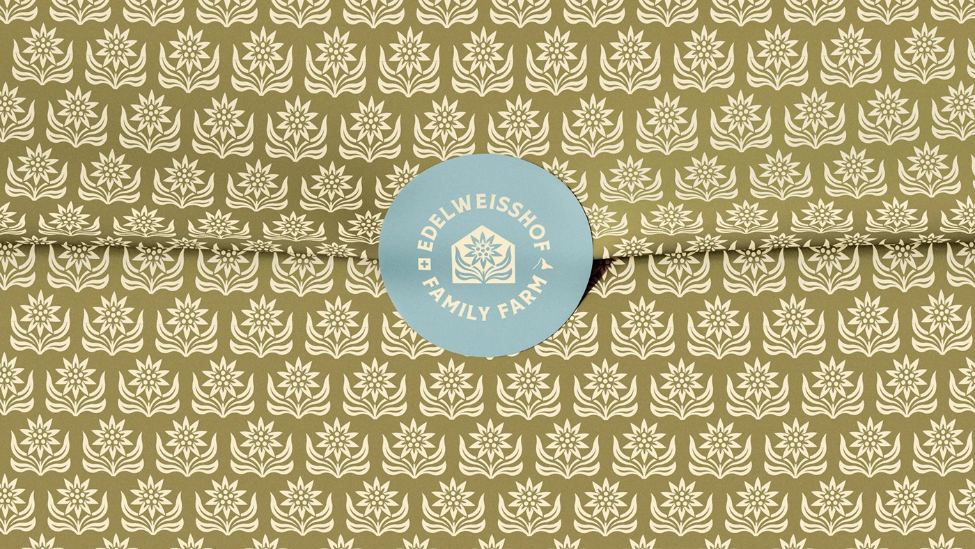
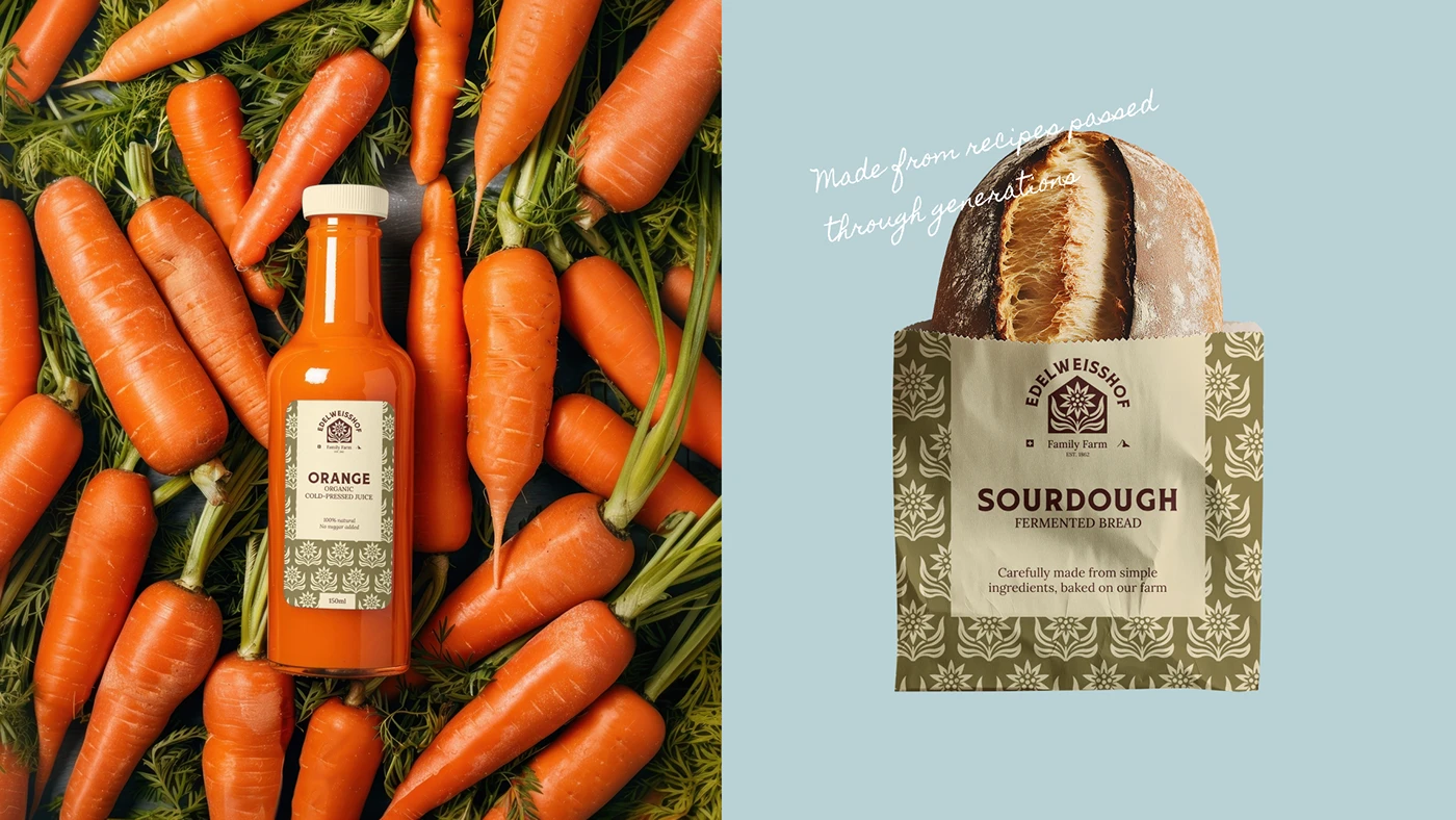
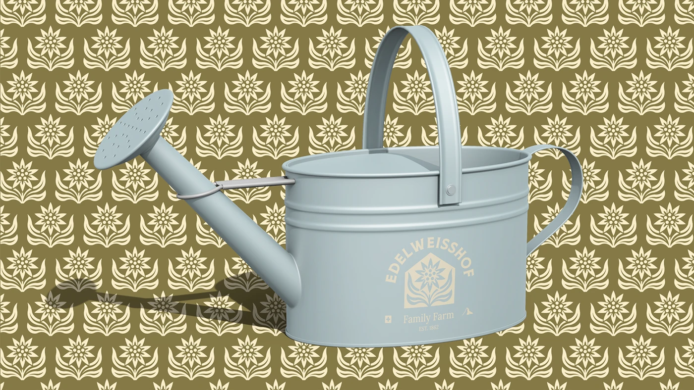
The edelweiss lifts out of the crest and into a tight block-print repeat. It does the recognition work at the sizes where the mark is too small to read — a label border, a bread bag, a wrap of paper — and carries the brand without a single word of copy.
The Larder
Packaging built like a pantry, not a product range
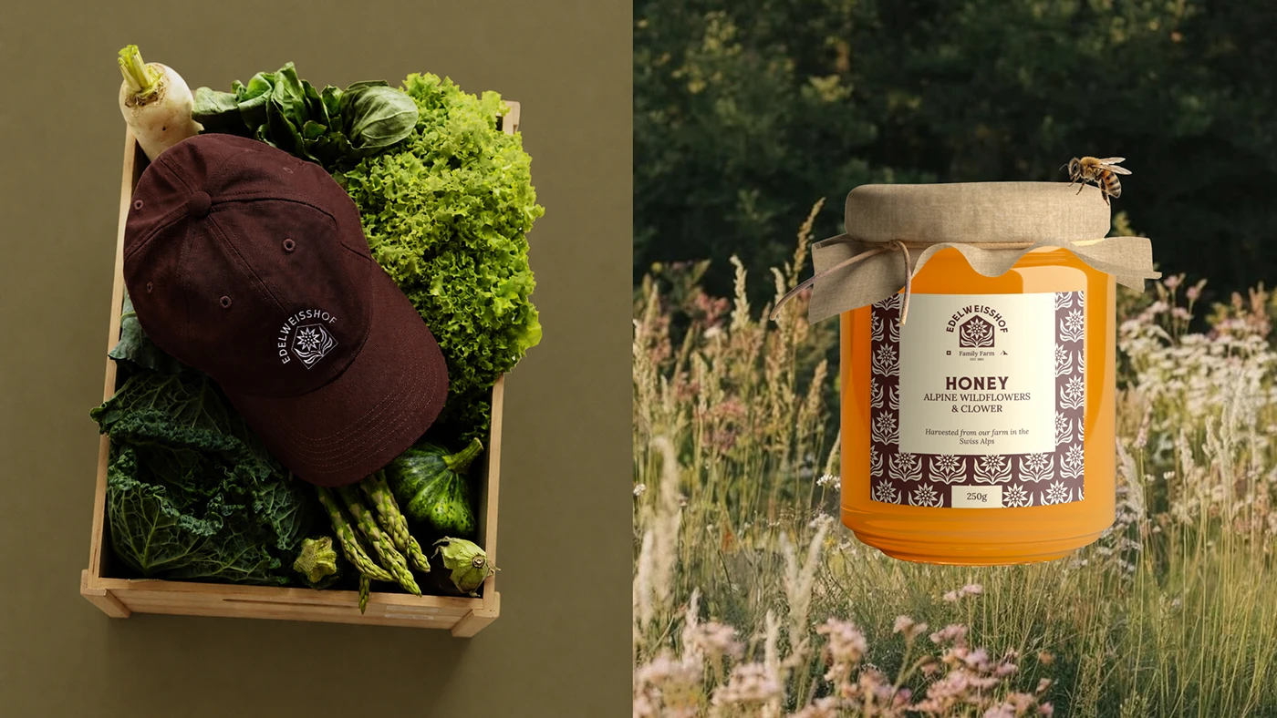
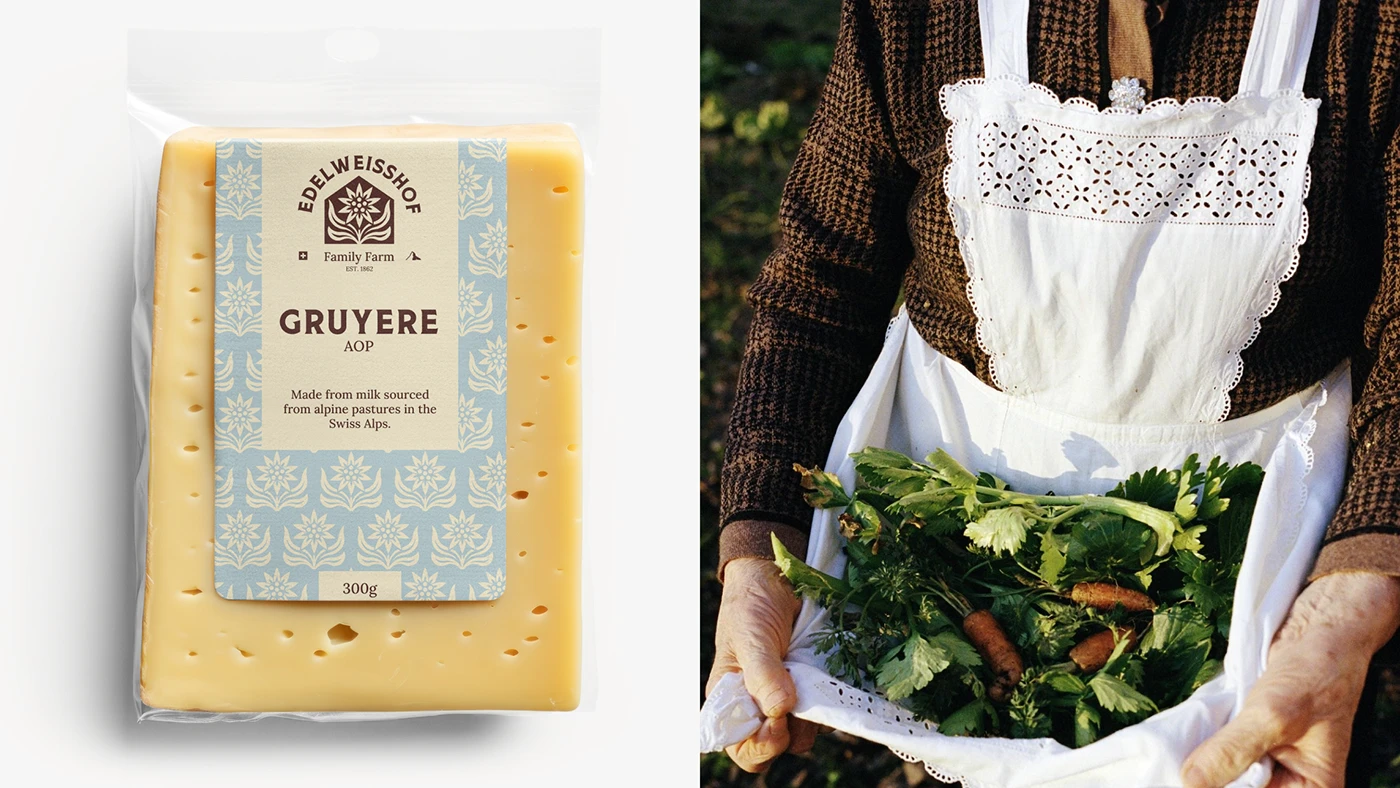
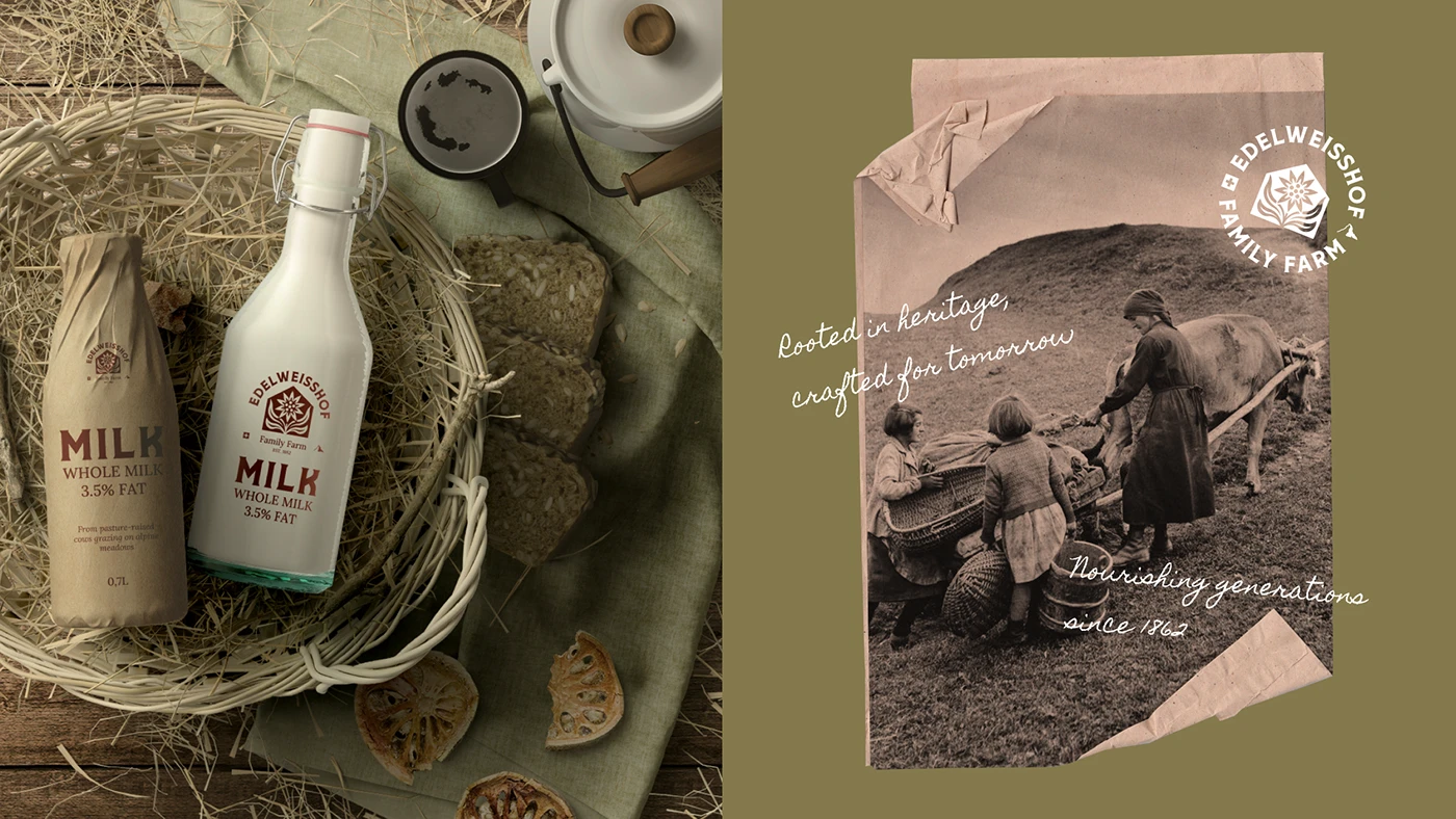
Honey, Gruyère, milk, cold-pressed juice, sourdough. Every pack makes the same three moves — the crest, a pattern border, one plain product name — so a shelf of them reads as a single household rather than a line-up. The differences between them are the ingredients, which is the argument the farm is making anyway.
On the Farm
Where the brand stops being print
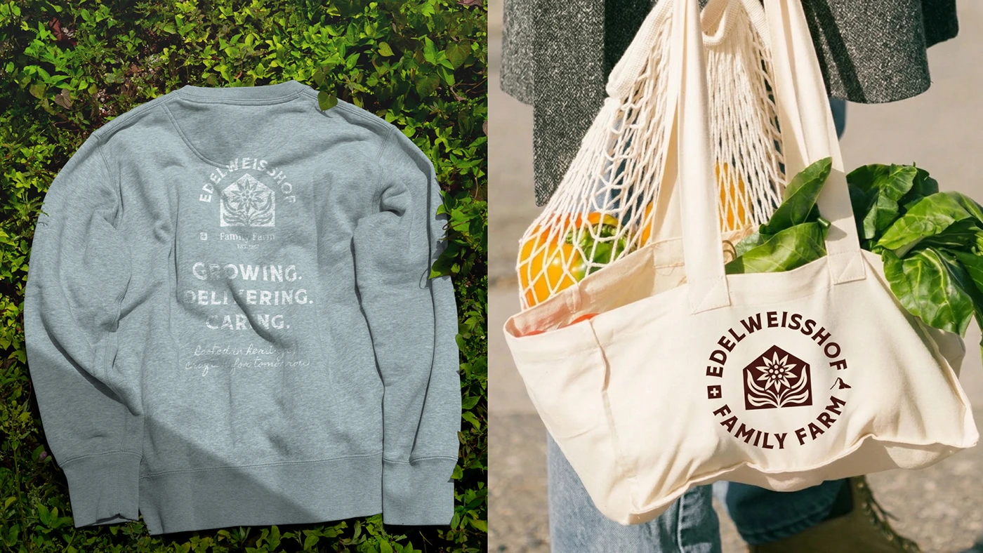
Enamelware, workwear, and the tote that goes to market. The crest was drawn as a single-weight form with no gradient to lose and no detail too fine to stitch, so it survives embroidery, screen print, and a powder-coated curve as well as it survives paper.
The Work
What went into it
The same disciplines we bring to a client identity, run on a brief of our own so we could push the craft further than a timeline usually allows.