
Brand, Web & Identity · AI Video Studio
SeedAgent
An inbound lead, a brief we wrote ourselves, and the front door we built them.
Built end to end
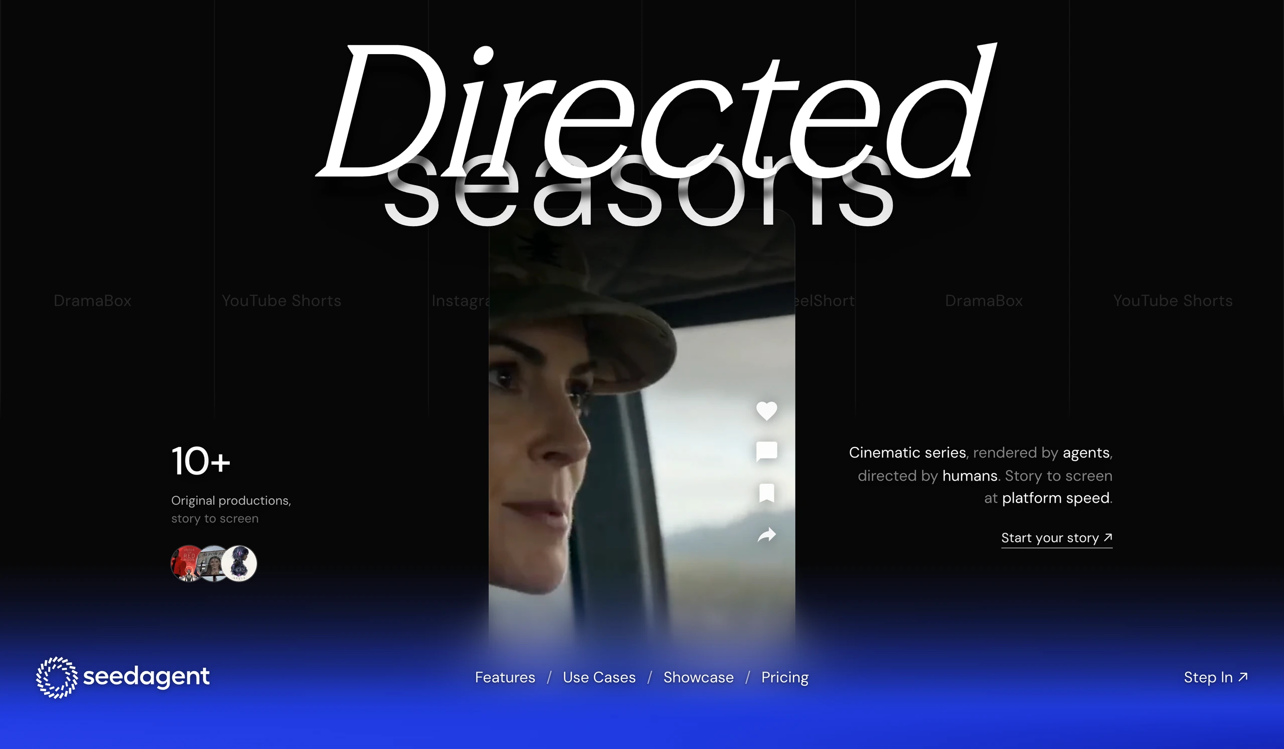
SeedAgent is an AI video studio, shipping original short drama to TikTok, ReelShort and DramaBox. Before the first call we read their site the way we read every prospect, and then we did the part nobody asks for: we built the answer.
SeedAgent came to us as an inbound lead. We answered with a complete build: identity, motion system, campaign, and a full landing experience, designed and built end to end by Machina.
We took the brand apart before we drew anything.
SeedAgent was shipping prestige work in borrowed clothes. The palette belonged to a phone maker. The type dissolved on half the world's screens. Paid media flew with no instruments on board. Strong stories, weak signature. So the brief wrote itself: build the studio an identity it owns, and a front door that converts the attention its work already earns.
Research
Every surface the brand touches, taken apart and read.
Strategy
One ownable color. One voice. One front door.
Identity
Mark, type and motion designed as a single system.
Build
The full landing experience, designed and shipped.
Campaign
Frames that carry the identity into the world.
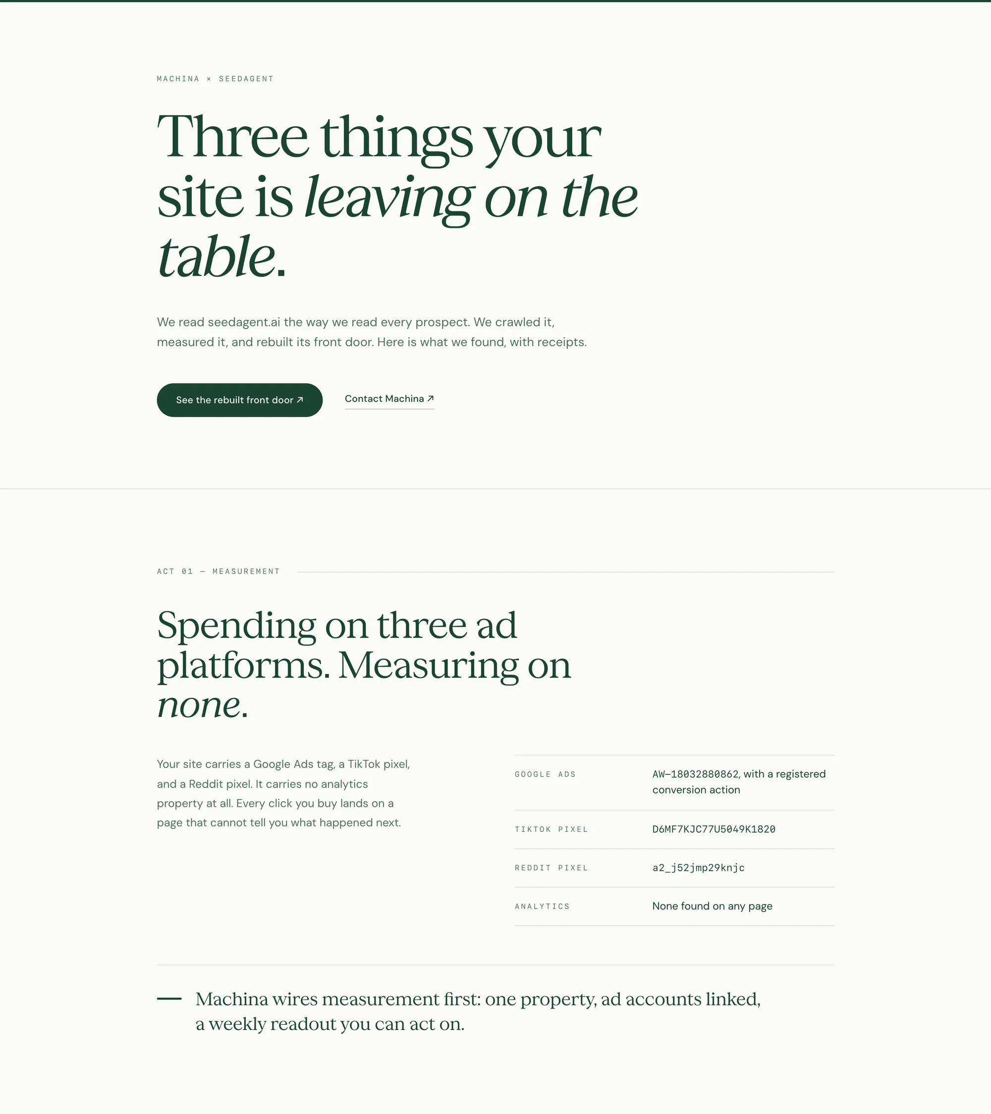
A studio shipping original worlds should not be wearing a phone maker's palette
So the identity starts with one decision and derives the rest from it. The blue is #1D38DE, an electric indigo that belongs to them. It is loud enough to hold a full panel and dark enough to carry white type at the size a headline needs.
Season Mix sets the words that carry the argument. DM Sans sets everything that carries information. One face for meaning, one for reading, and a single italic accent that only ever falls on one word in a line.
rgb 29 56 222
- #5A74FF
- Focus rings, hairlines on black
- #2A46E8
- The lift under a pointer
- #1D38DE
- The identity. Everything else is derived
- #1527B8
- Held states and cast shadow
- #070708
- The page black the site runs on
- #FFFFFF
- Type, marks and rules over both
Season Mix
A licensed serif with enough contrast to hold a full-bleed headline and enough weight to sit on footage.
DM Sans
An open grotesque that stays readable at 13px on black, which is where most of a landing page actually lives.
The accent
One serif word, one sans word, locked so the serif's baseline sits inside the body of the word beneath it. The second word is typed rather than set, and every word in the cycle is something a studio actually directs.
Season Mix ships no italic cut. This slant is the browser's
Thirty-six marks in a ring: a shutter, an iris and a seed head reading as one shape. It holds at the size of a favicon because there is only ever one shape to hold, and it gives the identity a pattern to fall back on everywhere larger.
The clear space is one spoke on every side, which is roughly a fifth of the mark. It scales with the mark rather than being redrawn for each size.
The mark as pattern, at three weights
Thirty-six strokes in rotation, then nine letters, outline before fill
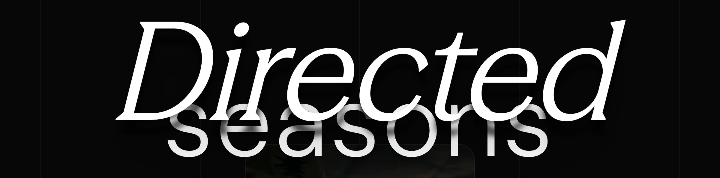
Two words, stacked until they interlock
The serif sits so low that its baseline lands inside the body of the sans word under it. Neither word is transparent. The separation between them is a cast shadow, so the serif reads as a layer above rather than a wash over.
The second word is typed and retyped. Visions, stories, episodes, worlds, seasons. The geometry never moves while it does, because the line box is measured off the serif alone.
There is no line where the footage stops and the colour starts
The phone does not end above the navigation and hand off to a painted band. It keeps going down past it, three coats of blur compound over it, and the blue arrives as a tint rising through the smear.
So the links sit on intensely blurred footage rather than on flat colour, and they carry the same cast shadow the headline does to stay crisp against whatever frame the loop is on.
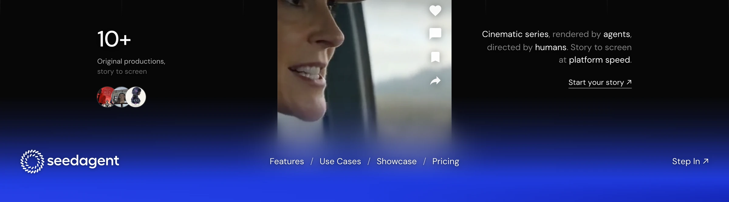
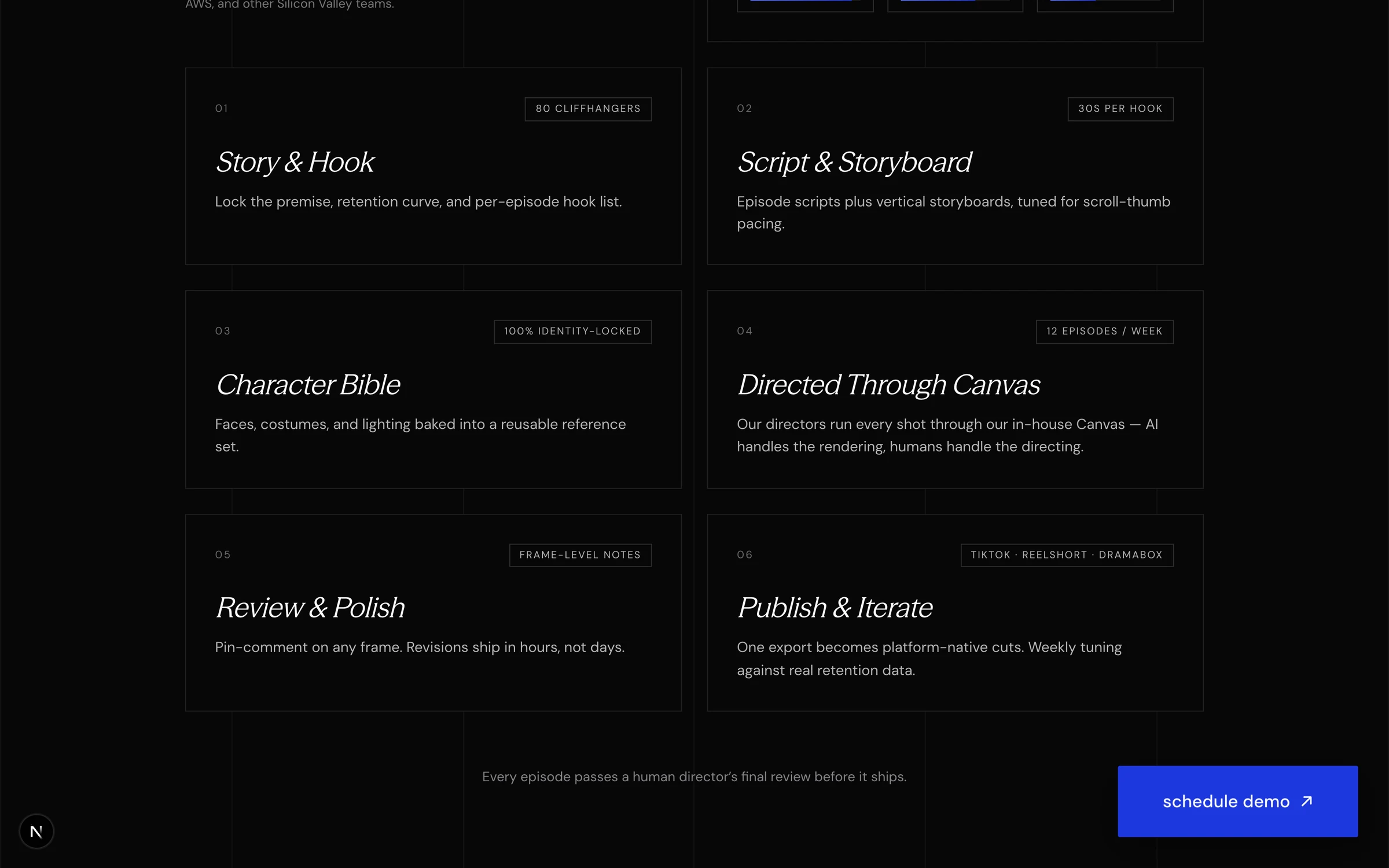
Six panels, one argument
Every panel is full bleed and owns its own ground, so the page runs black to the band blue and back to black without a seam that belongs to the page rather than to one of the panels.
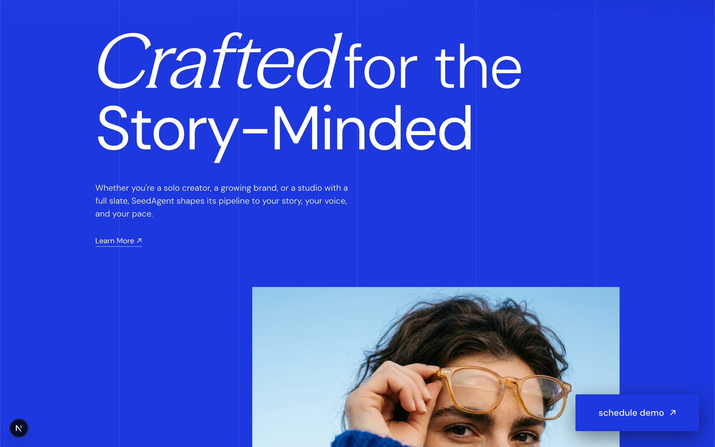
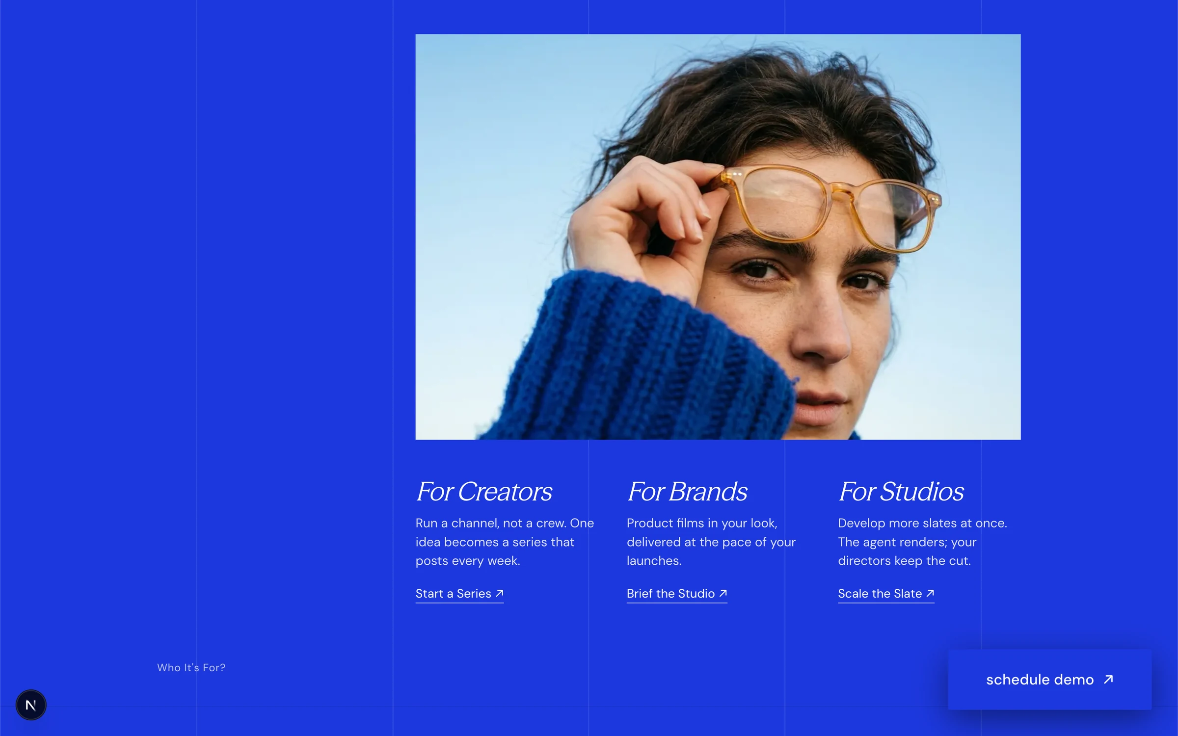
The blue field
The page leaves black once, and it leaves black for the identity colour. Everything that has to be believed sits on it.
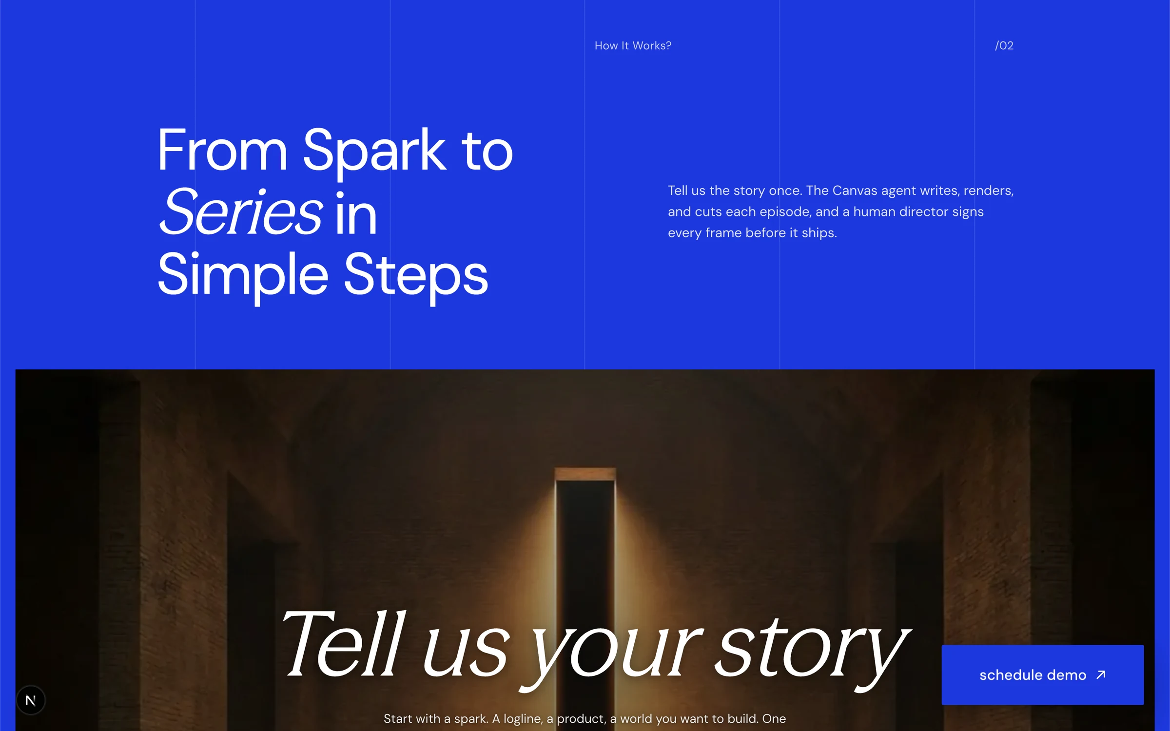
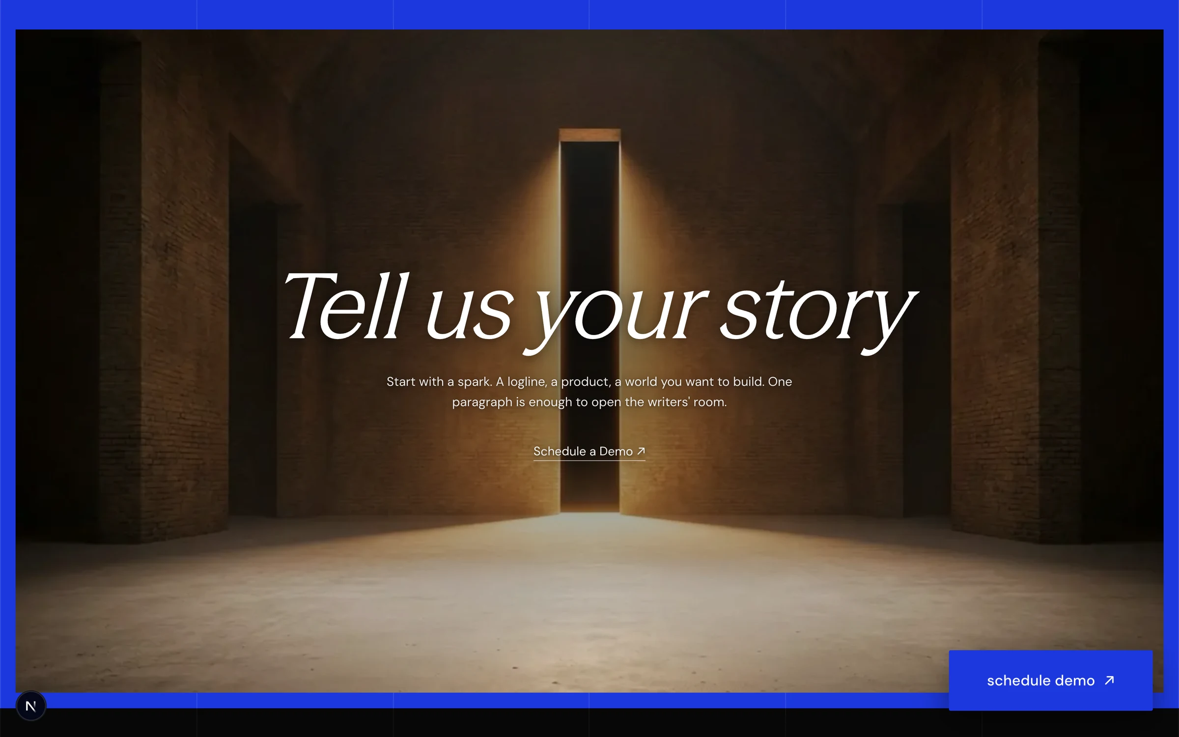
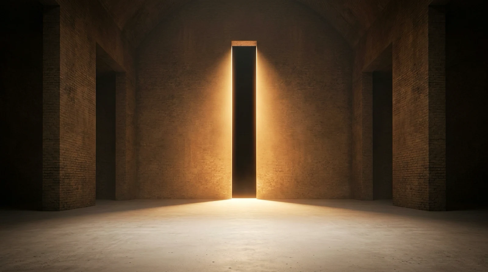
The light shaft
One image, one sentence, one door. The panel is the only place on the page where the copy is allowed to be a single line.
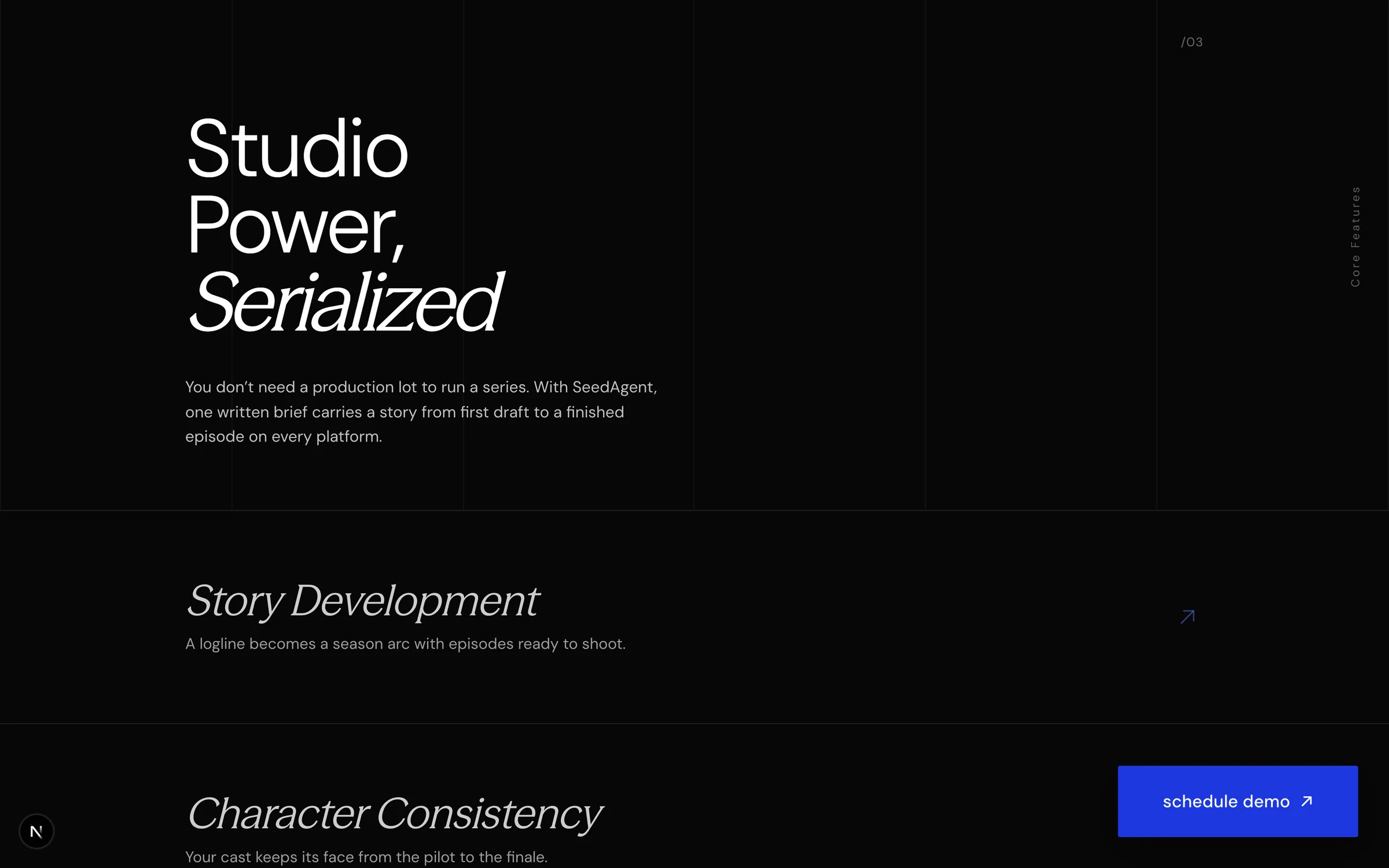
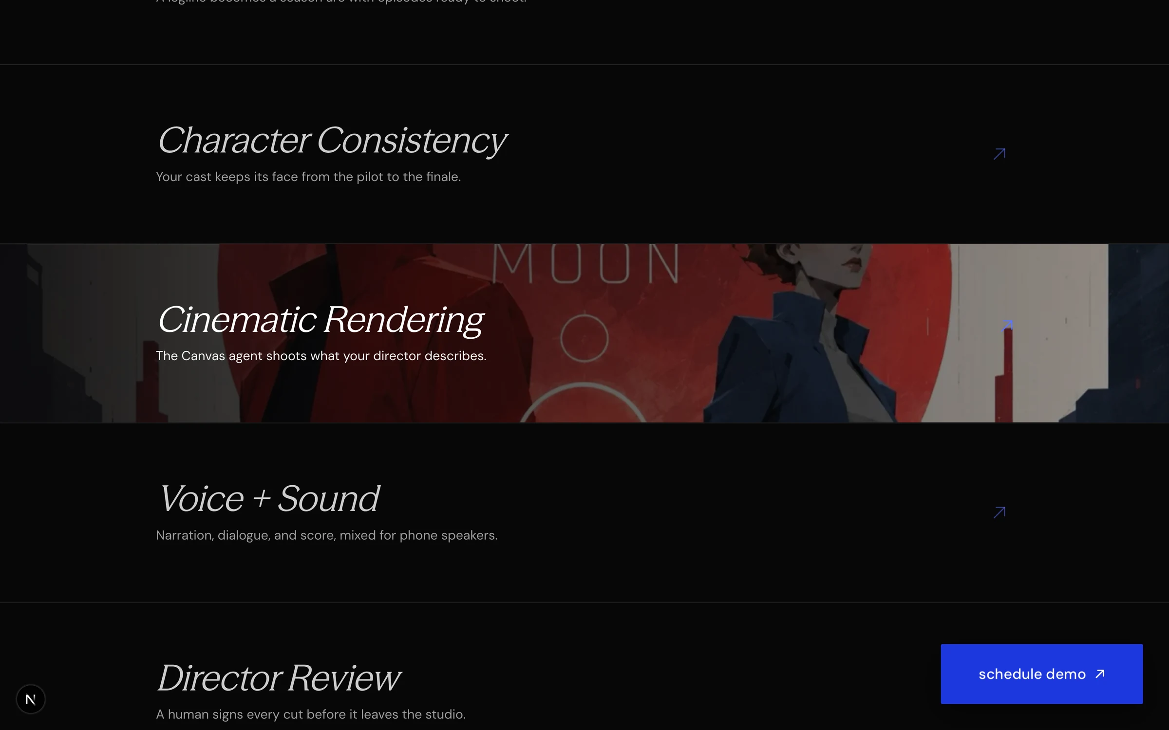
Rows that open
Six capabilities as ruled rows. Nothing is illustrated until a pointer asks for it, and then the row itself becomes the still.

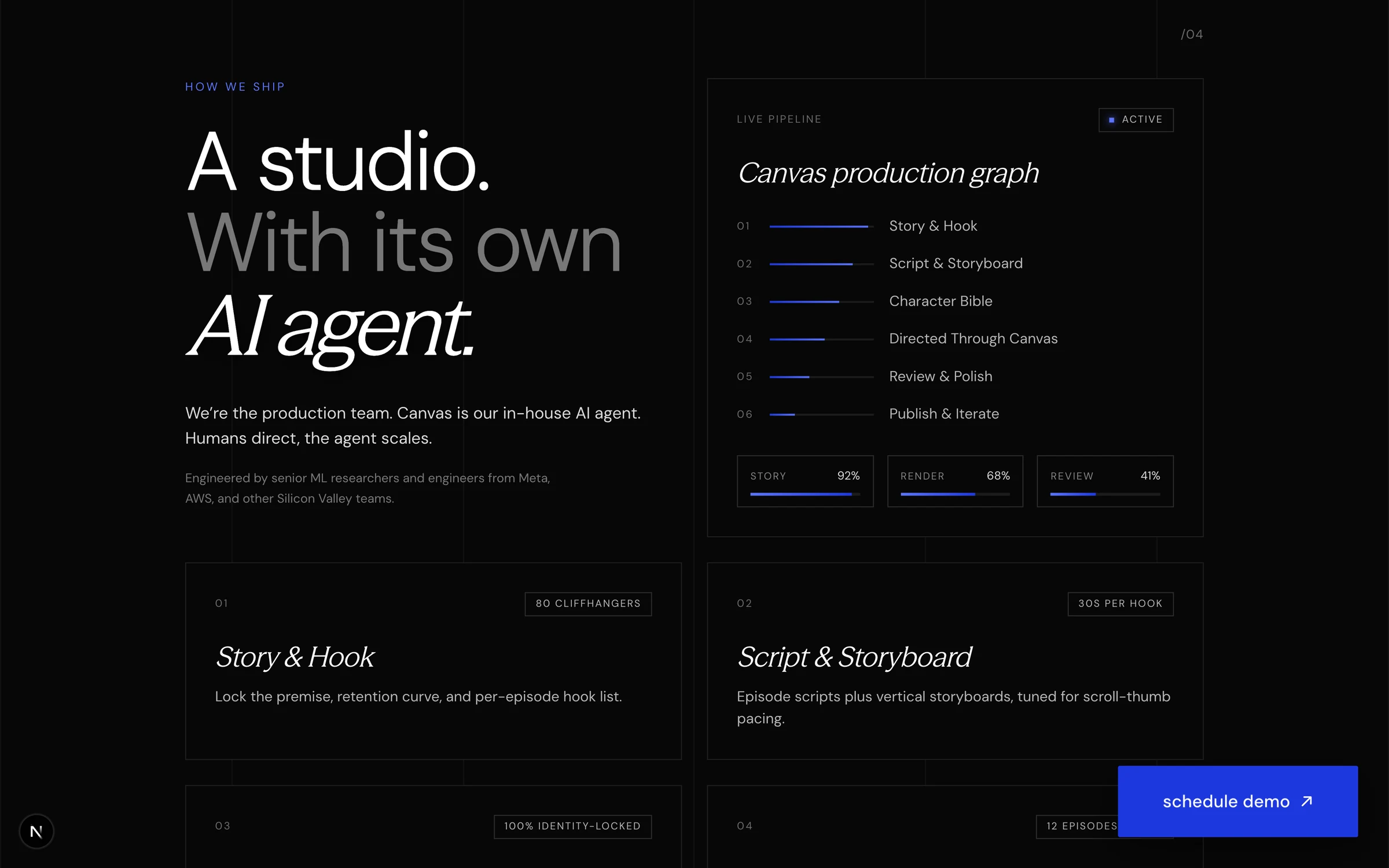
Built on a grid
The pipeline panel and the ruled cells under it share one measure. The rules are the layout, not decoration on top of it.
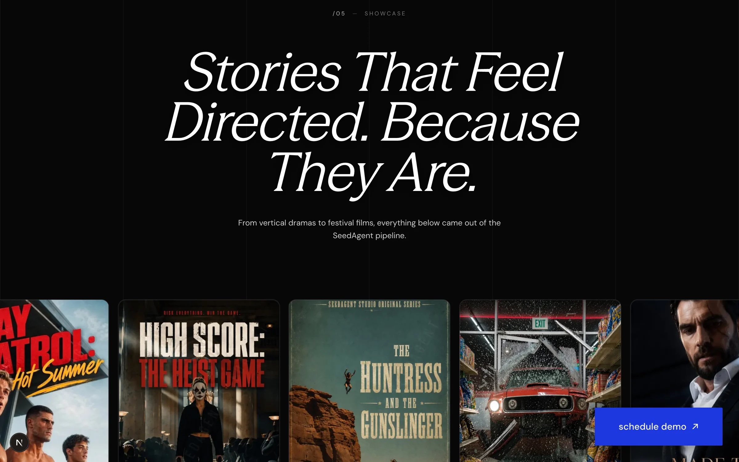
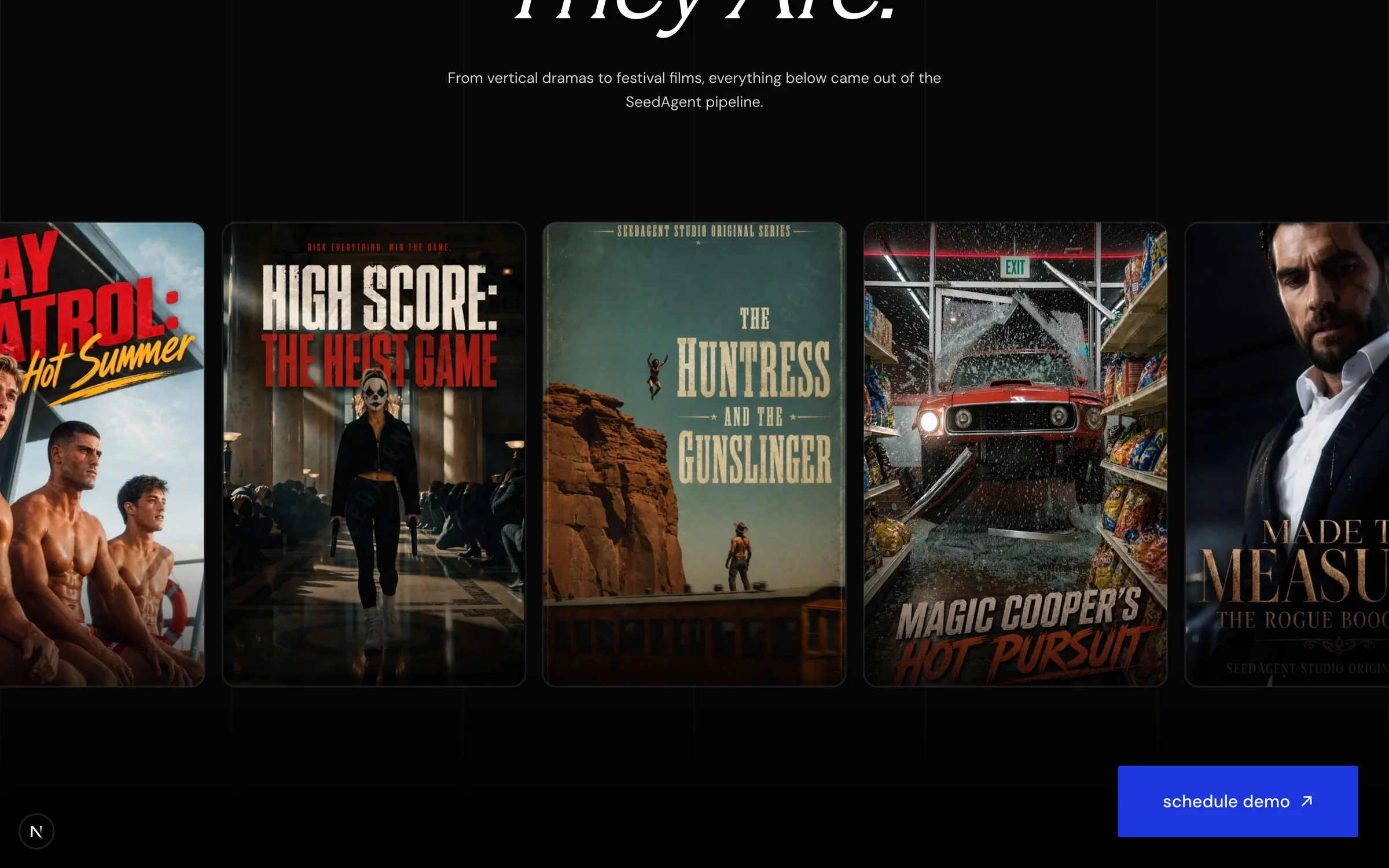
The poster row
Their own productions, at poster proportions, running edge to edge. The work argues better than a paragraph about the work.
The contact block
The last panel sits on a slow space loop, and the form is the only thing on the page with a hard edge.
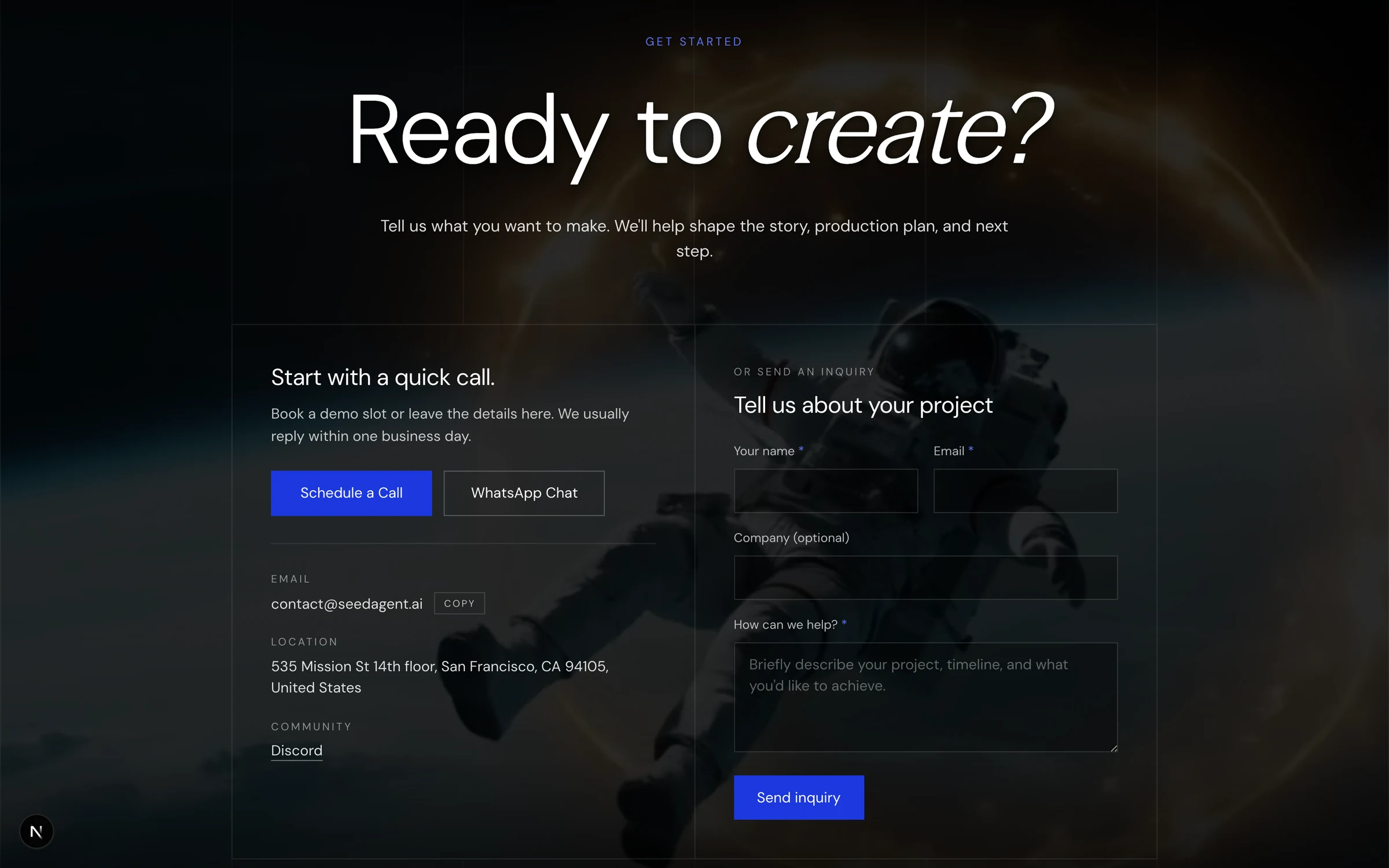
The photography in the first two panels was generated for this build, to a brief written against the identity. Neither frame is stock and neither is theirs.

Two things that only work if you stay
The call to action is a split-flap board. It riffles over to Contact Machina, holds long enough to be read twice, and gives the label back. Two to four cards pass before each letter lands, because a fixed count reads as a loop and a random one reads as a mechanism looking for a letter.
It is a signature, not a trick. The flap is the only place in the build where the maker is named, and it names us on their page for four seconds at a time.
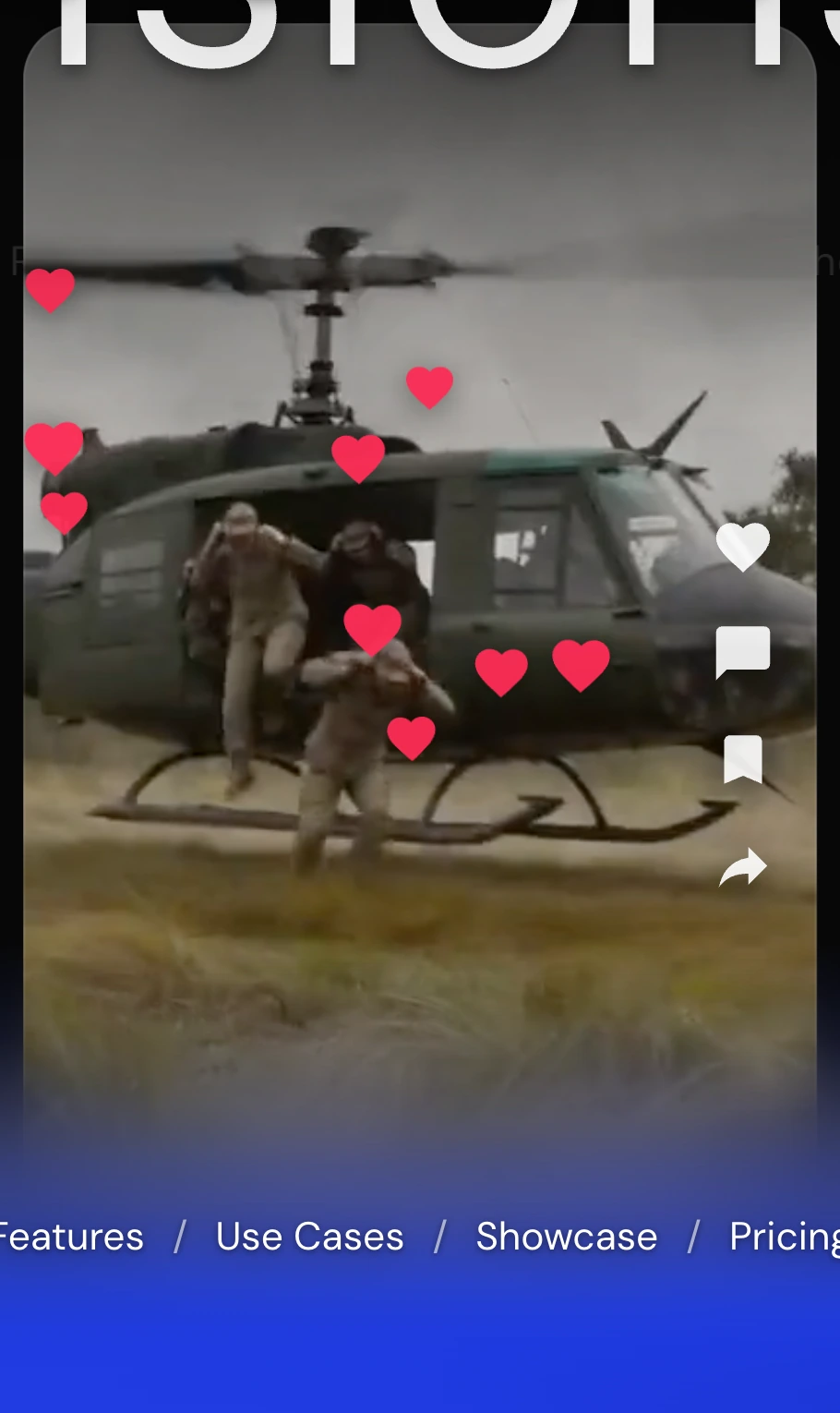
A tap anywhere on the window throws a heart, which climbs an arc into the corner. It is the one gesture every viewer of this footage already has in their thumbs, and the rail beside it carries no counts, because a number there would be a claim about someone else's audience.
Nothing announces it. It rewards the reader who stays long enough to touch the thing.
Frames from the campaign system
The identity has to survive contact with a picture. These are built the way the placements would be: the photograph carries the frame, the lockup sits in the part of it that was already dark, and the line is one sentence long.
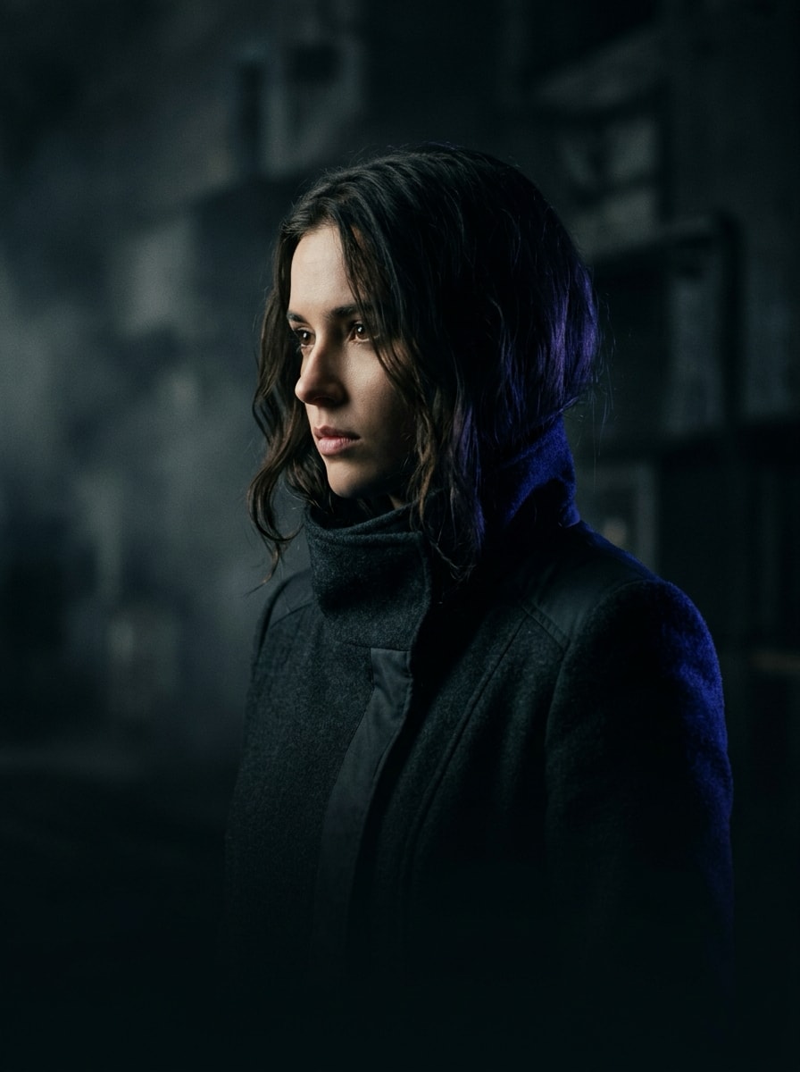
Directedvisions.
seedagent.ai
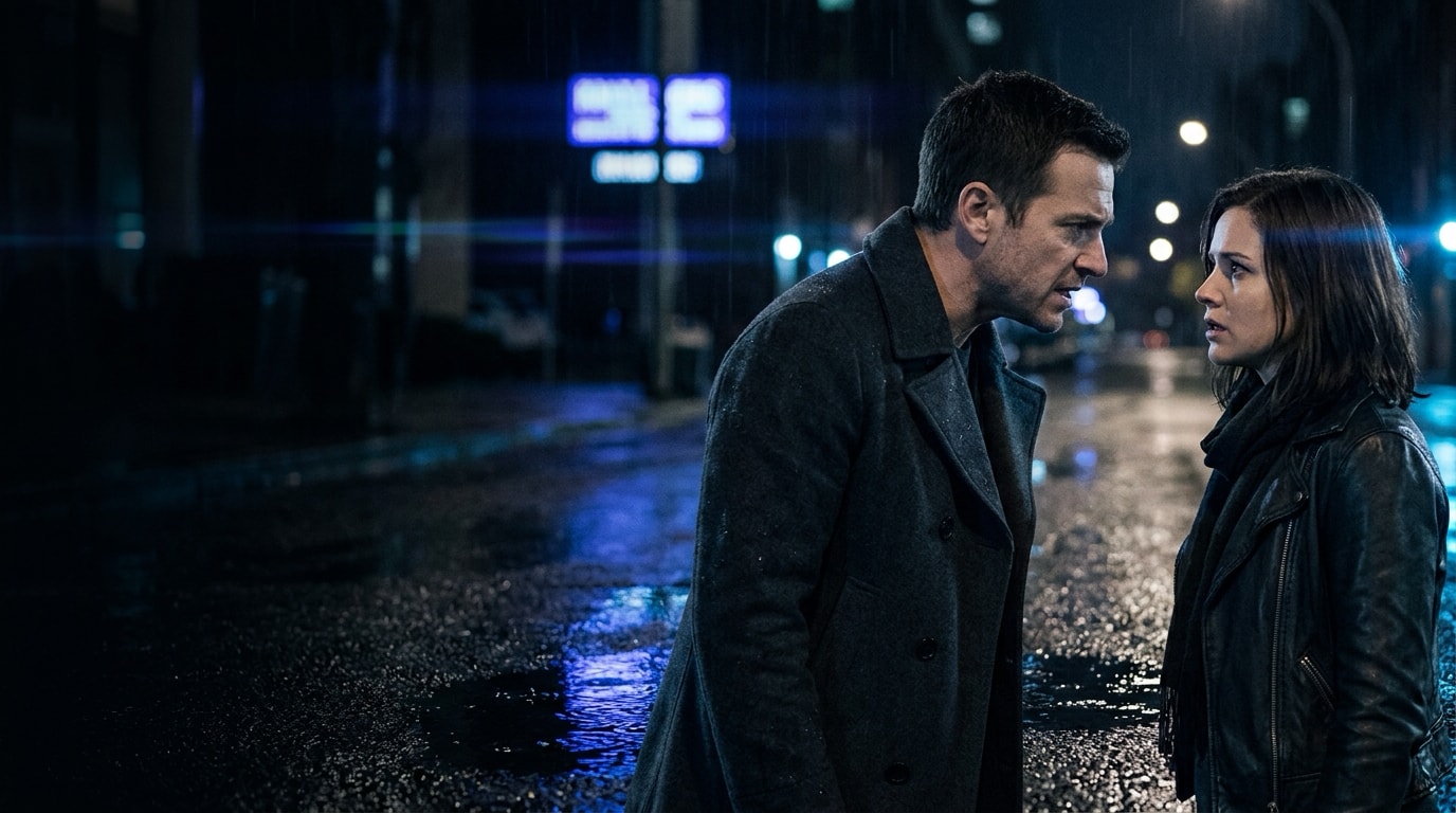
Every story, directed.
seedagent.ai
Campaign concepts.
The two places an identity like this actually lives: a rounded square on a crowded home screen, and a title card two seconds before the work starts.
The burst alone, held at 62% of the tile so the ring never touches a corner.
Black, centred, nothing else. The card is a held frame rather than a slide, so it carries no rule and no colour.
The same two frames recut for the surfaces the studio already ships on. The lockup sits in the lower left on every one of them, which is the only rule the set needs.
The whole front door, top to bottom
Eight panels and a closing lockup, one identity held the whole way down. Scroll the frame to read it the way it was built.

Scroll the frame
Branding & design
Built end to end in one working session
Identity, landing experience and the argument that carries them, built before the first call. If you want the same treatment on your own front door, start here.