
Brand identity · Packaging · Campaign · Social
NU3
nu3 is a nutritional supplements brand working across sport, food and everyday health. The identity gives it one conceptual form, a typographic voice drawn from classic pharmacy lettering, and a colour system that lets fifteen flavours sit together without argument. What follows is that system as it runs across packaging, out-of-home, still life and social.
- Client
- nu3
- Category
- Nutritional supplements
- Disciplines
- Identity, packaging, campaign, social
- Sector
- Consumer health
A brand in balance.
Where science, nature and human well-being converge.
nu3 leads in nutritional supplements, uniting sports, food, and health. To refine its identity while preserving its essence, we crafted a strategic visual language—introducing a defined TOV, a new colour system, refining typography, and creating a unifying conceptual form.
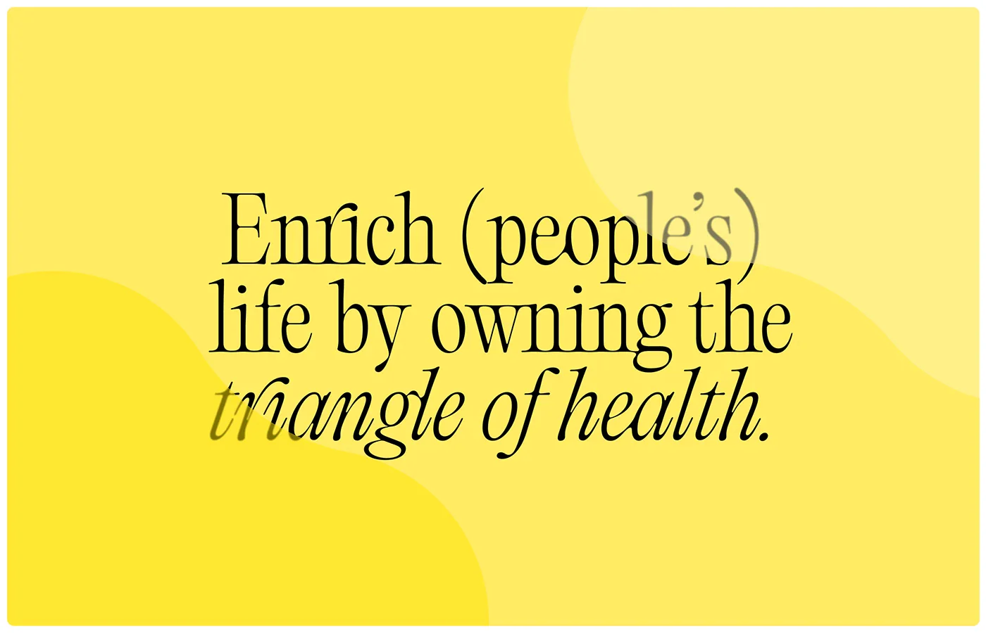
Heritage and harmony.
Where timeless typography meets the fluidity of form.
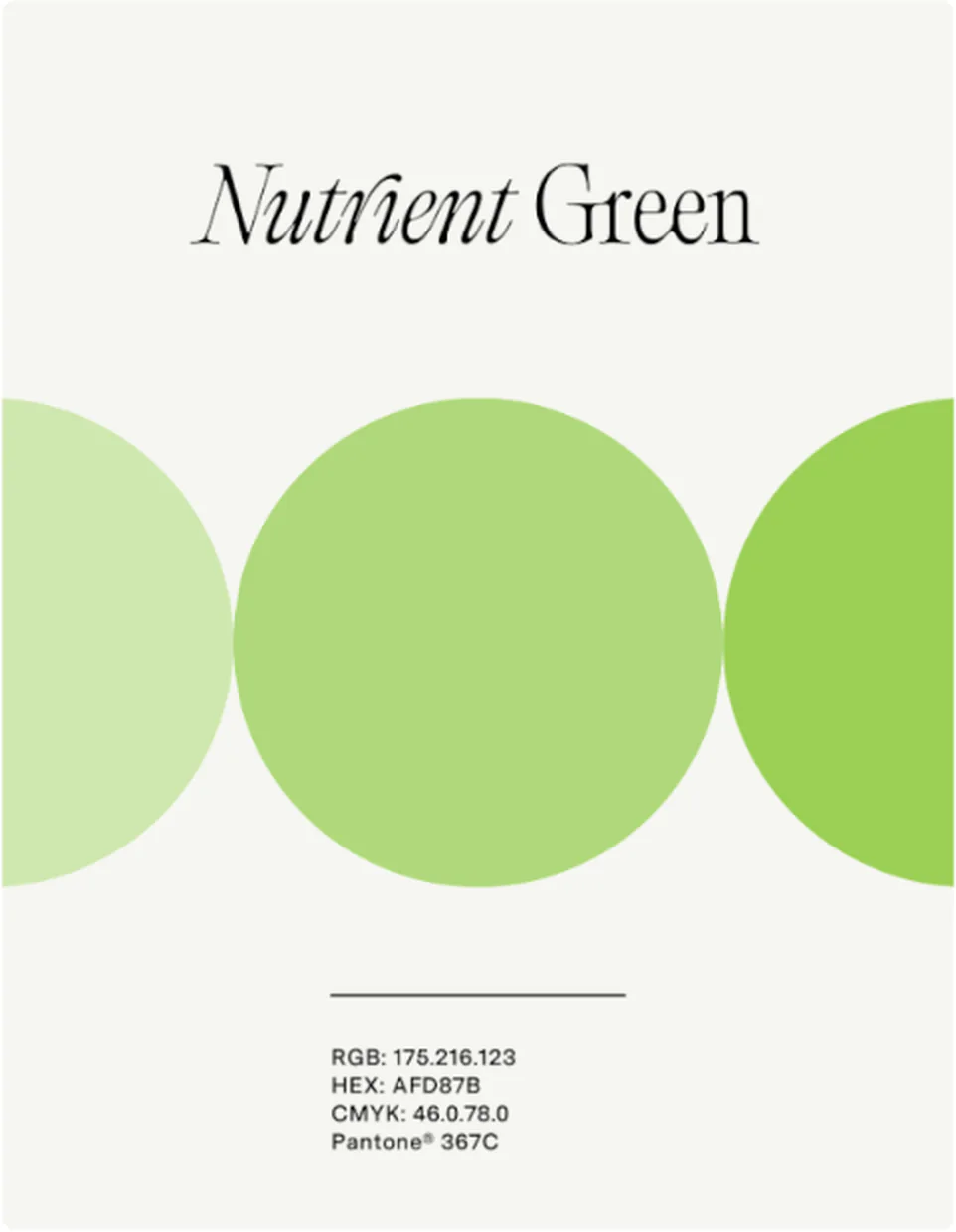
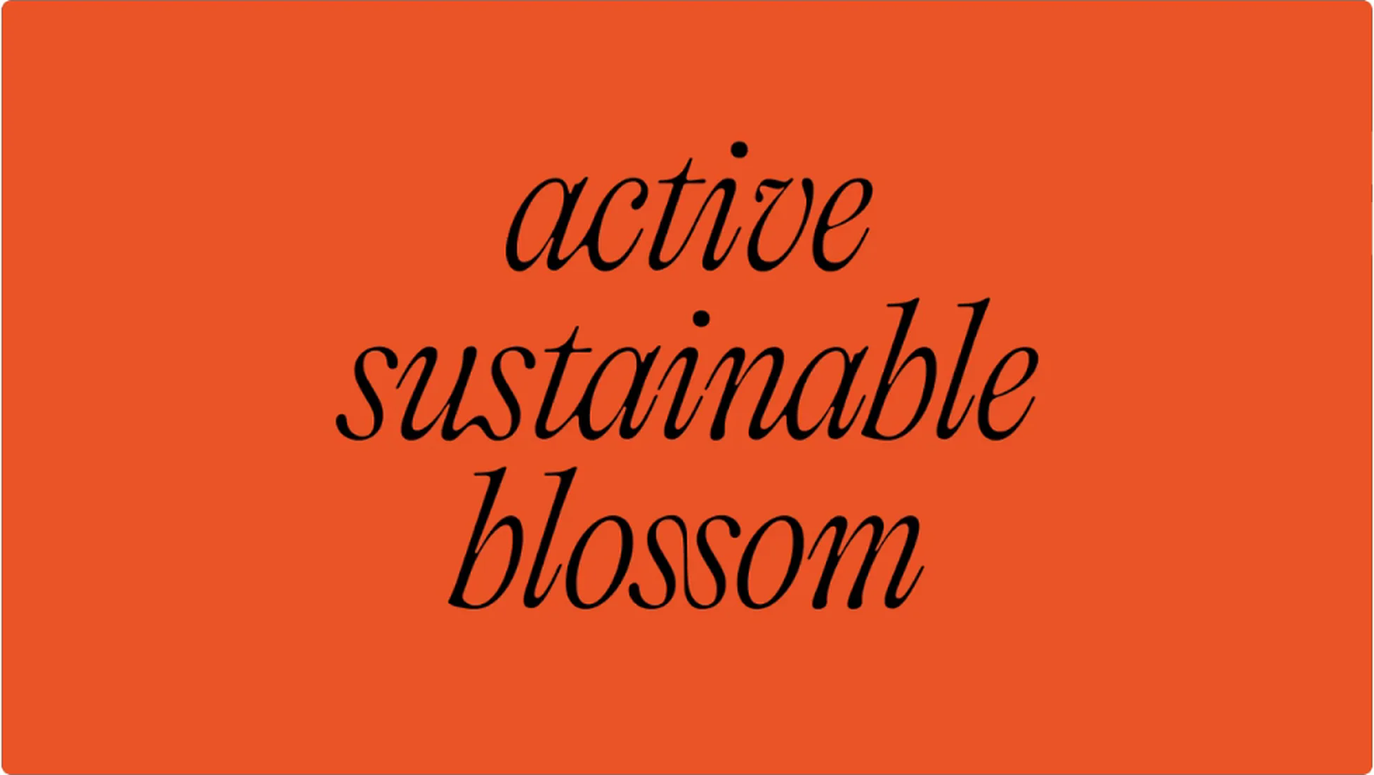
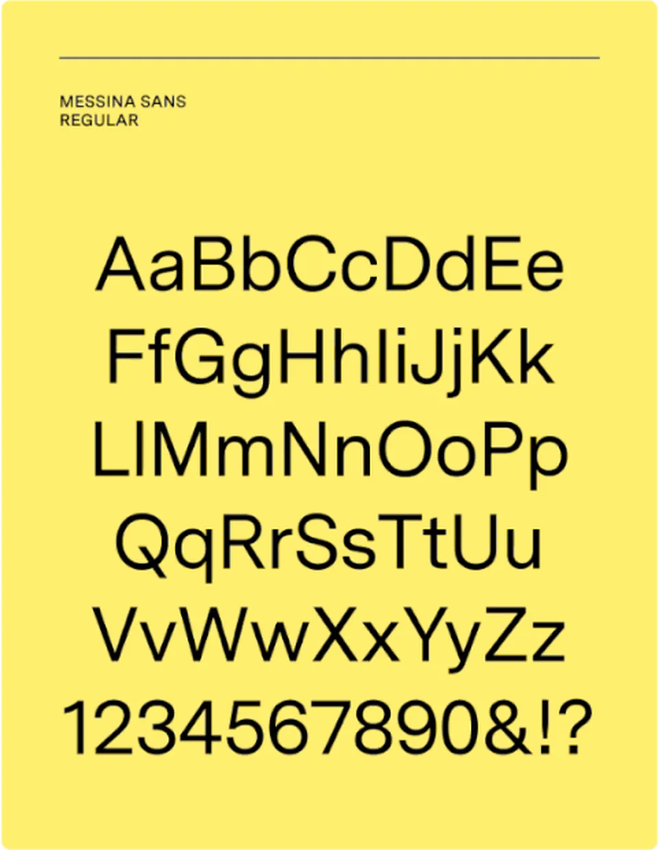
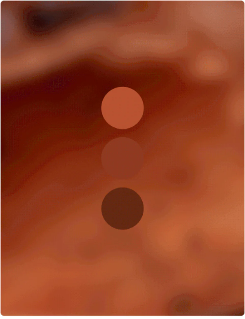
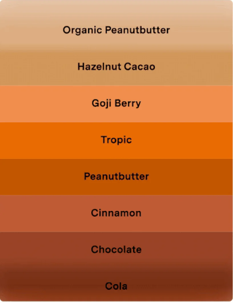
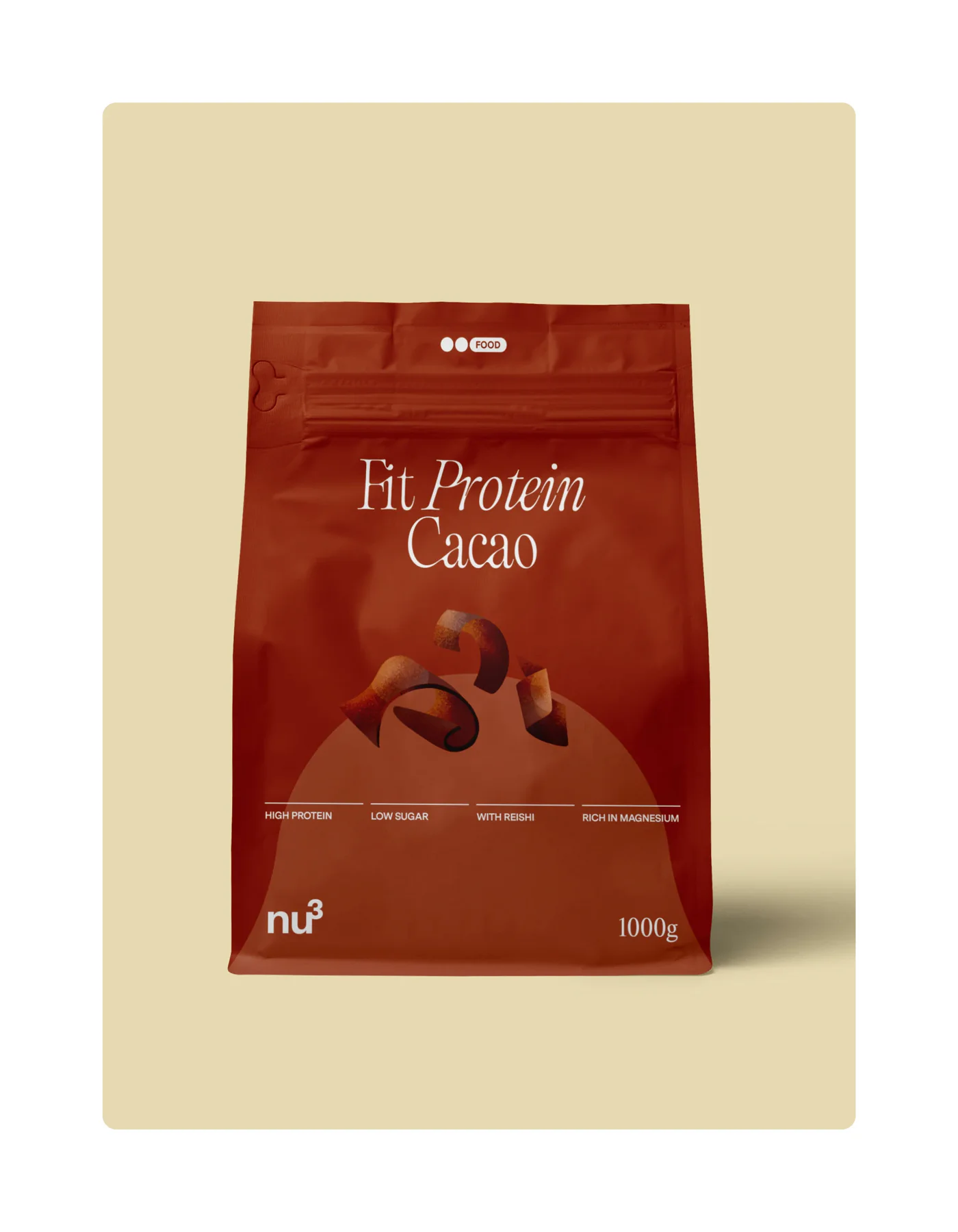
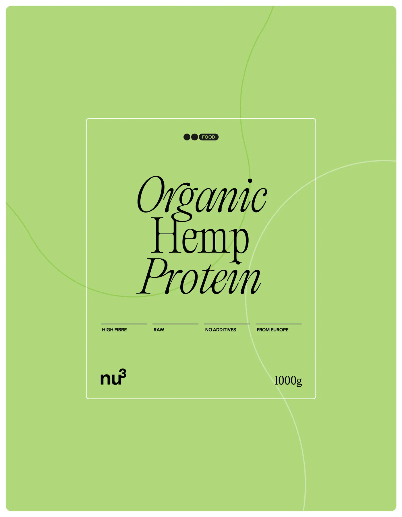
At the heart of the new identity is Editorial Old, a typeface inspired by classic pharmaceutical and herbalist design, balancing tradition with modernity to convey trust and craftsmanship. The streamlined colour palette defines Sport, Food, and Health, with a bold yellow as the corporate hue for energy and optimism. The Flavour System, now distilled into 15 shades with light and dark variations, ensures consistency and adaptability across product lines.

Organic precision.
Where fluid forms and human presence define a new visual sensitivity.
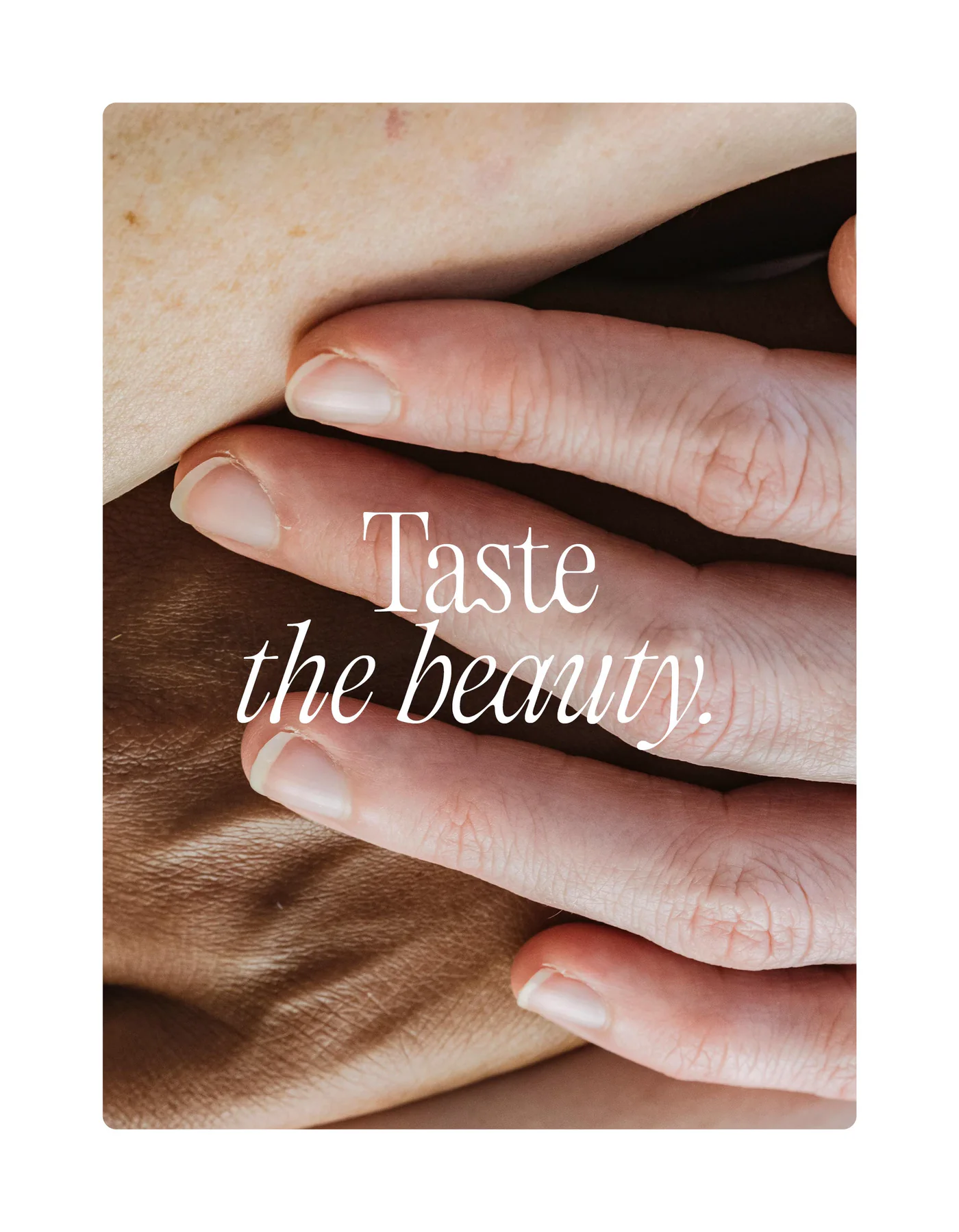
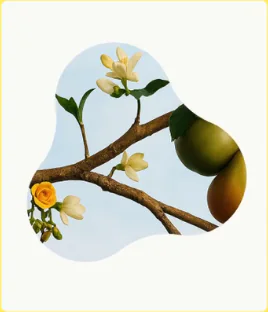
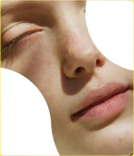
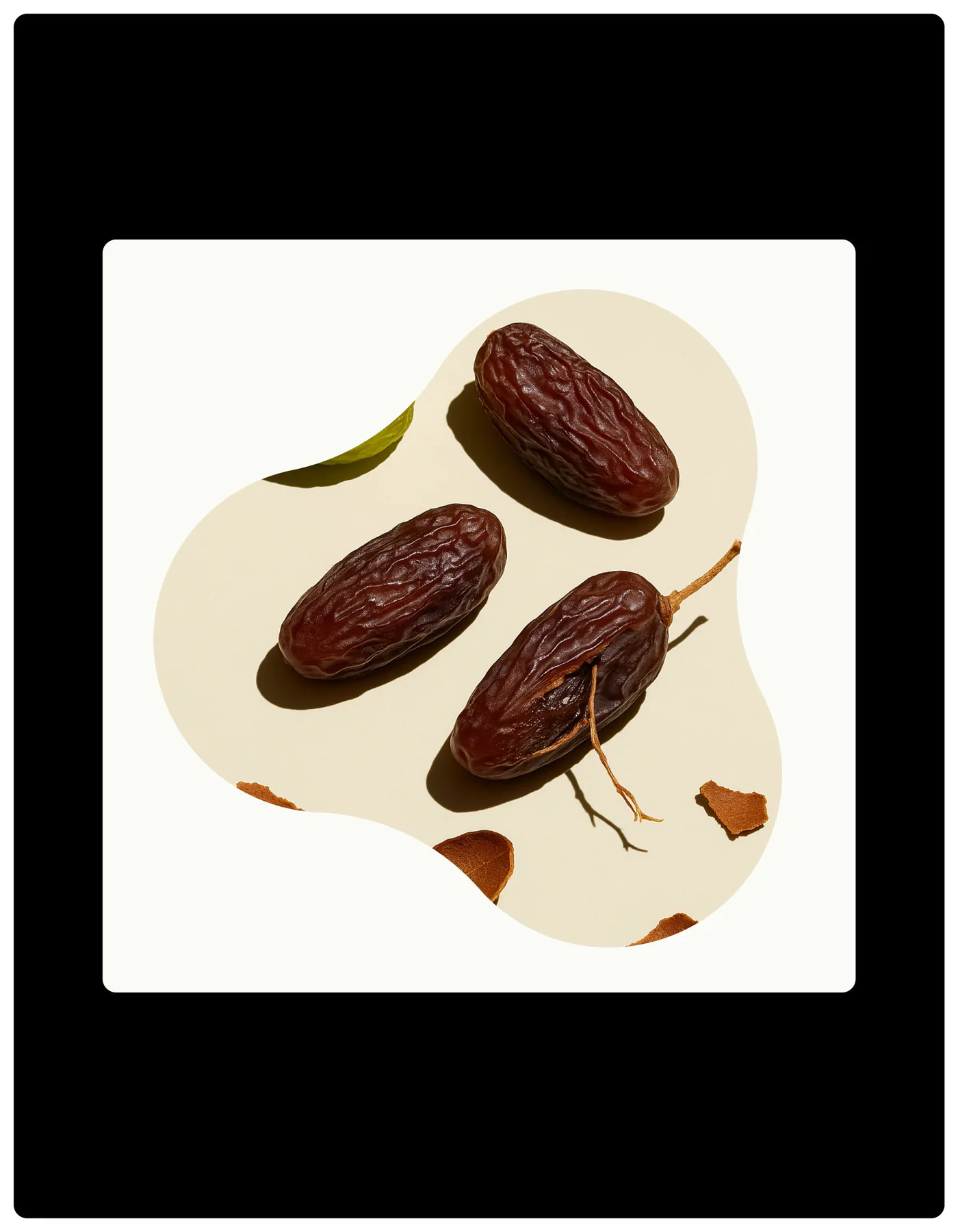
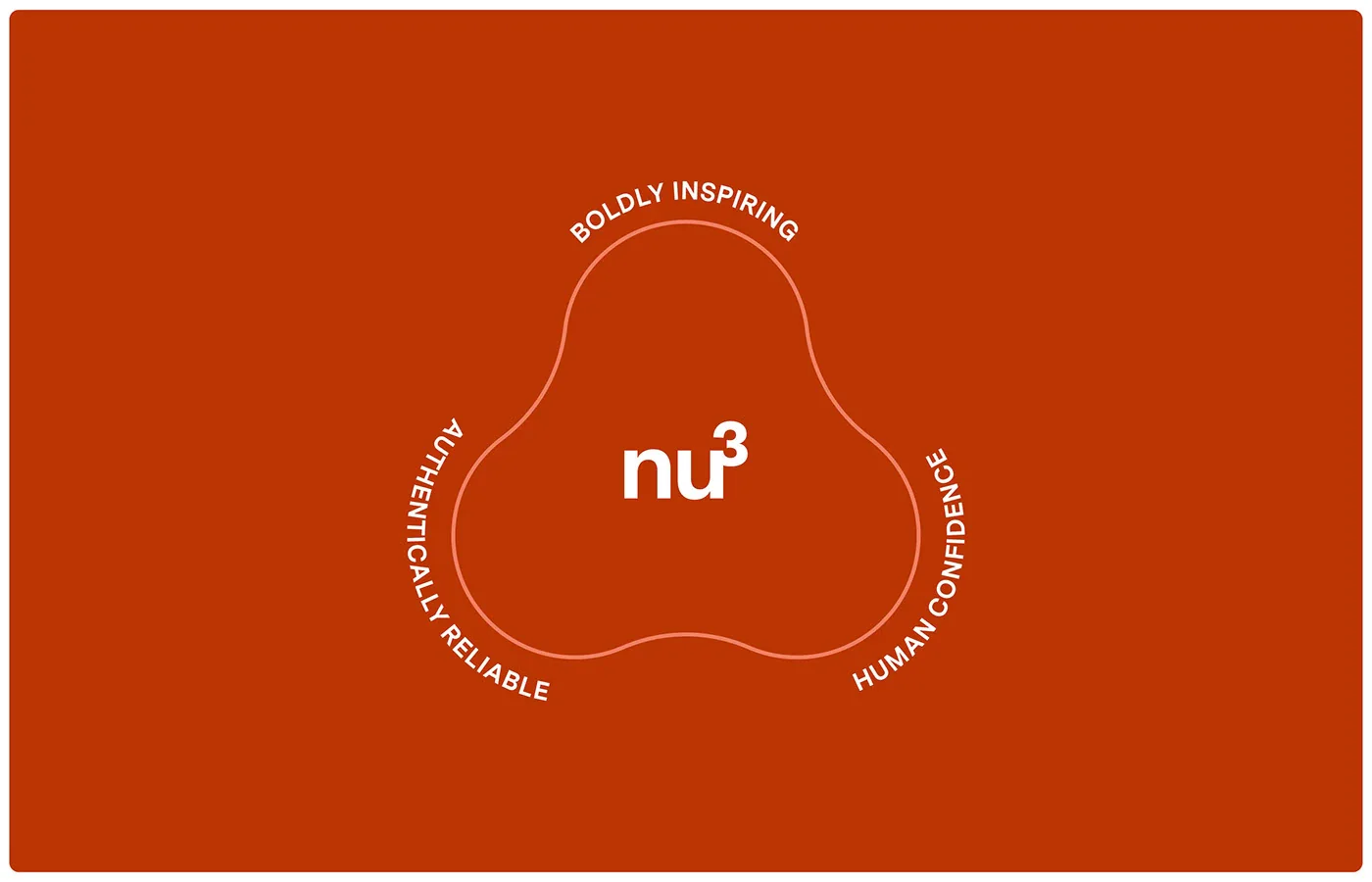
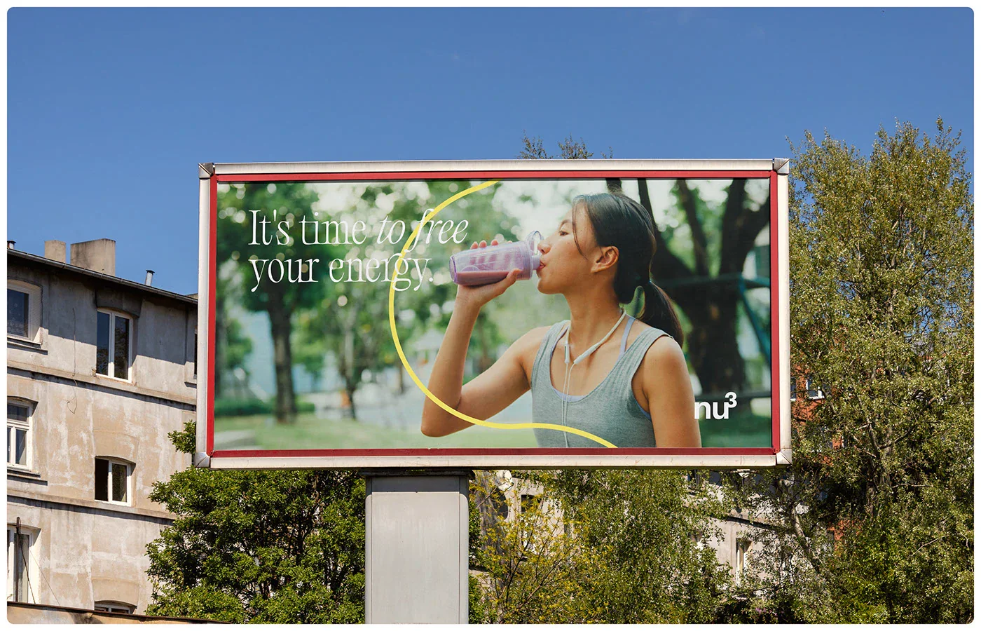
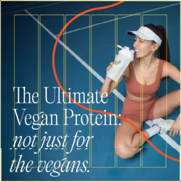
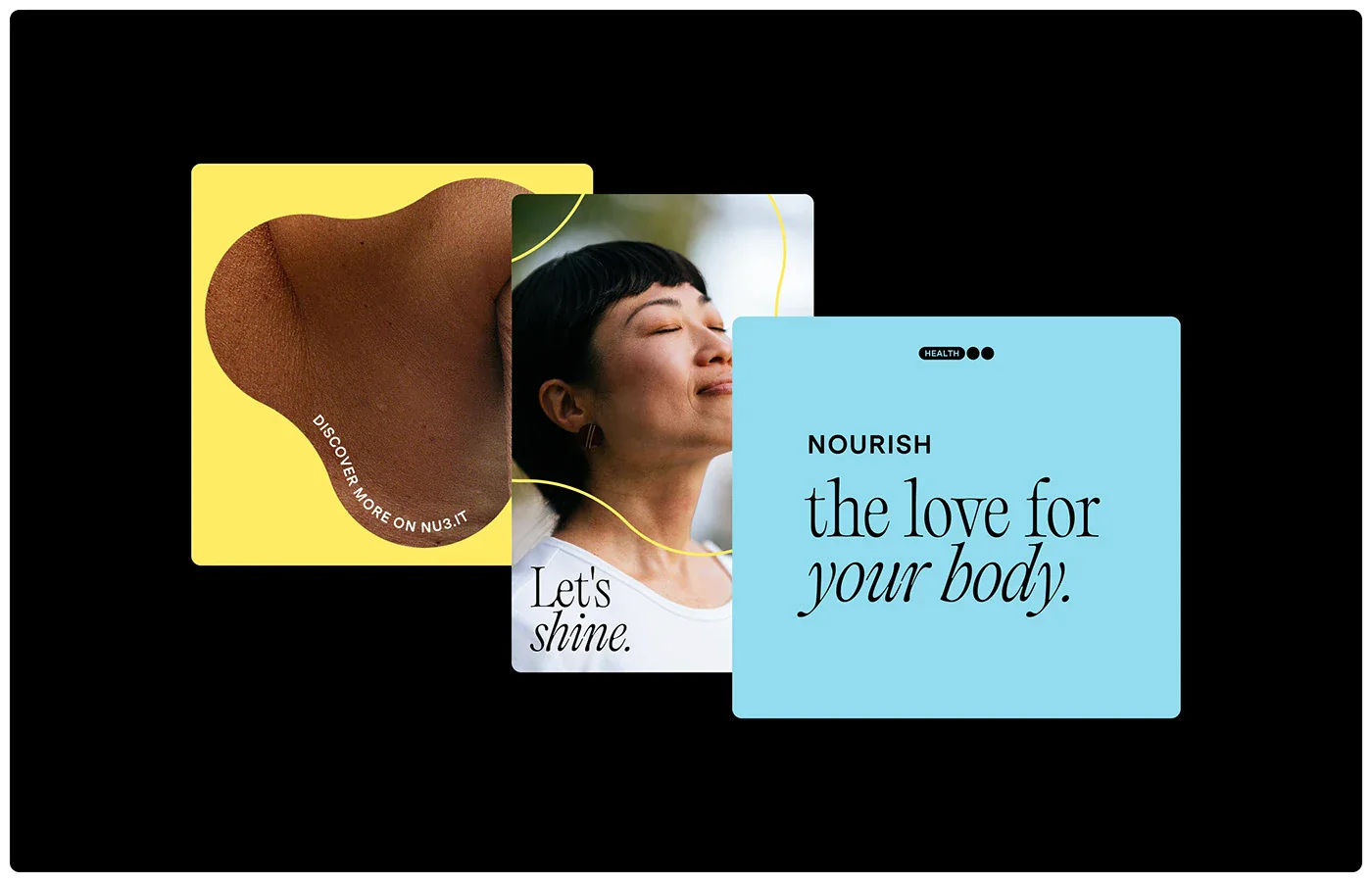
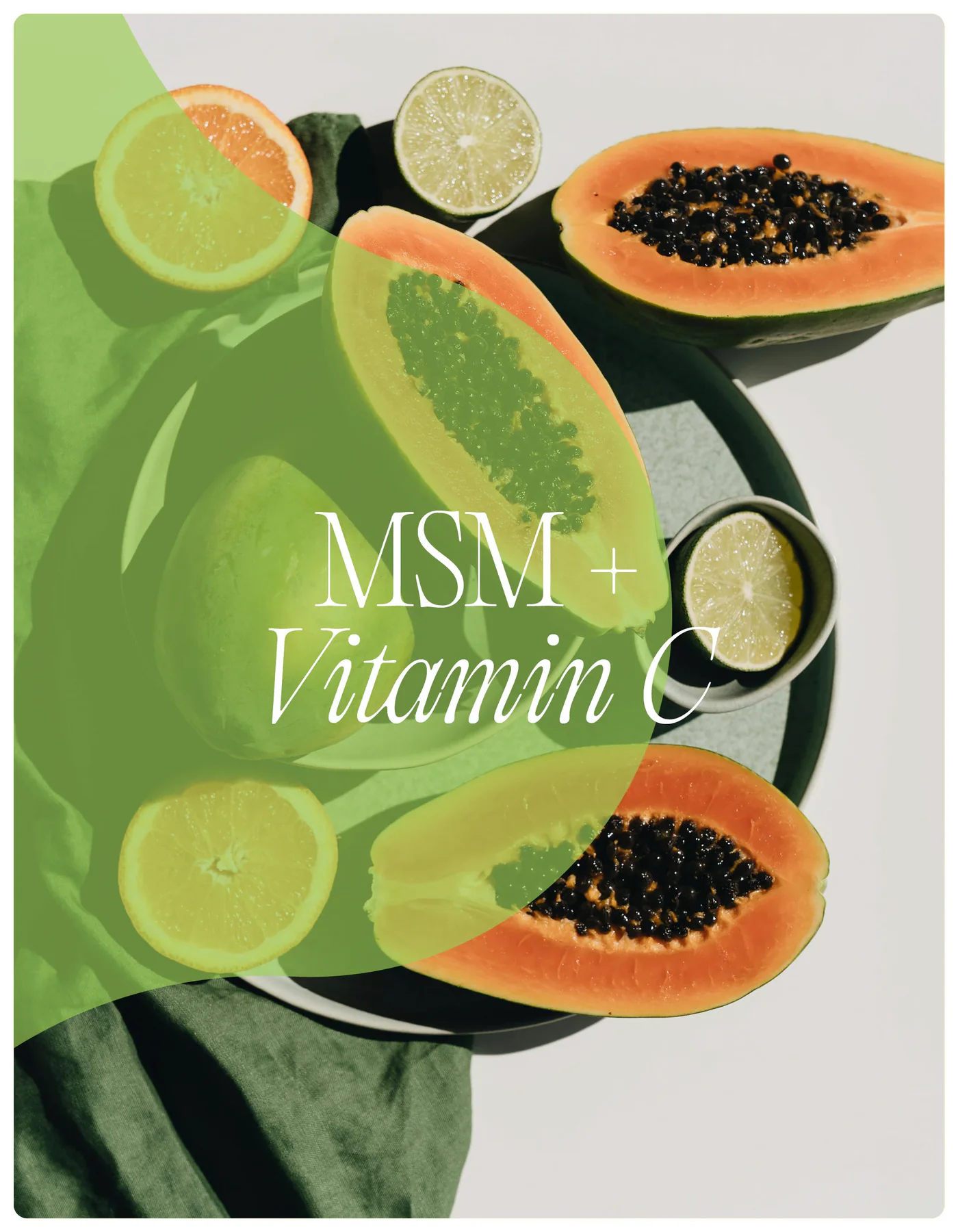
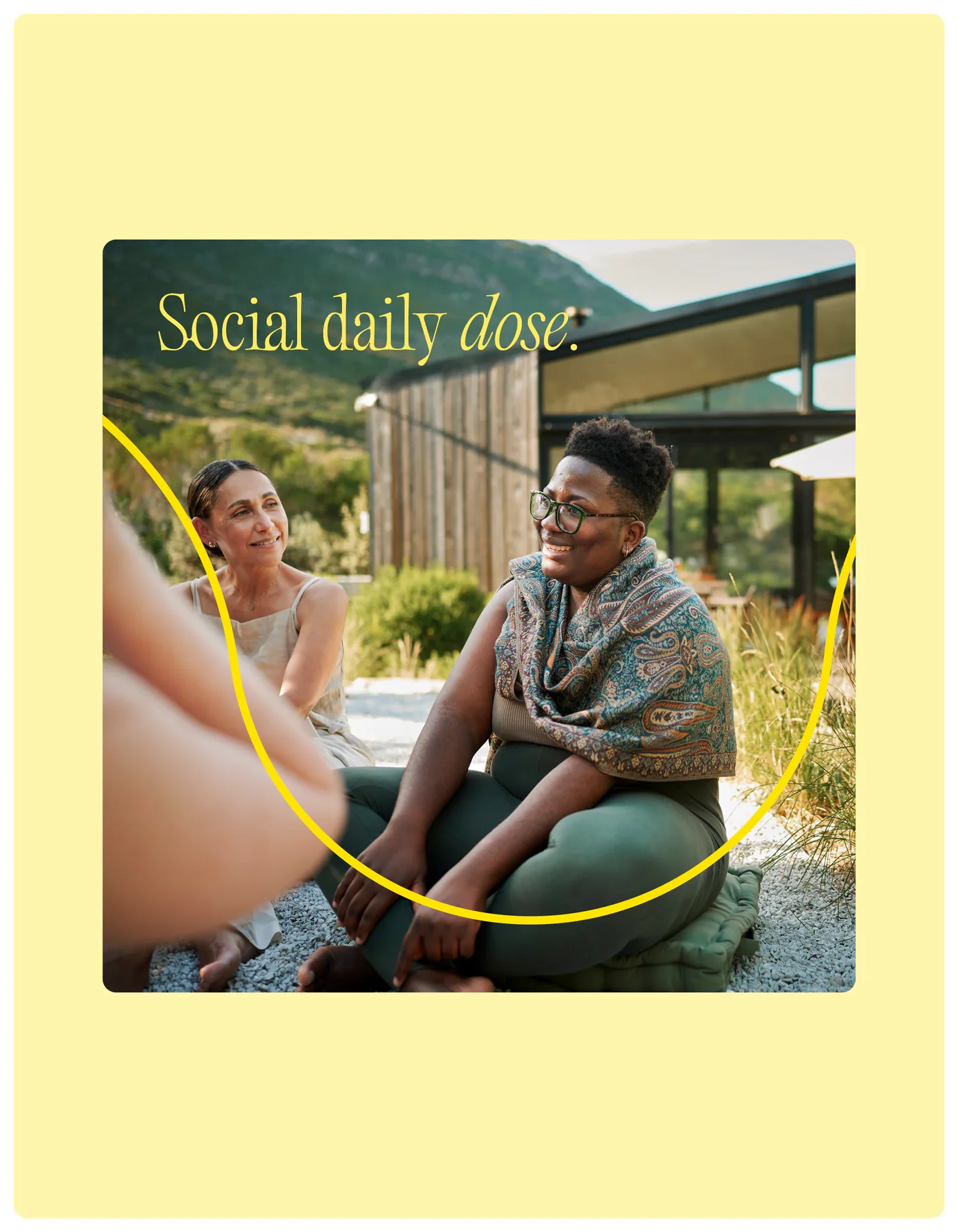
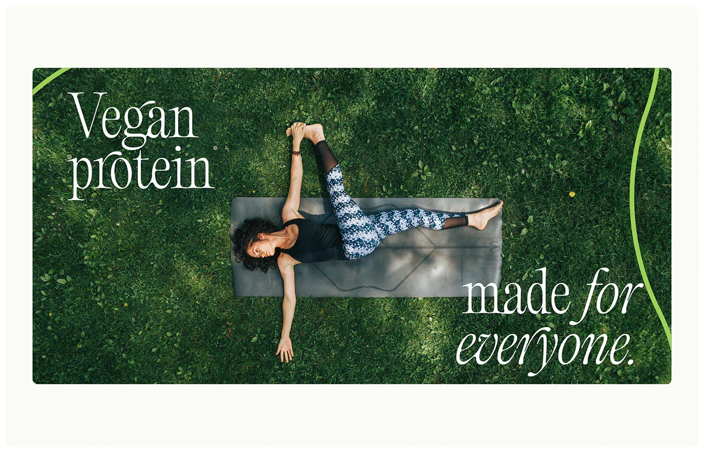
The Tricle, a modern take on the Triangle of Health, anchors nu3's identity, symbolizing balance and adaptability through soft, fluid forms. The photographic direction embraces a human-centric, organic aesthetic, highlighting individuality and the connection between people and nature. A desaturated palette, subtle grain, and editorial sensibility enhance nu3's premium, contemporary feel.


A shift in identity.
Beyond rebranding, a bold recalibration for a future-facing brand.
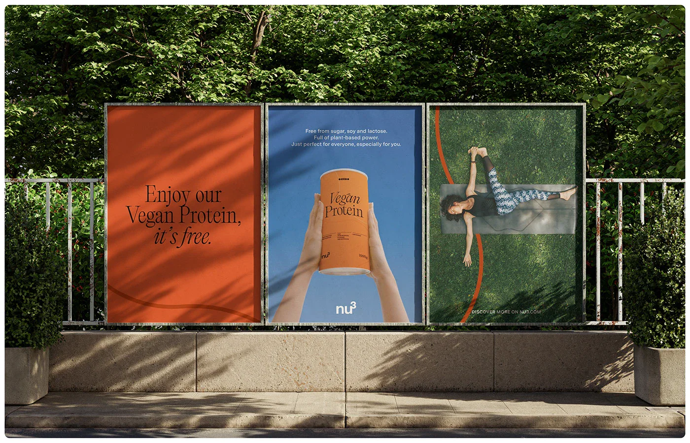
This strategic reimagination of nu3 goes beyond a simple rebrand; it represents a recalibration of identity. By seamlessly integrating form, colour, and imagery, we have crafted a bold, contemporary visual language combined with a redefined, dynamic TOV to make nu3 unmistakable and inimitable. nu3 now stands as a pioneering force in the industry, with a cohesive and visionary brand presence across both digital and physical spaces.
NU3
A Machina showcase