
Packaging · Illustration · Iconography
PlantChi
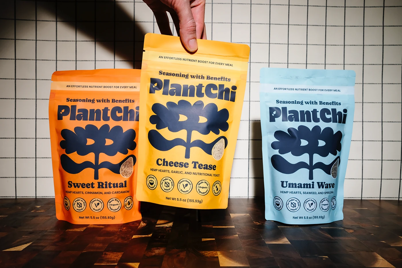
PlantChi is a plant-based food topper, made to be sprinkled over whatever is already on the plate. The redesign restructured the pack around a clearer hierarchy, put flavour and key ingredients first, and cut a front-facing window so the product itself is visible before anyone reads a word. Running alongside it is a set of hand-drawn illustrations, one composition per flavour.
- Client
- PlantChi
- Category
- Plant-based food topper
- Disciplines
- Packaging, illustration, iconography
- Sector
- Consumer goods
An effortless nutrient boost for every meal
PlantChi is a woman-owned food topper brand with an authentic and independent identity that emerged from the desire to offer nutrition in a light, accessible, and fun way, without the rigid and “formal” conventions of the traditional wellness world.
Every detail is carefully considered, from the artisanal formulation to the packaging, which features a creative design that breaks some of the industry’s conventions. The result is a unique product that combines simplicity, health, and personality.


The redesign
The main objective of this redesign was to improve clarity. While the brand already had strong visual appeal, the packaging did not clearly communicate what the product was or how it should be used. The goal was to make this understanding immediate, while preserving the brand’s distinctive and playful identity.
The challenge was to introduce more information and guidance without overwhelming the visual experience. It required balancing clarity and personality, ensuring the packaging remained engaging while supporting quick reading and easy comprehension at first glance.
As a solution the layout was restructured to establish a clearer visual hierarchy, with greater emphasis on flavor and key ingredients. Icons were introduced to simplify information, and a front-facing product window was added to reinforce transparency and instant recognition. The overall system was designed to support fast, intuitive decision-making at the shelf.


The illustrations
The illustrations were developed to visually communicate how each product can be used. Each flavor features a distinct composition, helping contextualize the product within everyday meals and reducing the need for interpretation.
They were hand-drawn following the brand’s existing aesthetic ~ bold, playful, and slightly irregular ~ ensuring consistency while reinforcing the idea of simplicity and versatility expressed in the concept “Sprinkle on everything.”


