

Branding · SEO · Social media · E-commerce
Lil Pals' Pet World
A neighborhood pet store in Hollister, California, under new ownership. We drew the name, built the identity around one warm red and hand-drawn pets, and carried it from the billboard to the bag that goes home.
- Client
- Lil Pals' Pet World
- Category
- Neighborhood pet store
- Disciplines
- Branding, SEO, social media, e-commerce
- Market
- Hollister, California
New owners inherited a store the whole town already drove past.
Lil Pals' Pet World has been part of Clocktower Plaza in Hollister for well over a decade. In September 2026 the store changed hands, and the new family set out to make it the place the whole town thinks of first for their pets.
The store already had the hard part: a full floor of food, gear and live animals, and a self-serve dog wash. What it needed was a name people could pick out across a parking lot, on a shopping bag and on a sticker.
So the identity came first. Marketing works harder when everything it puts in front of people already looks like one place.
What we built
One system, drawn to work at the size of a sticker and the size of a billboard.

A name drawn by hand
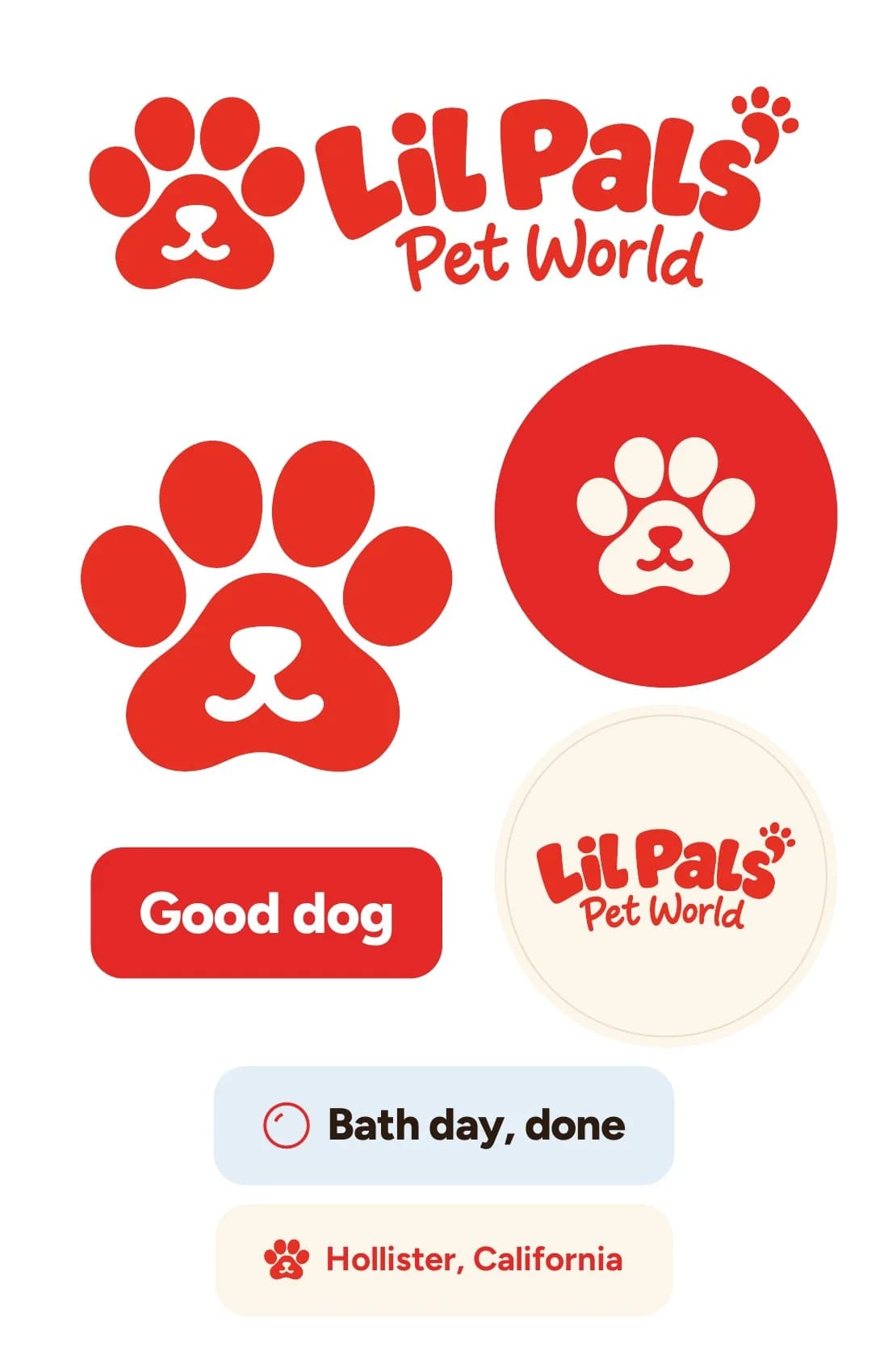
The rounded letters were drawn for Lil Pals' alone: a paw print for the apostrophe and "Pet World" written underneath like a signature. The wordmark is the logo.

A paw with a face
The paw carries a nose and a smile. It goes where the name won't fit: a tag, a cap, the corner of a screen.




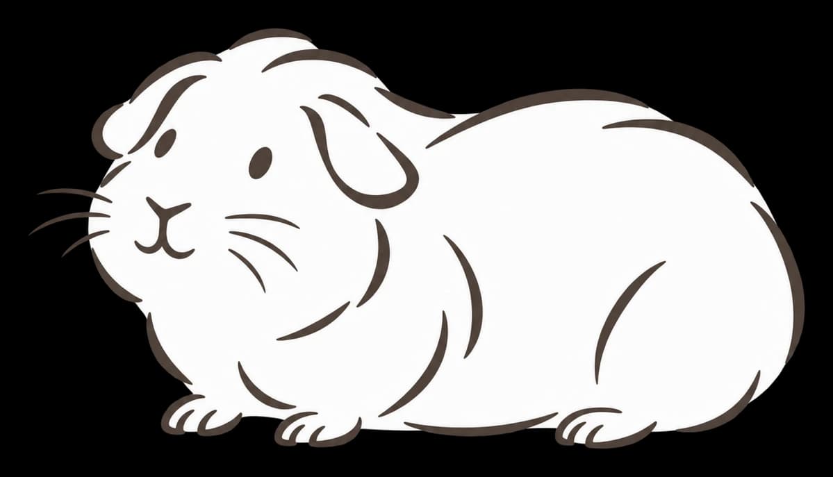
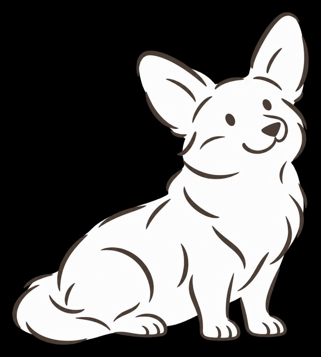
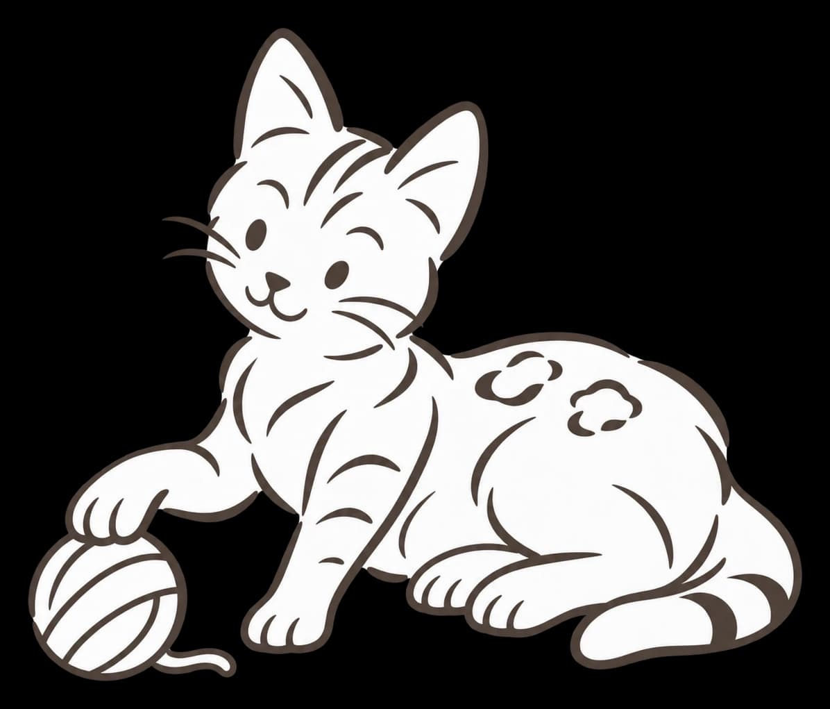
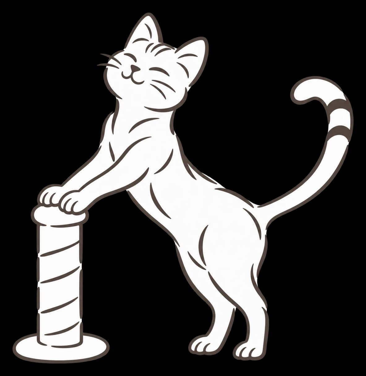
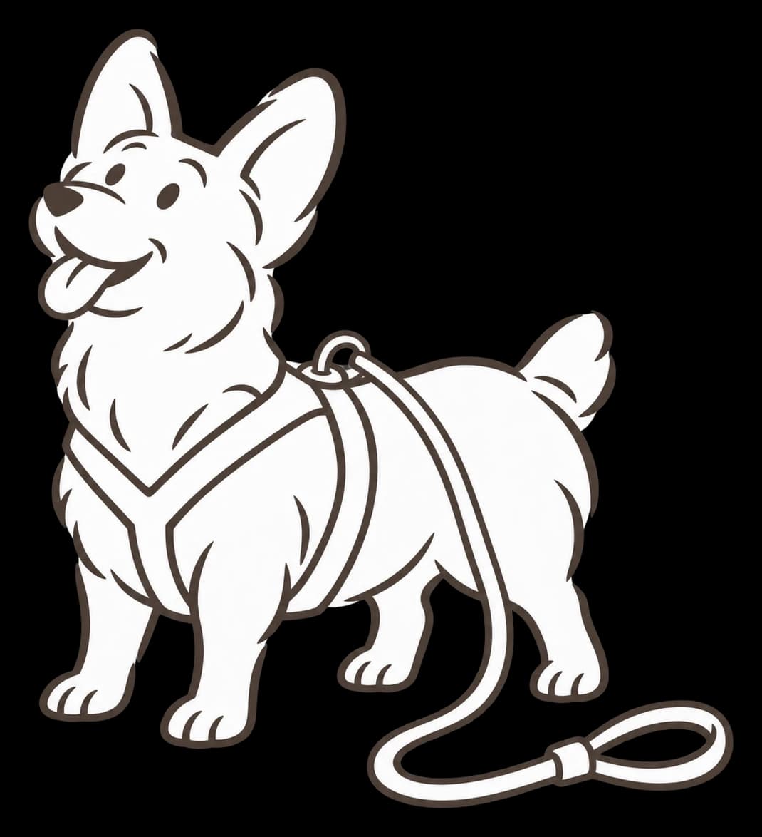
Pets drawn in one loose line
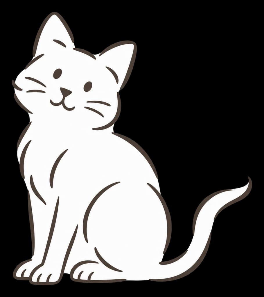
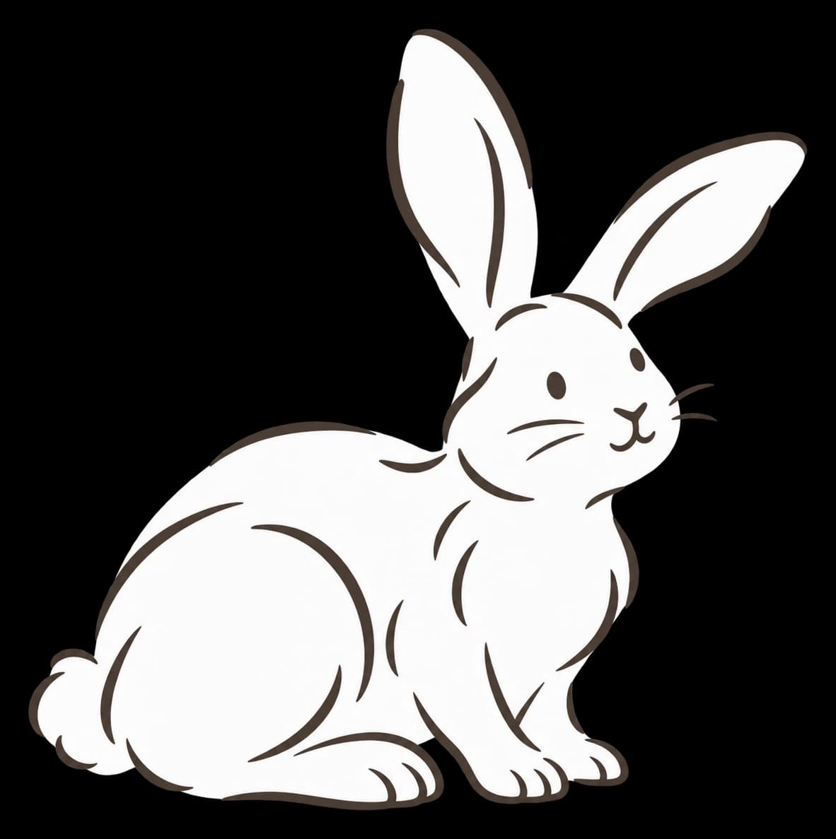
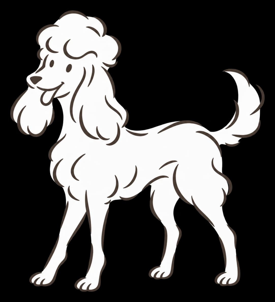
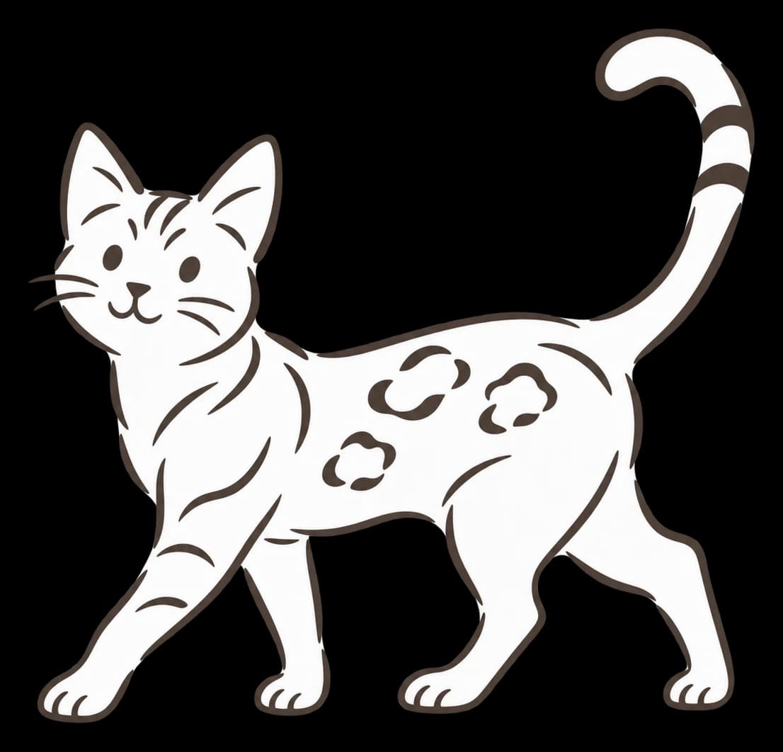
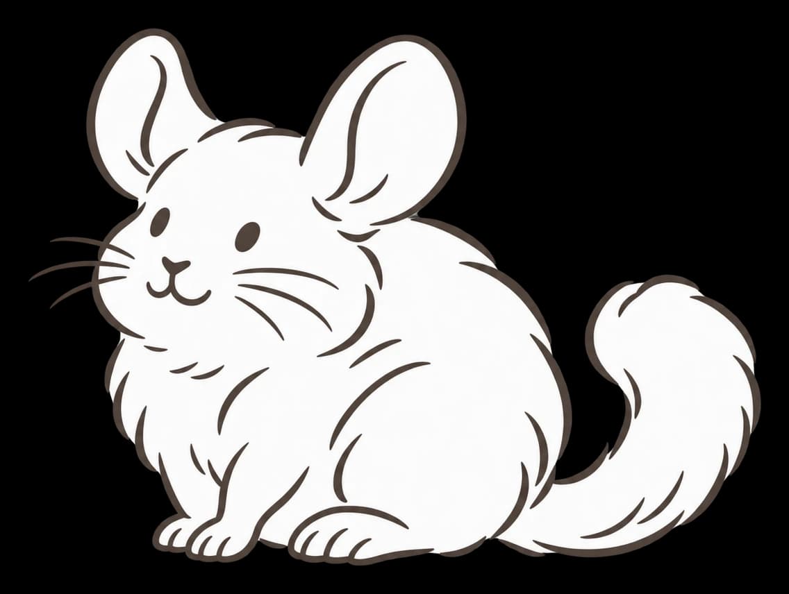
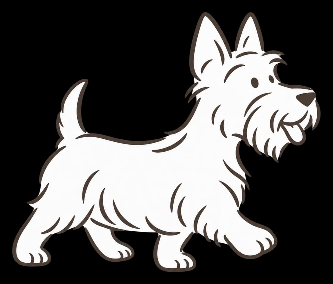
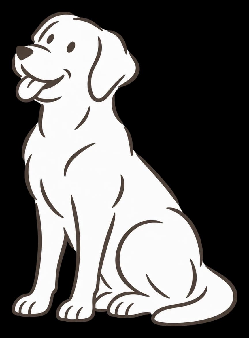
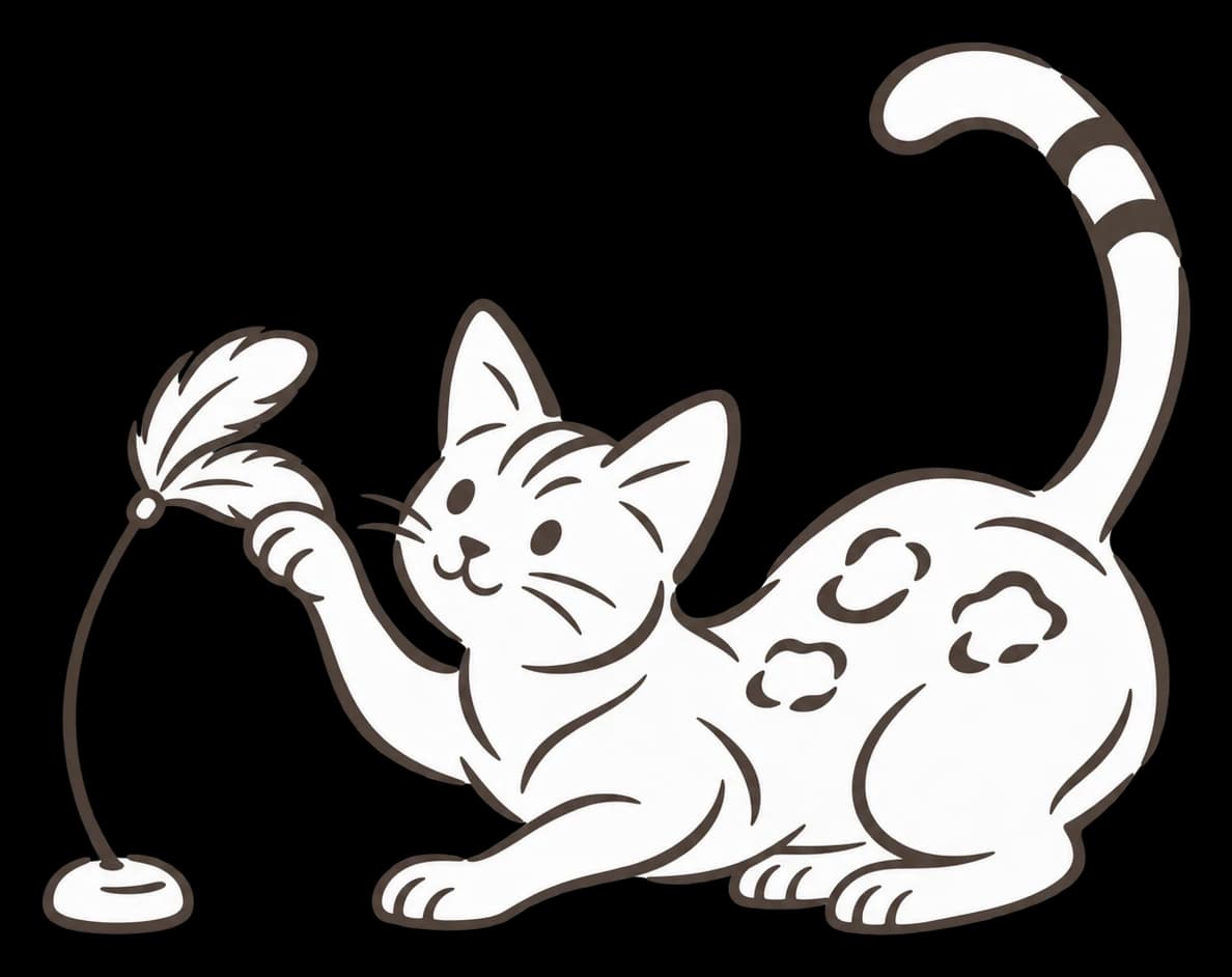
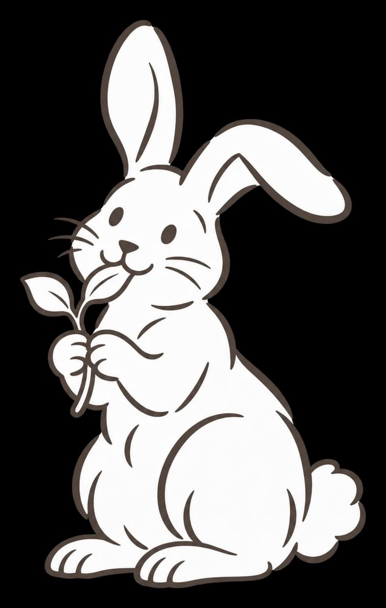
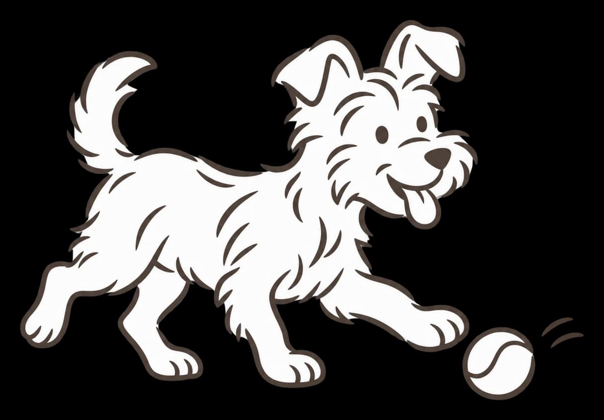
A cast for every aisle, from the dog bowing to play to the goldfish. They carry the warmth on windows, totes and packaging where the logo would be too much.
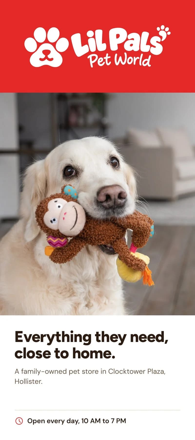
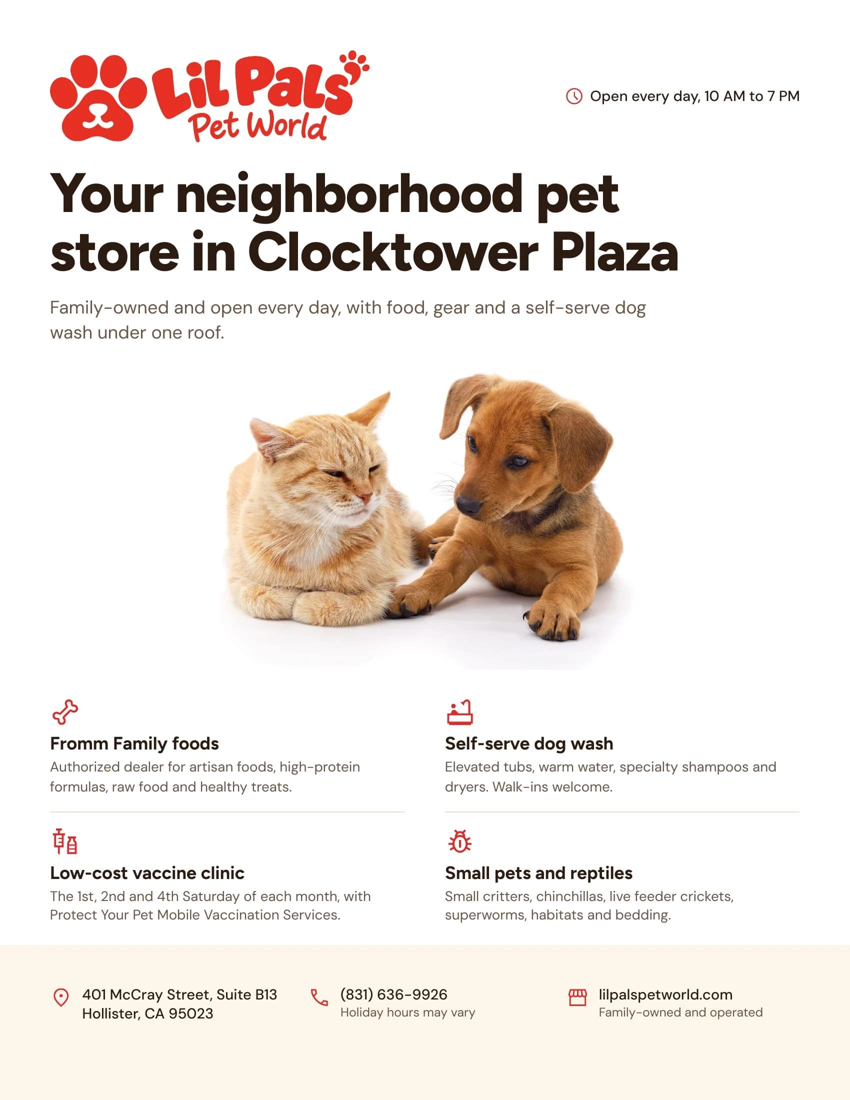
A kit that ships
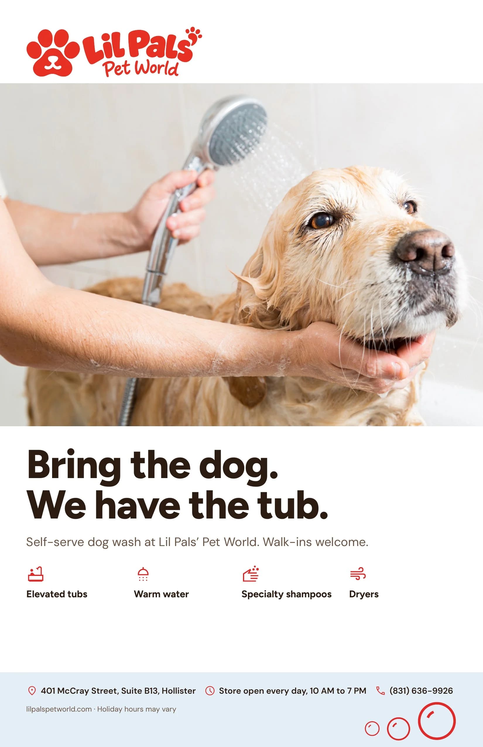
Every print piece is built on one grid and delivered as a print-ready file, so the store can put the identity to work from day one.
Color and type that do the reading
Figtree sets headlines with the same rounded warmth as the lettering. DM Sans keeps prices, hours and directions easy to read at any size. Most days, two colors do all the work.
Palette
Red and cream lead
Lil Pals red
#E53023
Cream
#FBF5EA
Dark brown
#2B1B11
Sun gold
#F5C04A
Bubble blue
#8FB7D6
Maroon
#9A1818
Illustrations that carry the warmth
The wordmark says the name. The illustrations say what the store feels like, with a pet for every aisle: dogs, cats, birds, small pets, reptiles and fish.
Each one is a single-weight line with no fine detail to lose, so it holds up as white vinyl on a window, a screen print on canvas and a one-color stamp on a paper bag.
They recolor with the palette: brown line on red, gold or blue for signage, red line alone on cream for print.











In the world
Everywhere a customer meets the store
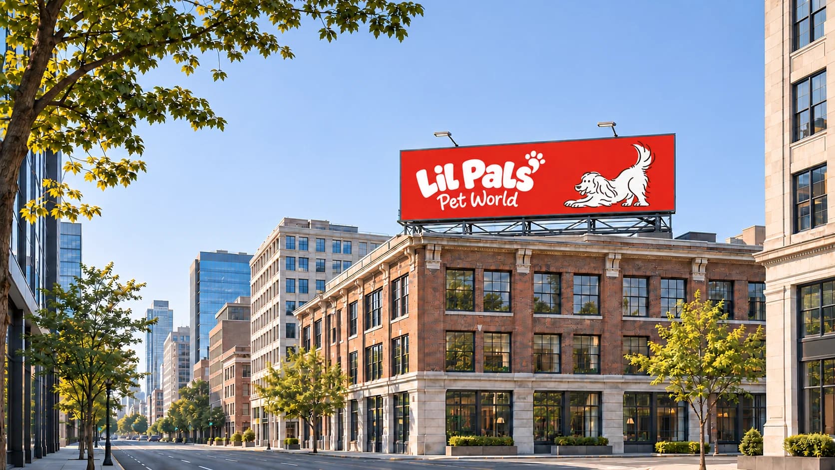
A pet store is a local habit. People see it from the road, walk past its windows, carry its bags home and pin its flyer to the fridge. The identity had to hold up at each of those distances.
The scenes below put the system to work: the street, the storefront, the counter and the things that leave the store with a customer.
The wordmark, colors, type, illustrations and print pieces are the delivered identity. The street, vehicle and product scenes are concept mockups that show the system in use.
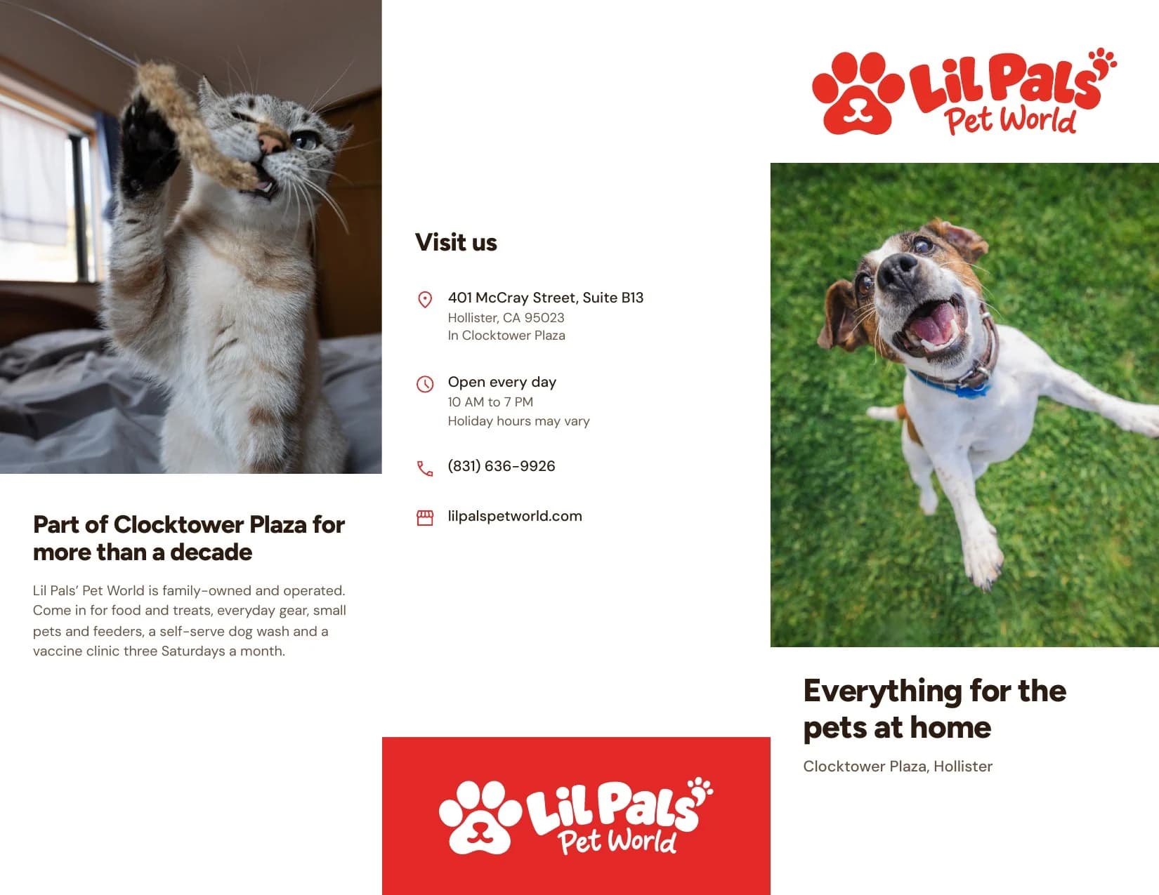
Print kit
A print kit for the counter and around town
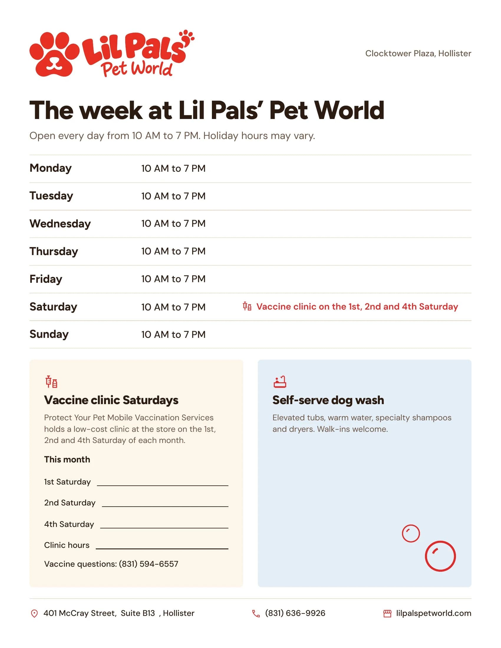
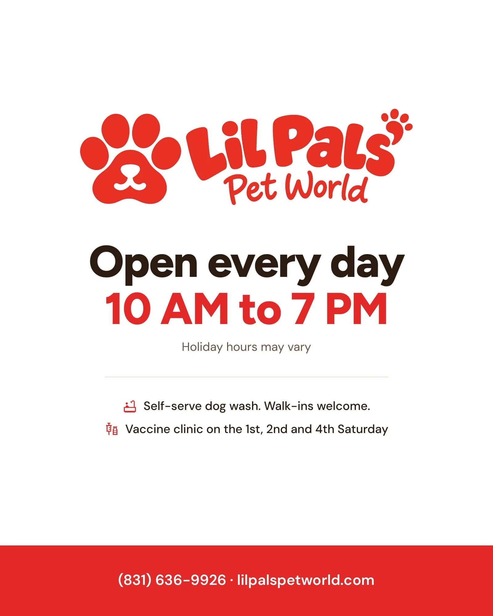
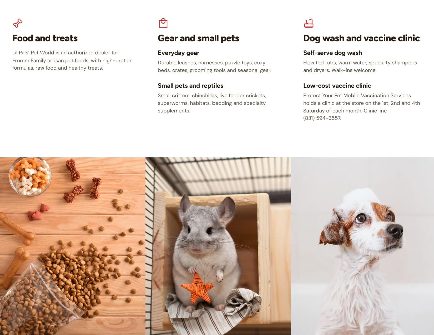
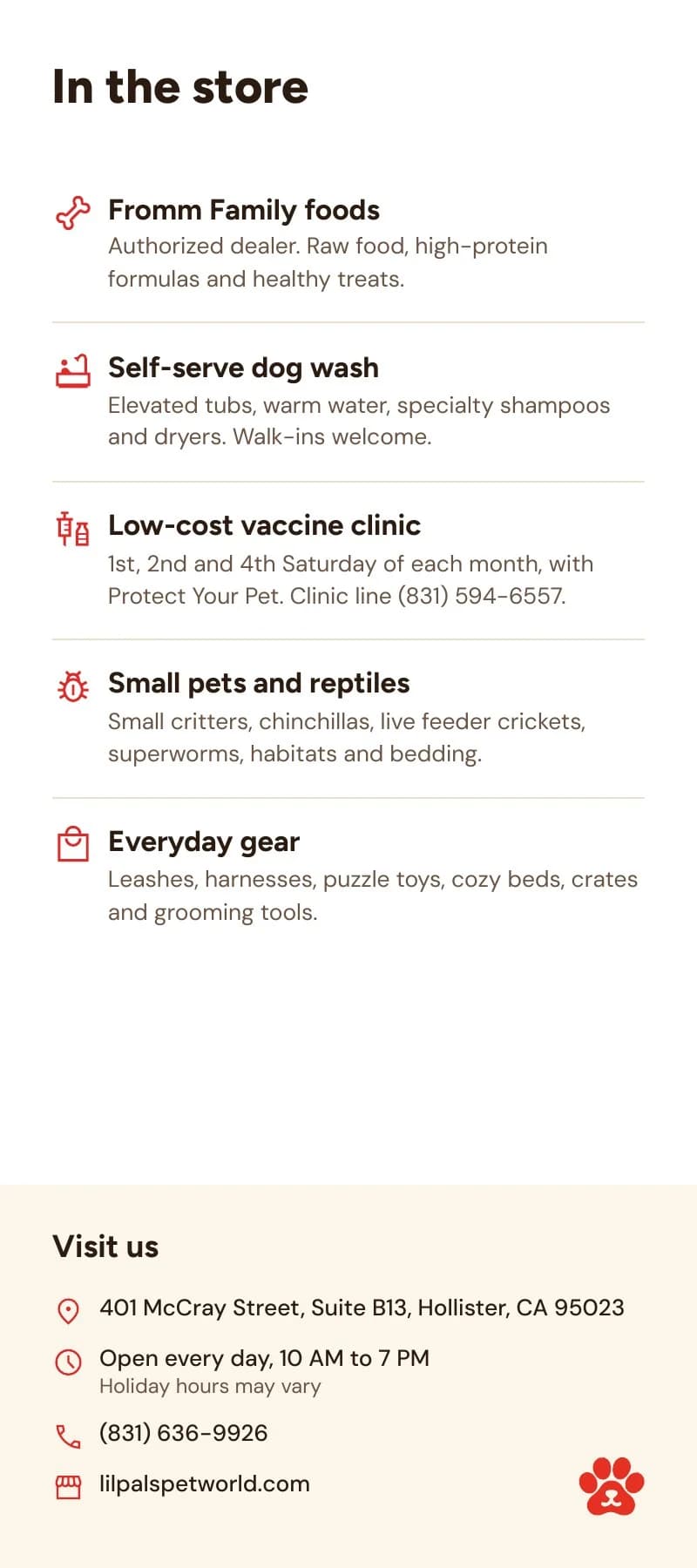
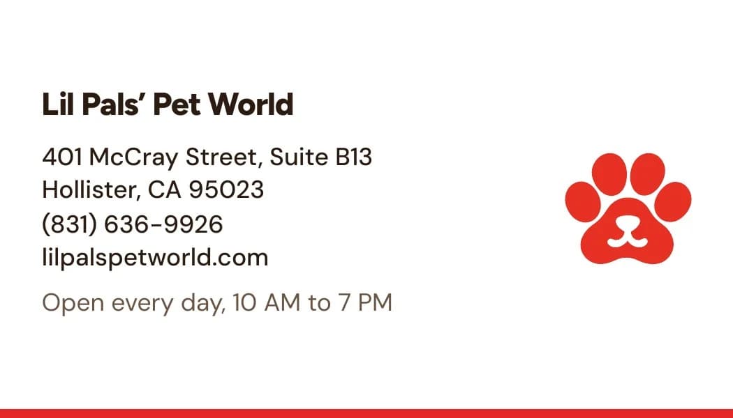
Business cards, a flyer, a rack card, a trifold brochure, a weekly schedule, a dog wash poster, a door cling, coasters for nearby restaurants and a sticker sheet, each built on the same grid and delivered as a print-ready file.
What the store walks away with
A name people can picture, a palette they'll recognize from across the plaza, and a set of pets that make the store feel like a neighbor. Every piece ships with the files to use it.
That's the order we work in. The identity first, because every ad, post and flyer that follows is only as good as the thing it puts in front of people.