

Branding
Veterans Transition Center
The corporate identity for a veterans nonprofit’s thirtieth year. We designed the system VTC now speaks in: colour, type, icons, ornament, signage, print, motion and every piece the staff hand out.
- Client
- Veterans Transition Center of California
- Category
- Corporate identity
- Disciplines
- Identity system, Signage, Print, Merchandise, Motion
- Market
- Marina, California
Thirty years in, VTC needed one look for everything it says.
Since 1996 the Veterans Transition Center has housed, fed and found work for veterans from its campus on the former Fort Ord. Going into its thirtieth year, its flyers, signs, mailers and reports were made one at a time, with no common system to draw from.
We kept the eagle badge VTC already had and designed everything around it: the palette, the type, the icon set, the laurels and stars, the page rules, the signage and more than thirty-five print pieces. A small staff can now make something new from the templates and it still looks like VTC.


What we built
A system small enough to remember and strong enough to hold thirty-five pieces together.
Navy for structure, gold for the moment
Heritage Navy carries headlines, footers and the solid bands. Veteran Gold is kept back for the rule over a heading, a key number, the button that asks for a gift.
The eagle, given a system
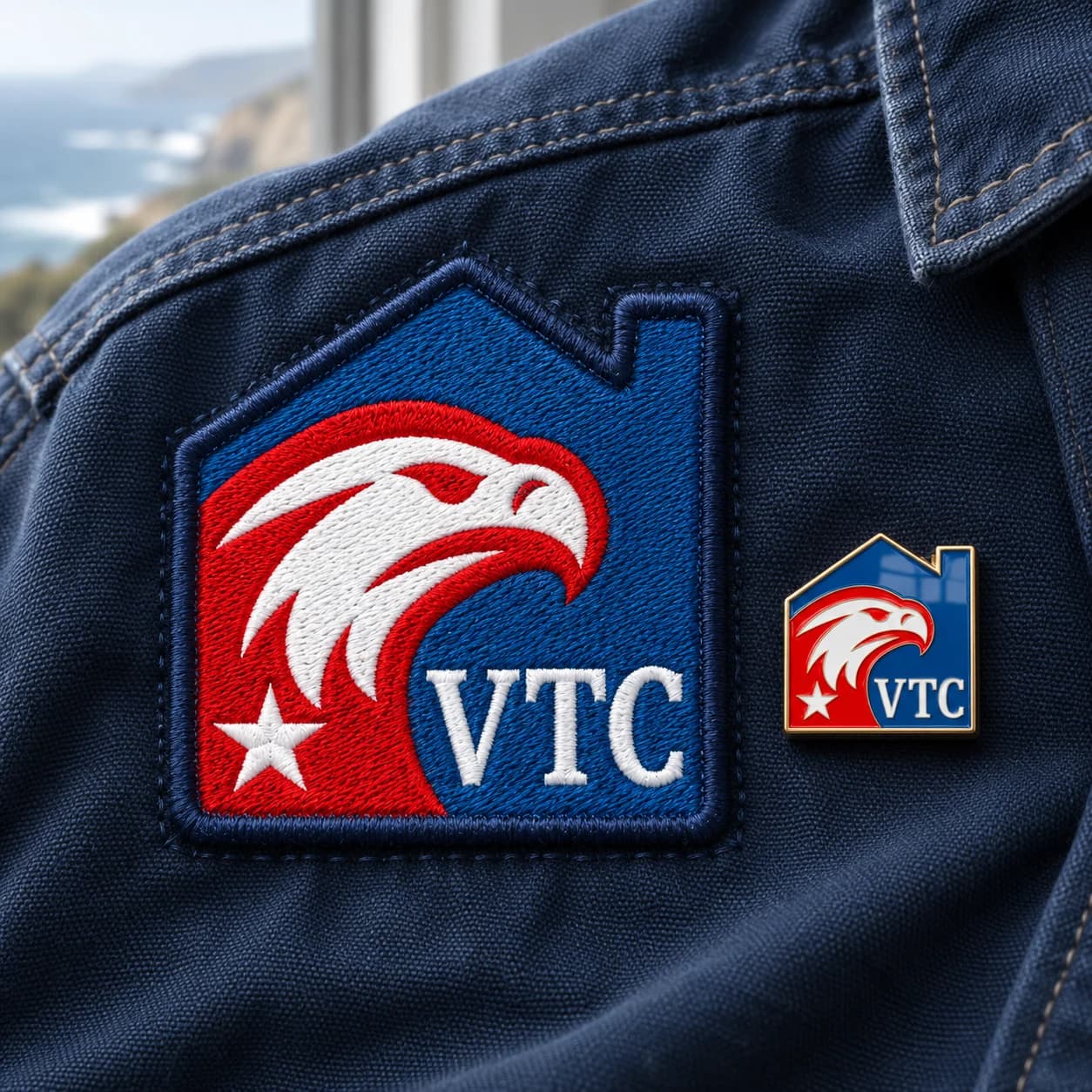
VTC’s badge came with it. We gave it rules: full colour on light grounds, white on navy and photographs, and the room it needs to breathe.
HOW WE HELP
Building stable, independent lives.
One rule, used everywhere
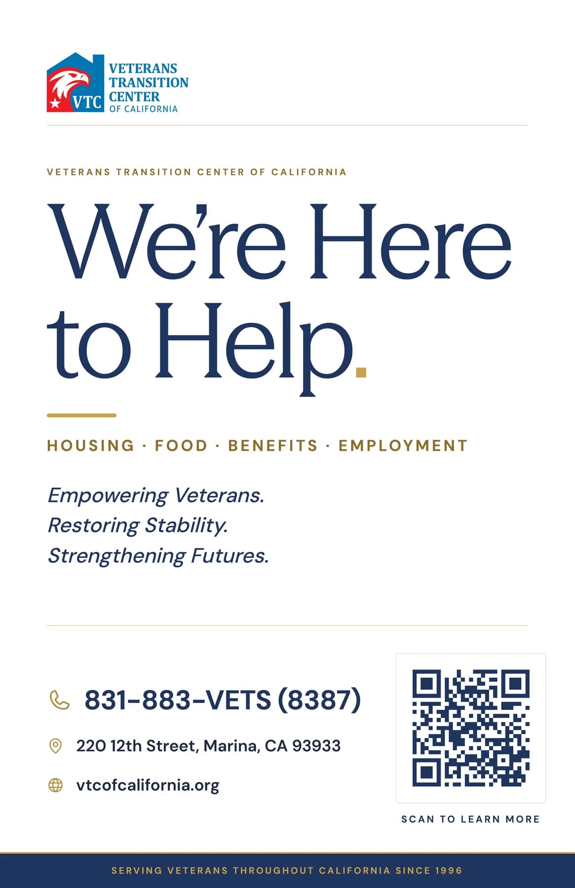
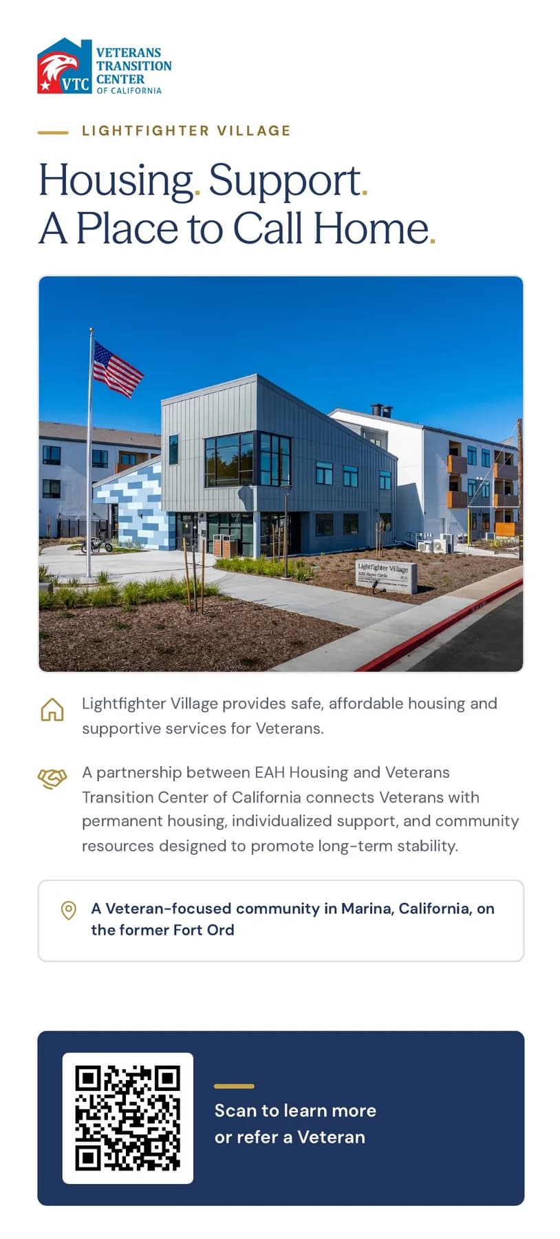
A short gold line sits above every section label: on the trifold, the rack cards, the yard sign and the certificates. It is the cheapest way to make a flyer look like it came from the same place as everything else.
A kit that ships
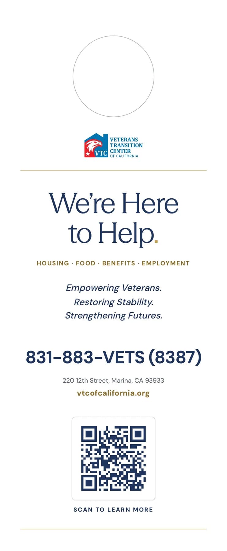
More than thirty-five print pieces, each built on the same grid and delivered print-ready with bleed, so the staff can send any of them to a printer as is.
A palette with a job for every colour
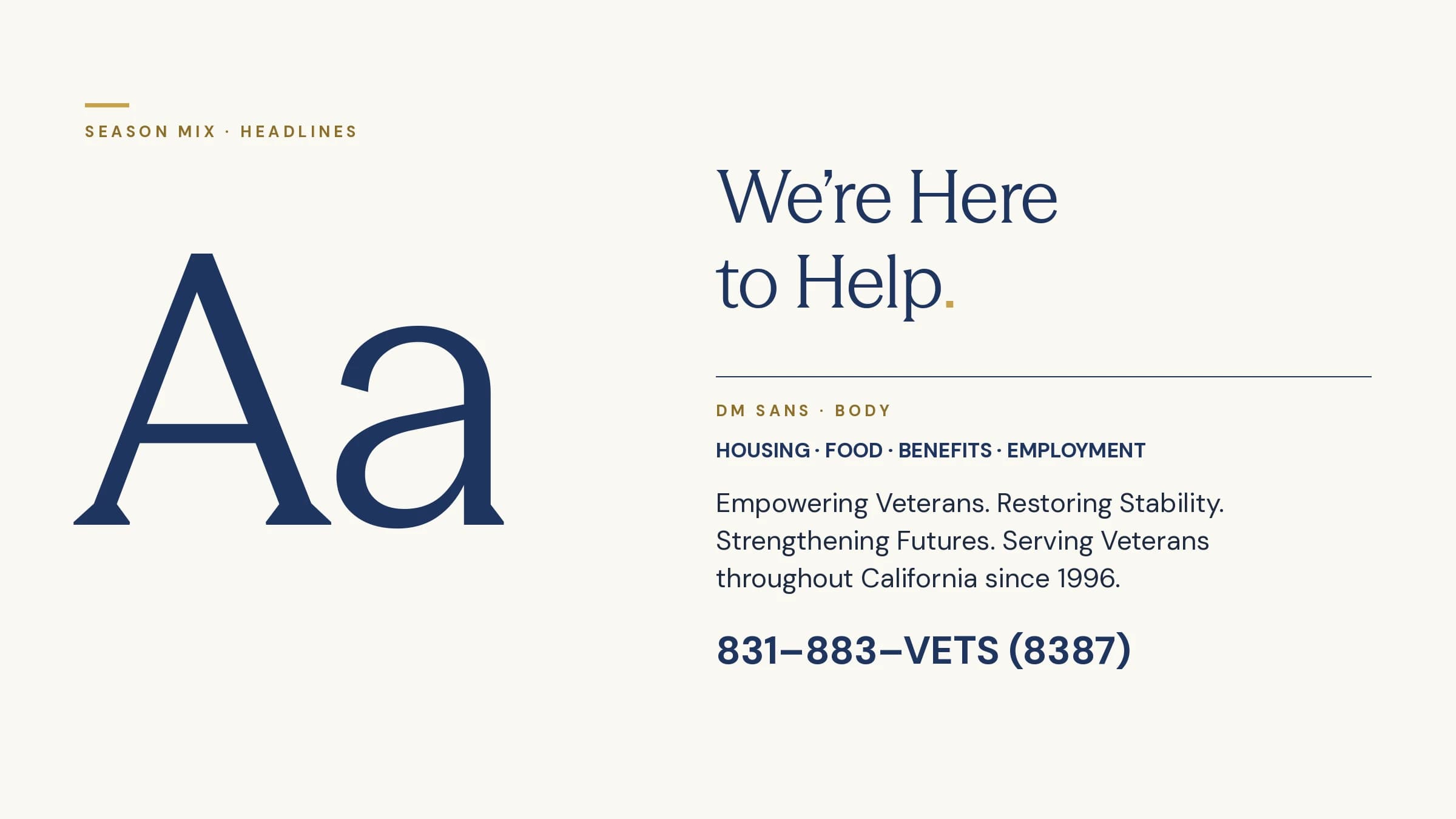
Navy does the structure, gold does the emphasis, and sand and surface keep long pages warm without going beige. Headlines are set in Season Mix, body copy in DM Sans.
A voice to match
Three short sentences carry the mission wherever VTC speaks: Empowering Veterans. Restoring Stability. Strengthening Futures. Numbers are set large and plain, because to a donor they are the argument.
Icons and ornament
Phosphor icons in a thin gold ring mark the four things VTC does: housing, food, benefits and employment. Laurels, a row of stars and a hand-drawn swash are kept for moments that deserve them, like a certificate or the anniversary.

Housing

Food

Benefits

Employment

Care

Community

Recognition

Wellness

Learning

Location

Events

Partners

Laurels

Stars

Swash
Guidelines
Rules a small staff can keep
The identity is written down as a short set of rules, so a flyer made on a Tuesday afternoon still looks like it came from the same place as the anniversary gala.
Logo on light and dark
Navy leads, gold accents
Navy carries structure and type. White and surface give room. Gold is kept for a rule, a number, a single call to act.
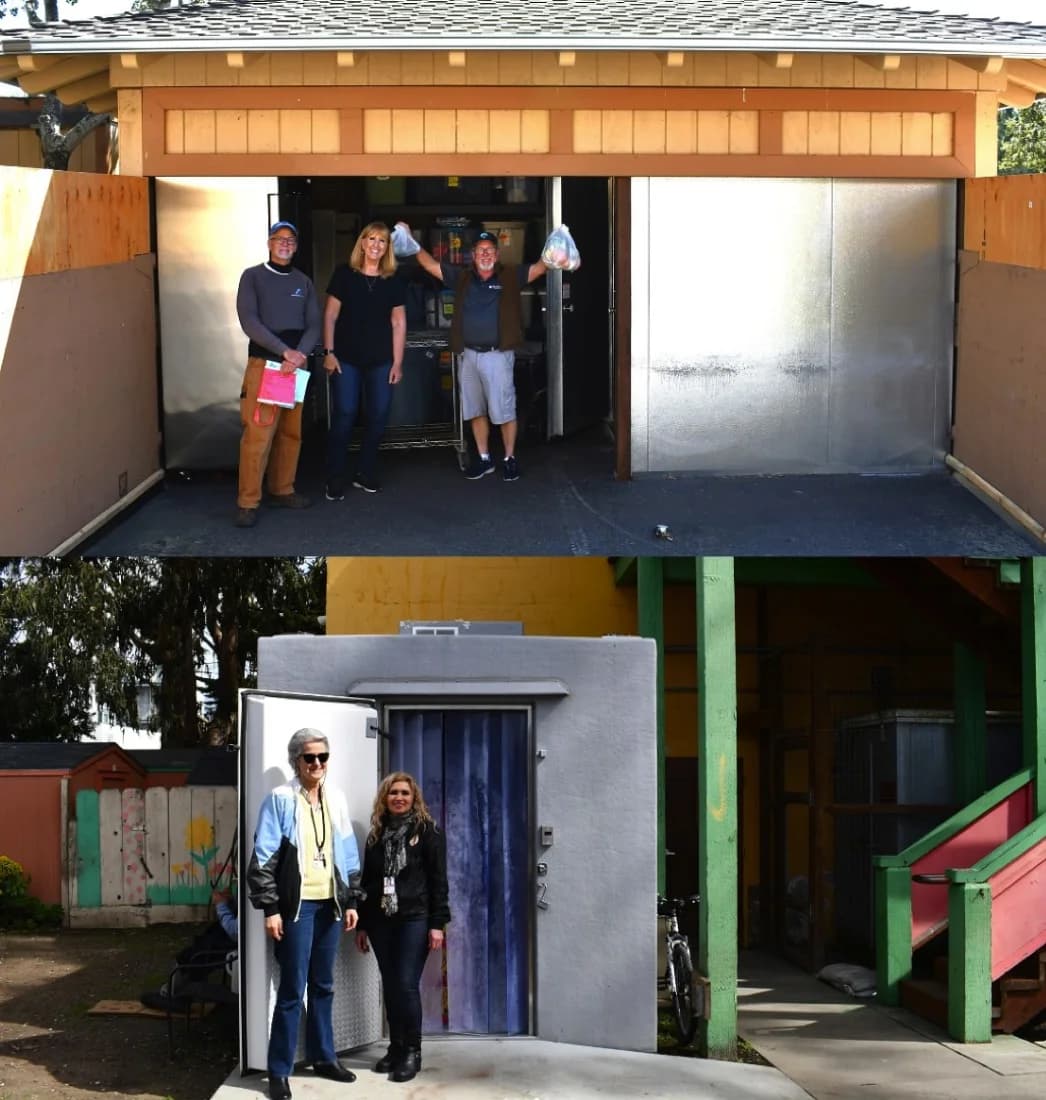
Photography: real work, in natural light



Signage
A campus you can find your way around
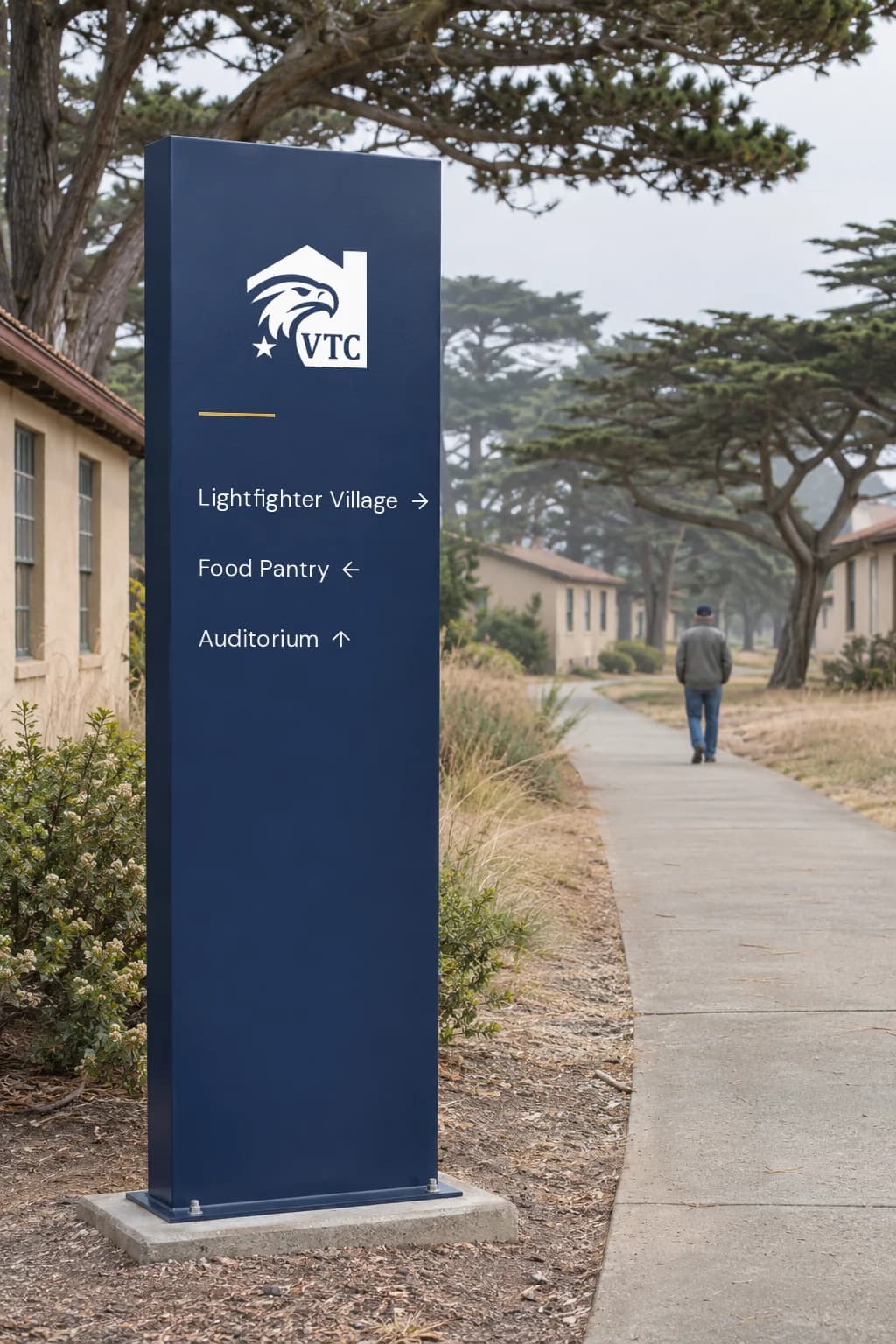
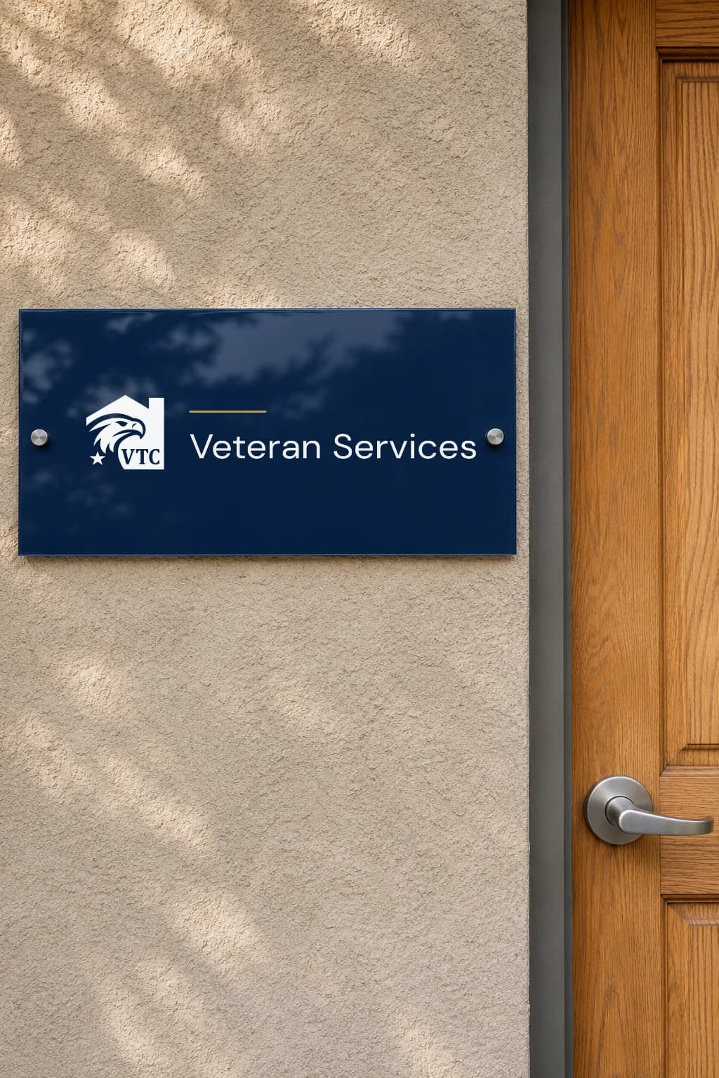
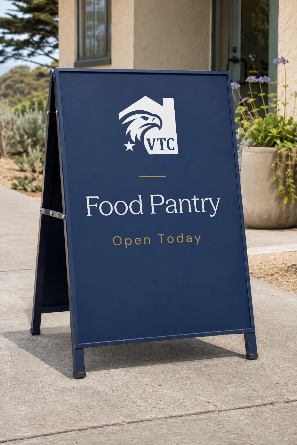
Signage starts at the gate and follows a veteran inside: the office fascia, a wayfinding post on every path, the door to the right office and a sign at the pantry.
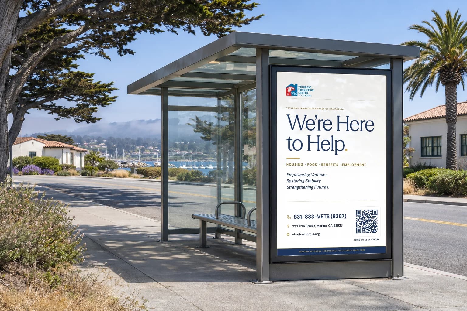
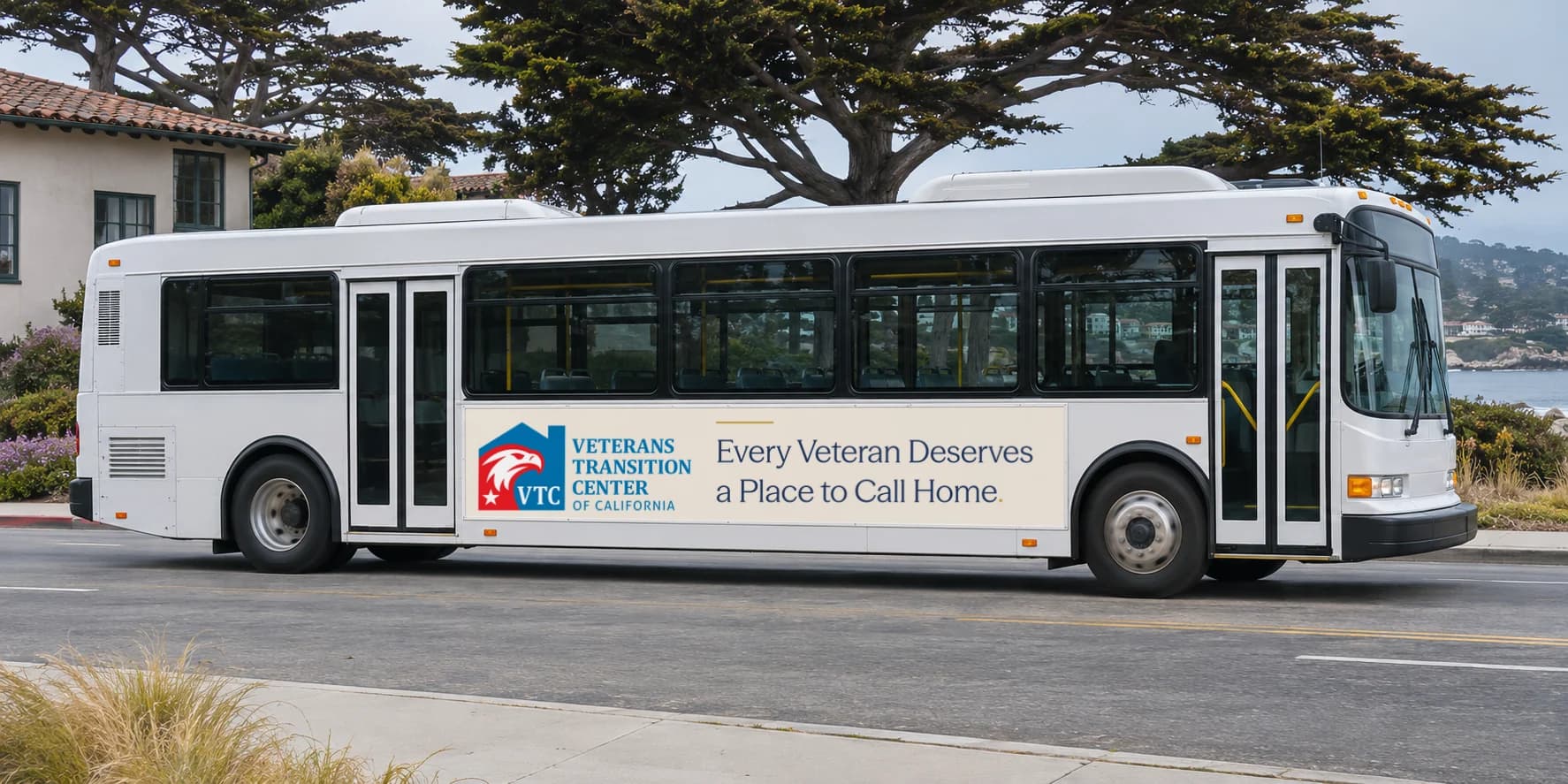
The colours, type, icons, ornament, logo rules and print pieces are the delivered identity. The photographed scenes are concept mockups that show it in use.
Outdoor
Out where veterans already are
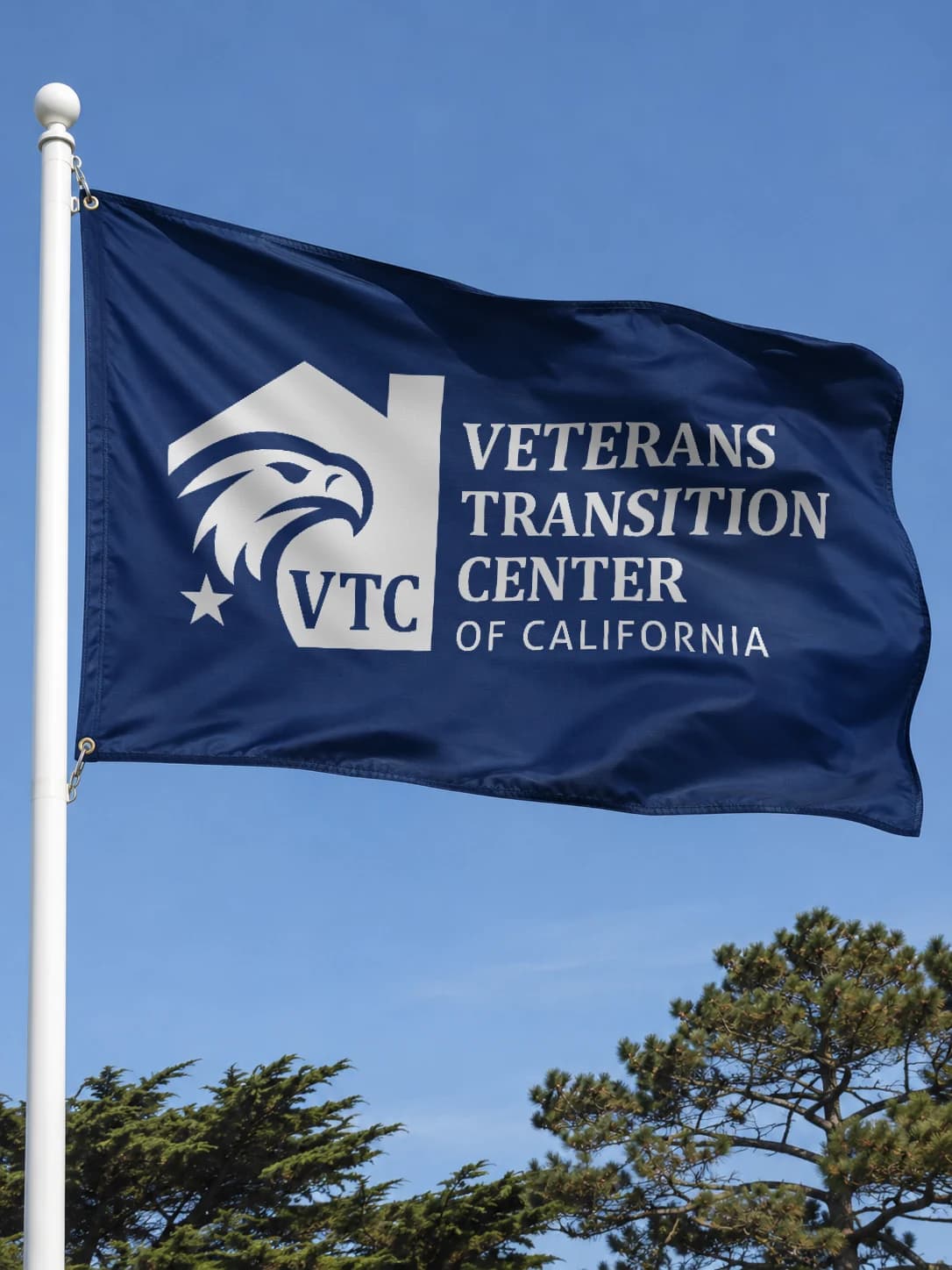
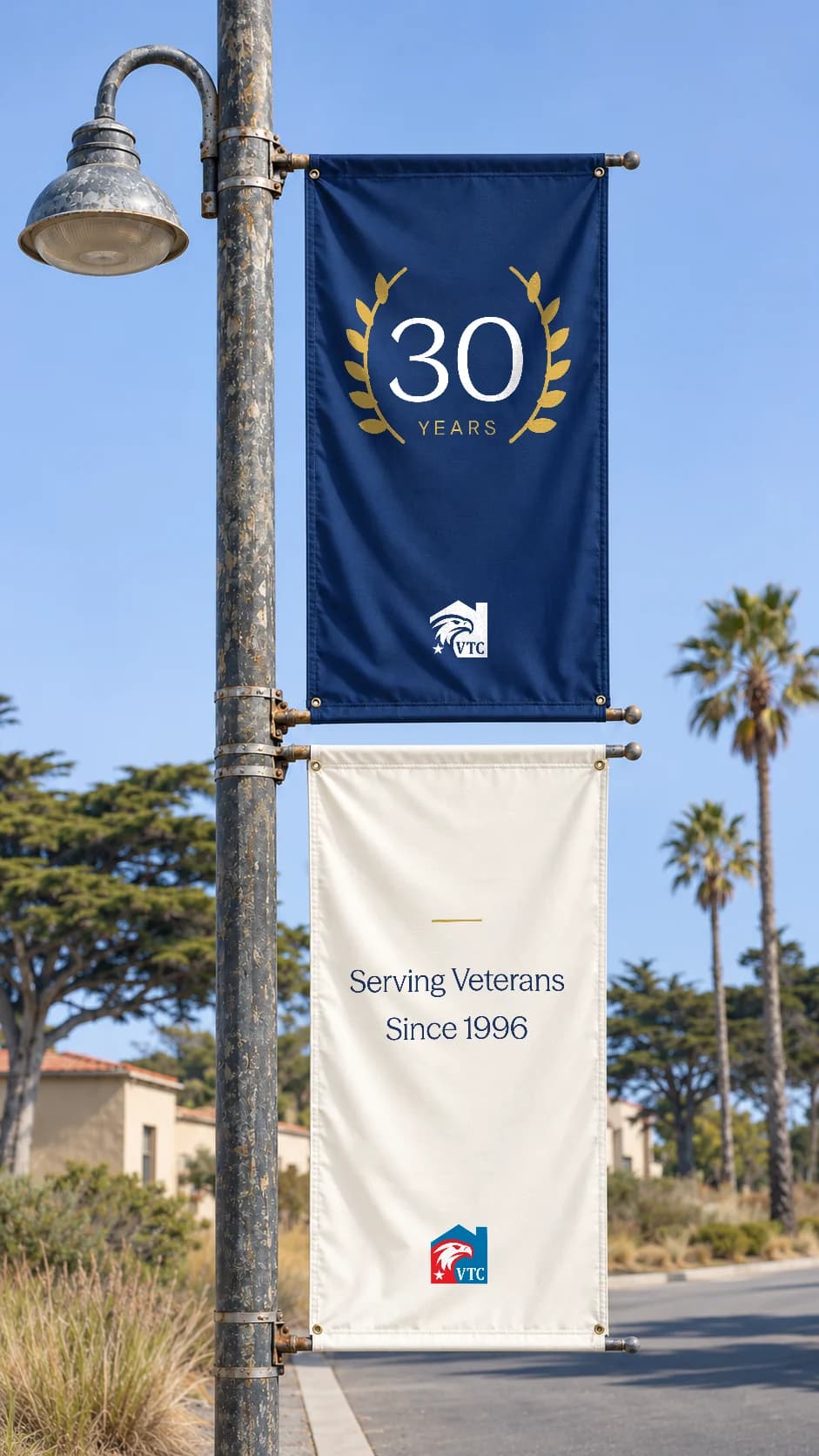
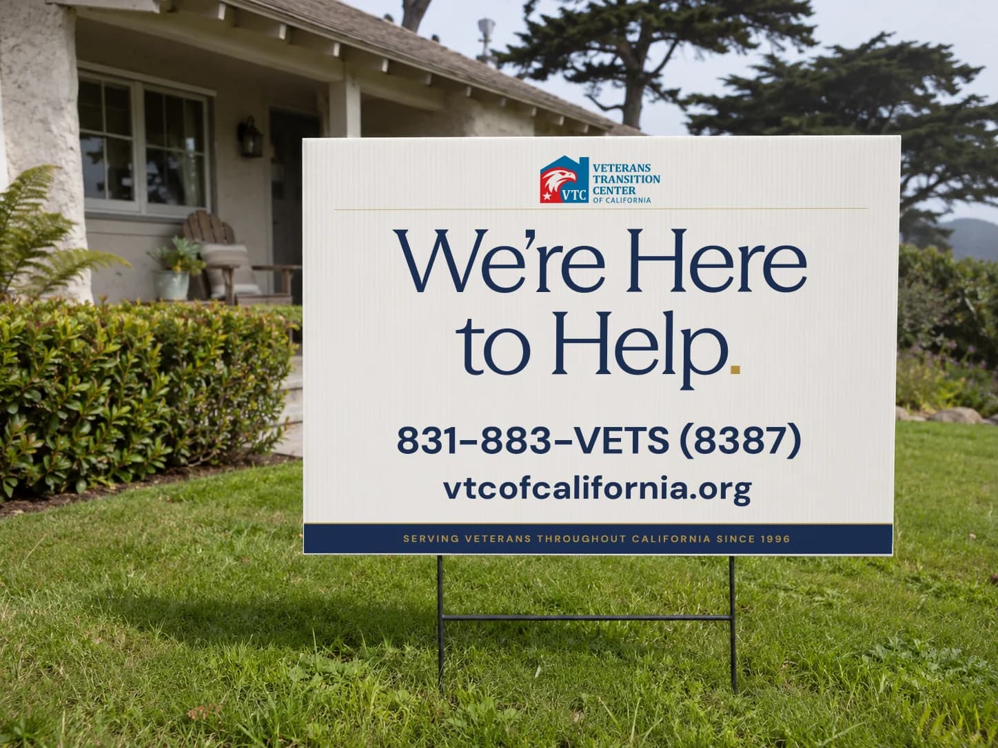
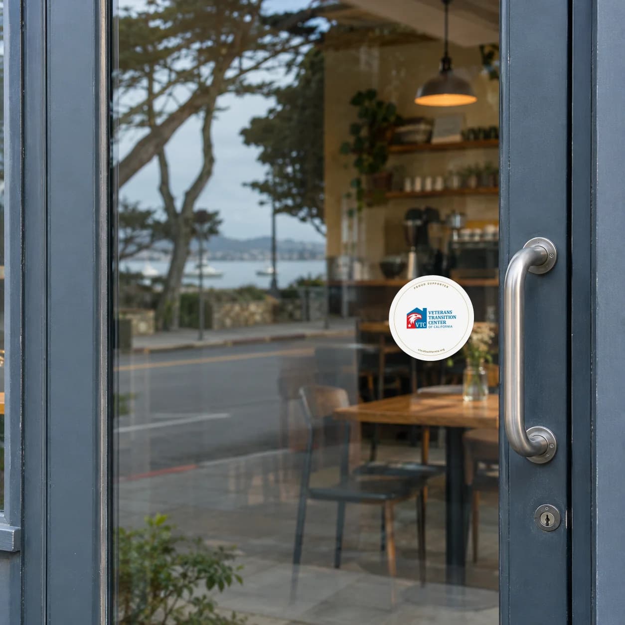
Most people meet VTC before they reach the campus: from the highway, at a bus stop, on a construction fence, on a neighbour’s lawn or a café door.
Vehicles
The biggest signs VTC owns
The outreach van and the pantry truck go everywhere the work does, so they carry the identity at full size.
Events and outreach
Set up in minutes, anywhere
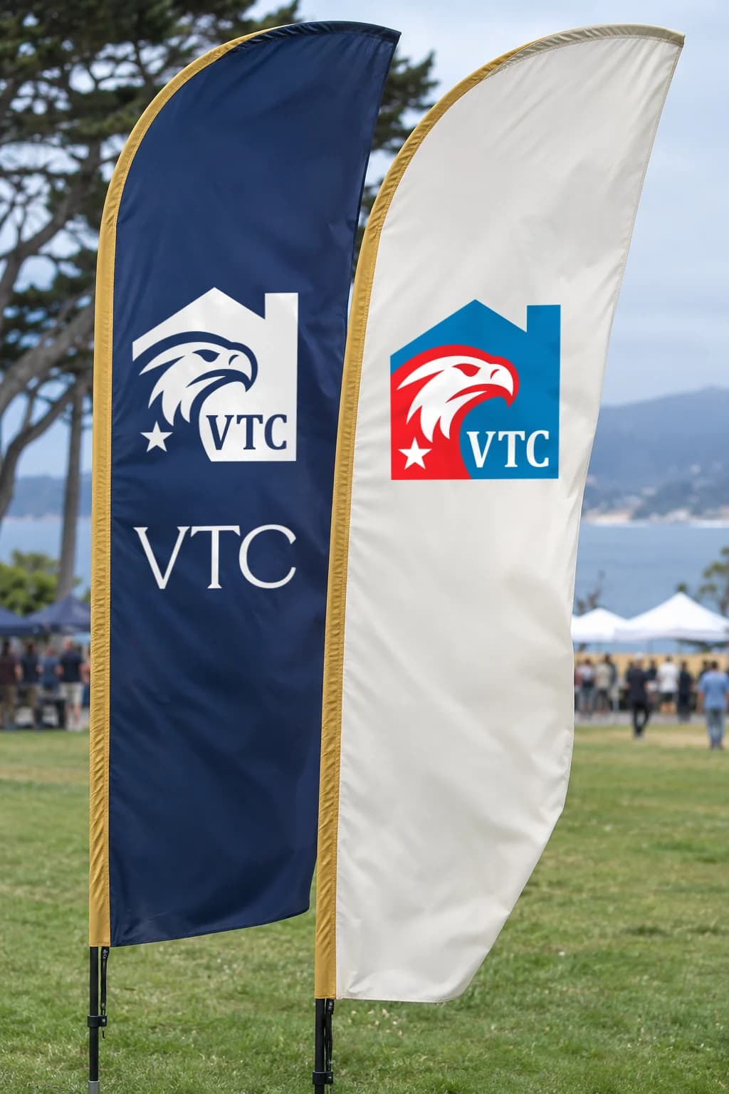
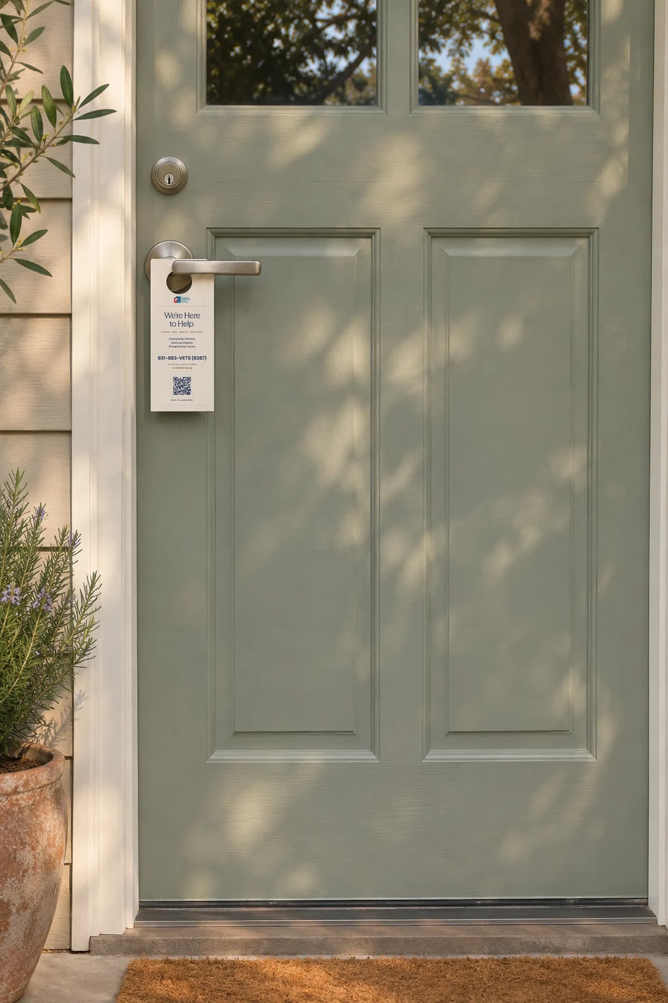
Outreach tables, community days and ceremonies run on one kit: a retractable banner, feather flags, a lectern panel, rack cards and a door hanger for the walk home.
Team and merchandise
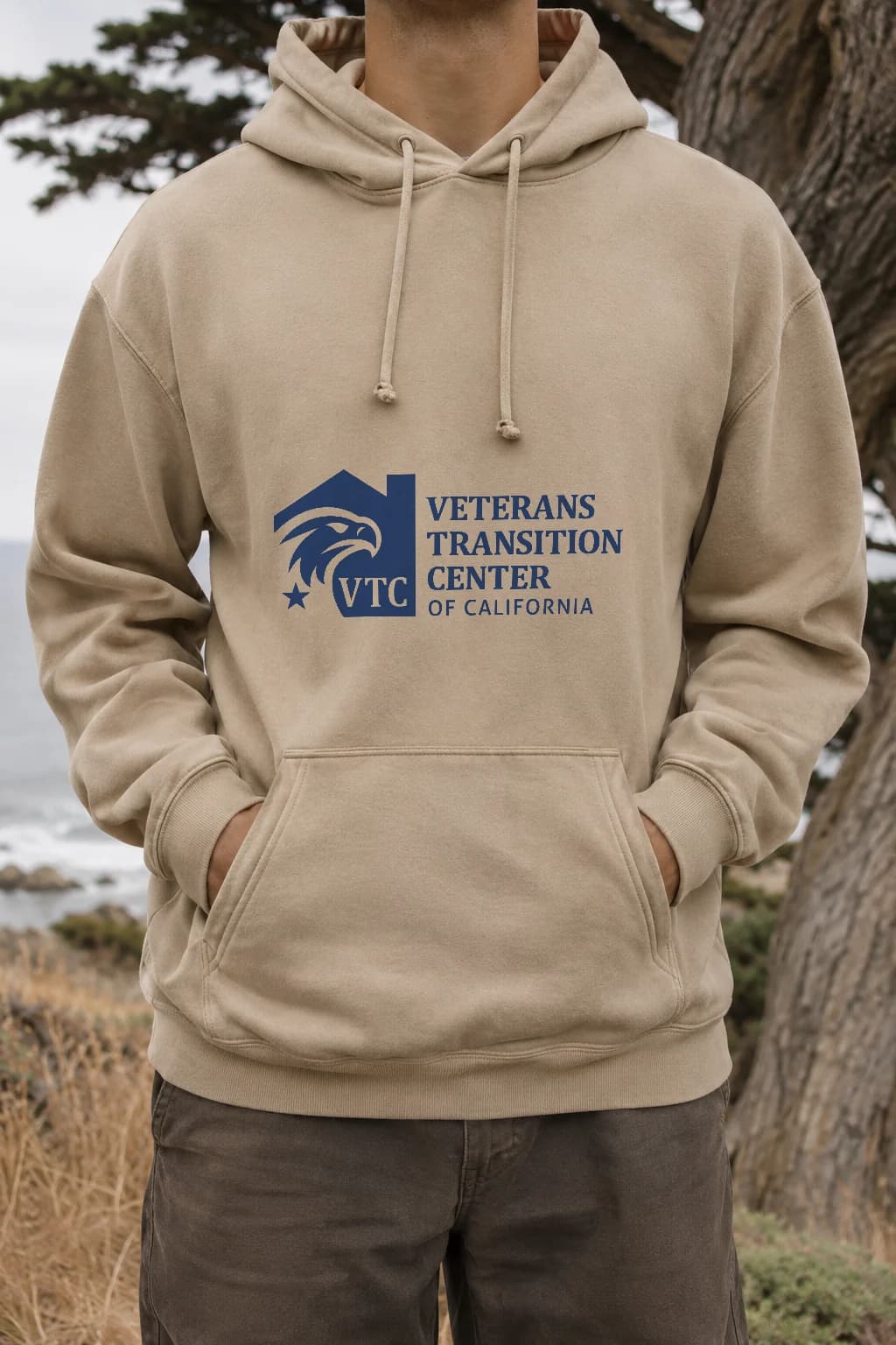
Worn by the people who do the work
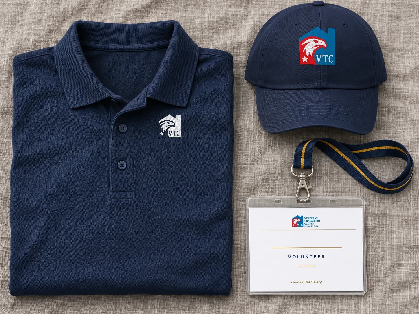
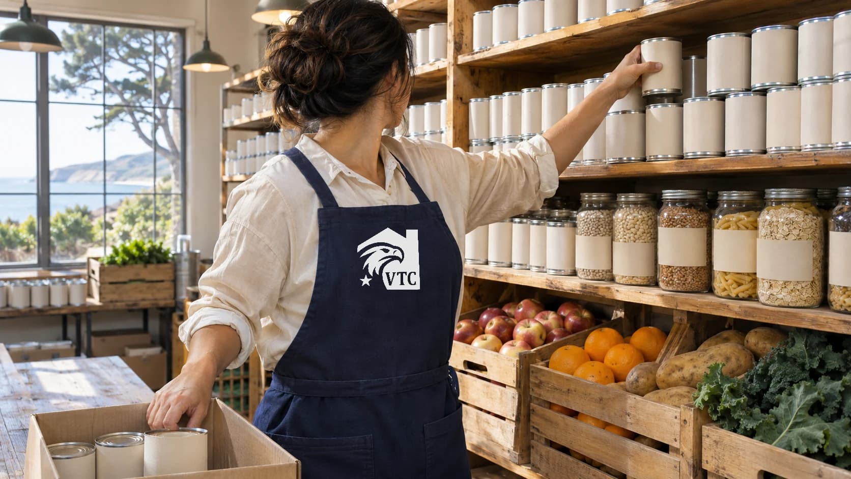
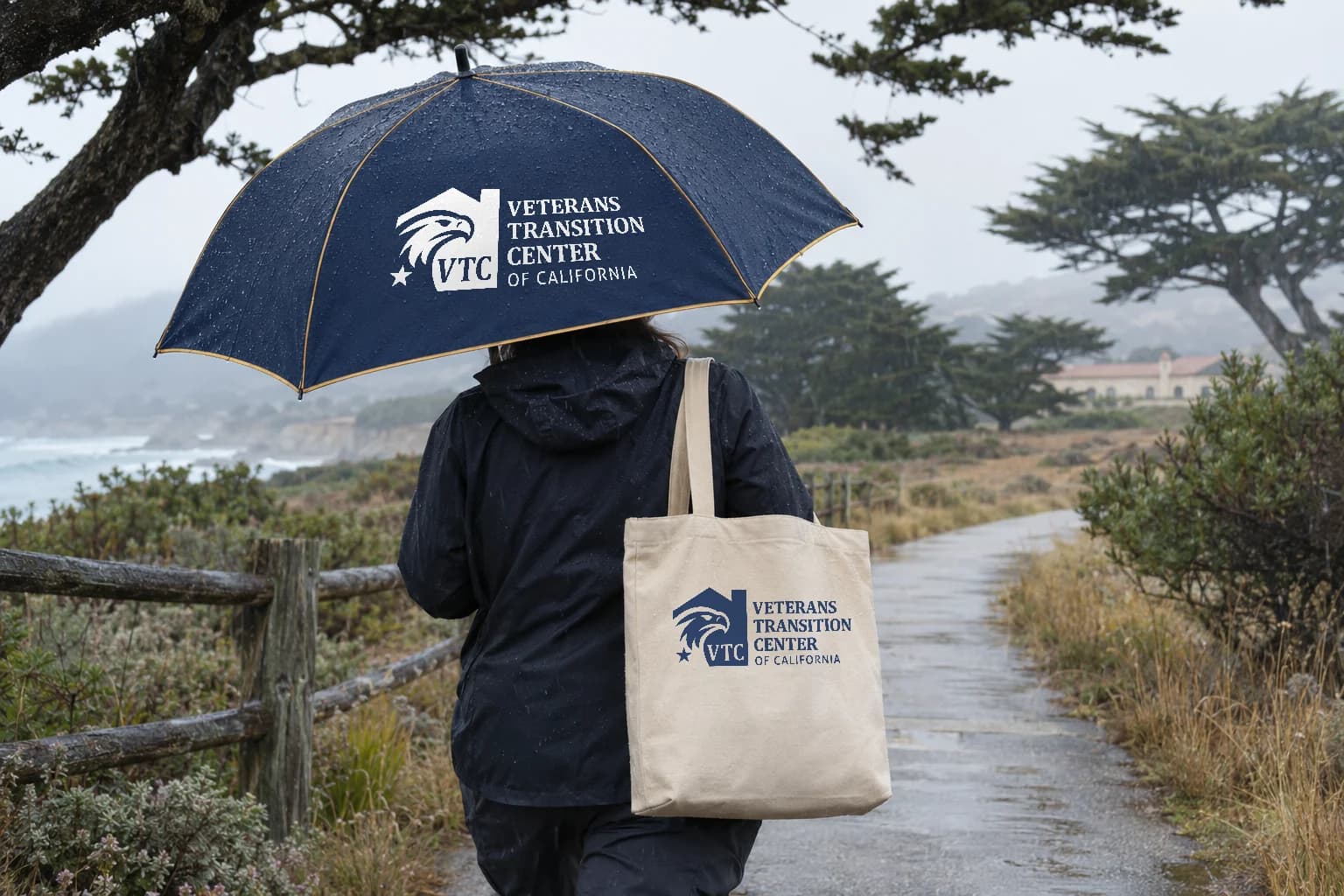
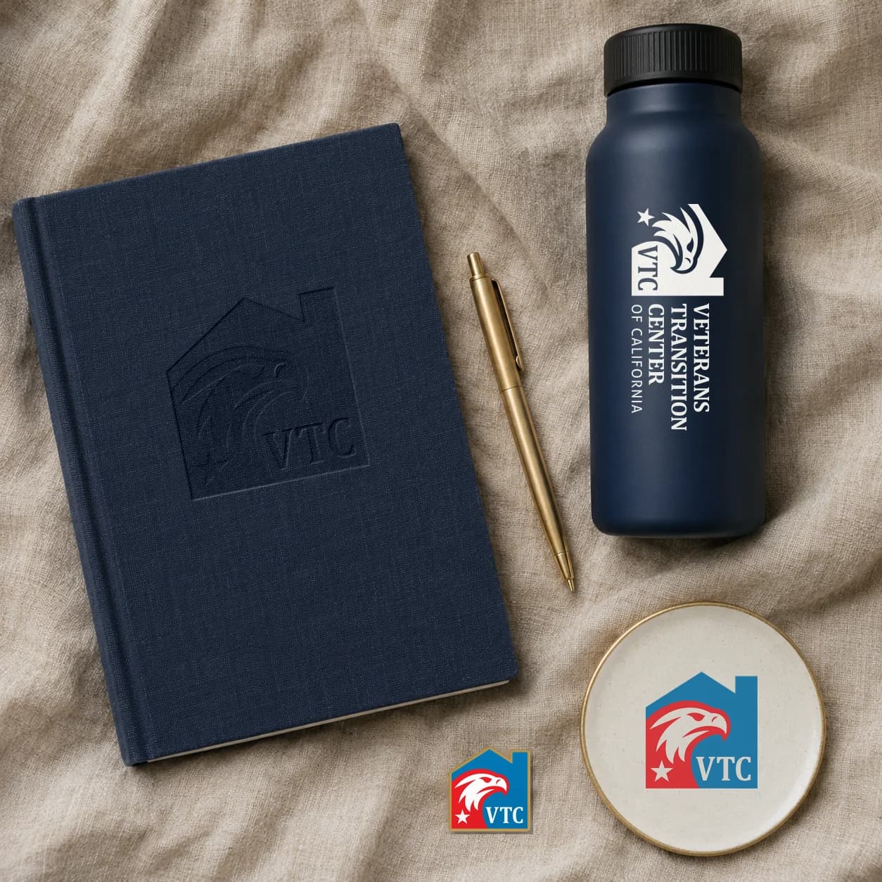
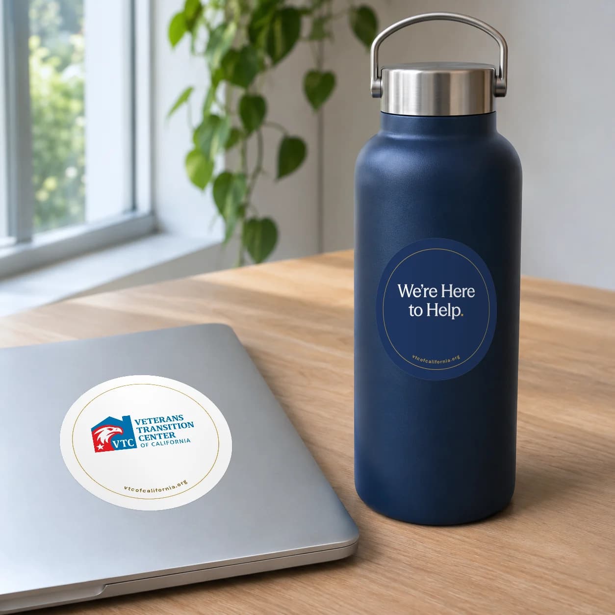
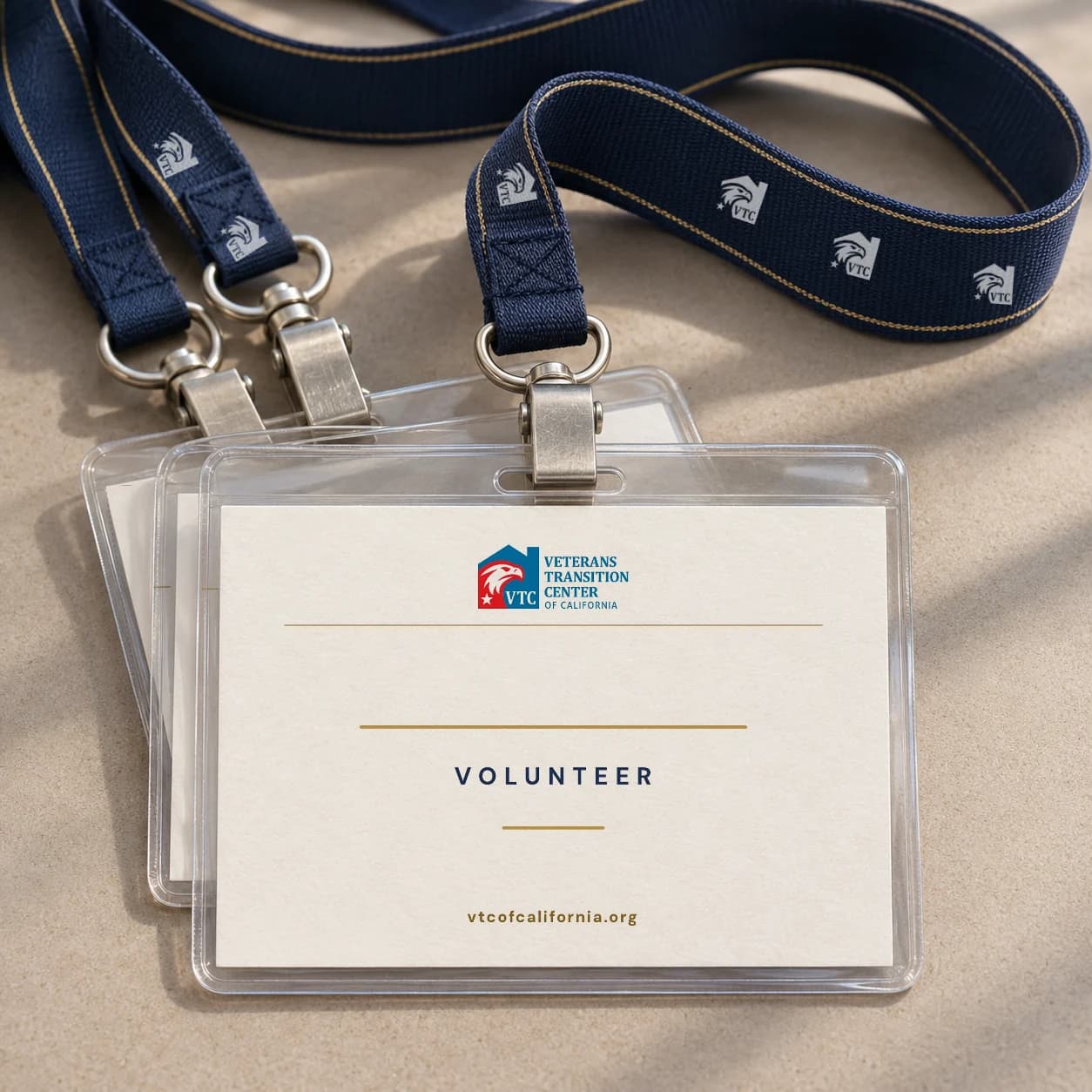
Polos and lanyards for staff, aprons for the pantry, and merchandise supporters actually use.
Pantry and home
From the pantry shelf to a front door
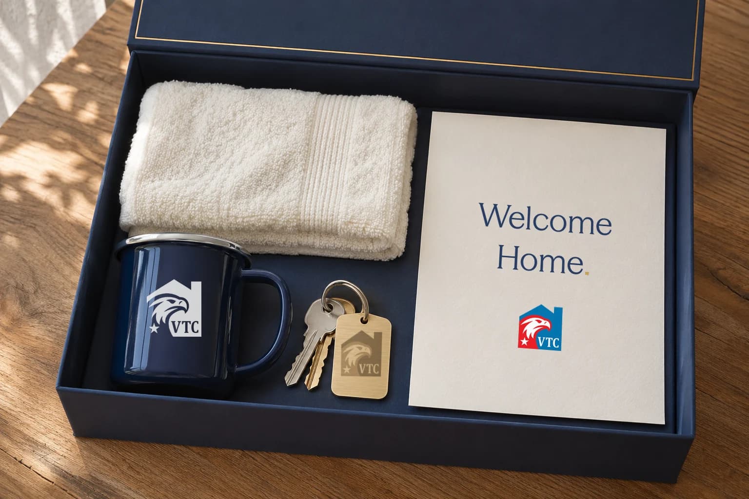
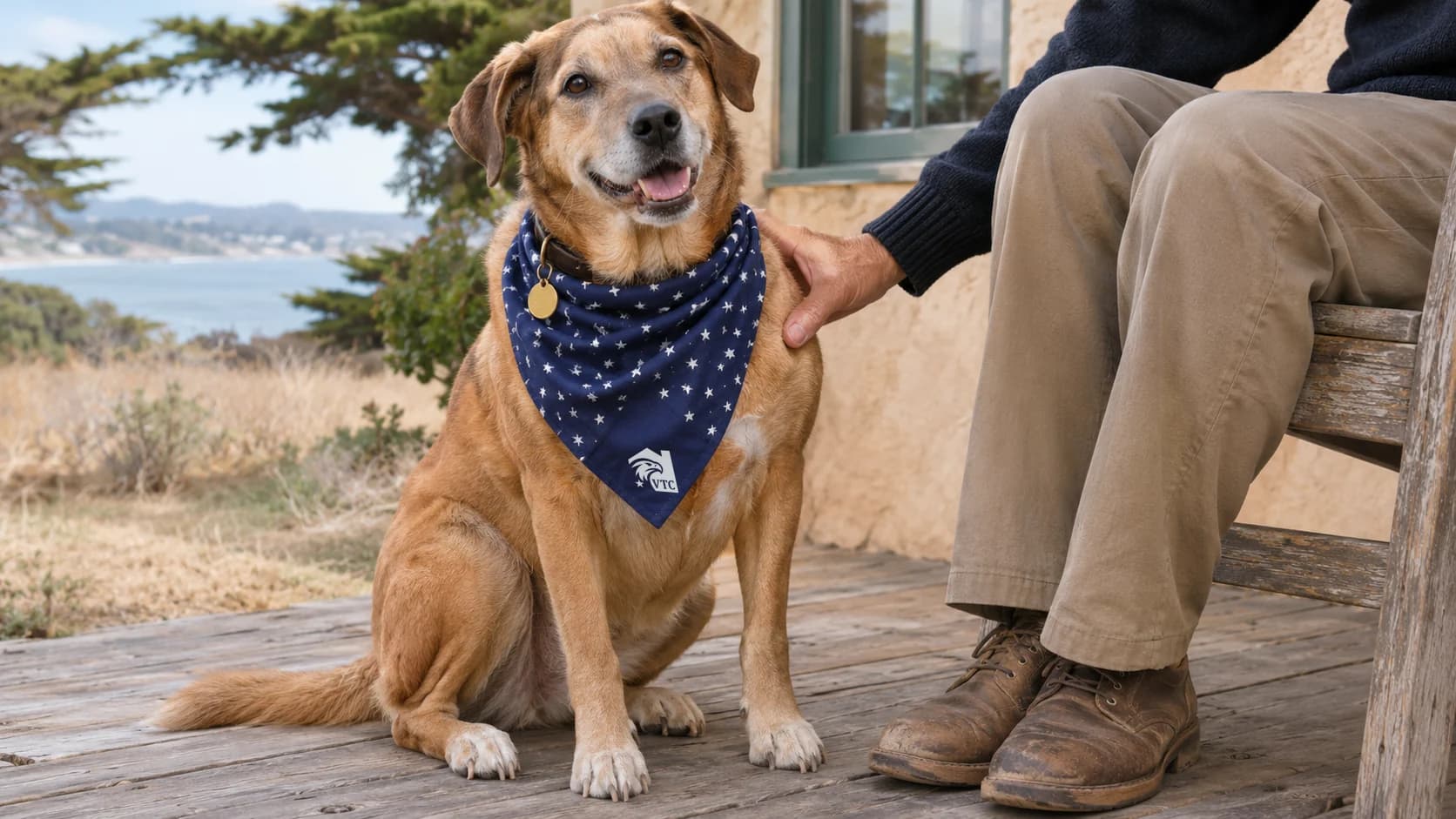
The identity reaches veterans where the help lands: a bag of groceries, and a welcome-home box with the keys to a new place. Pets are family at VTC, so the dogs get a bandana too.
Print, in hand
Paper that people keep
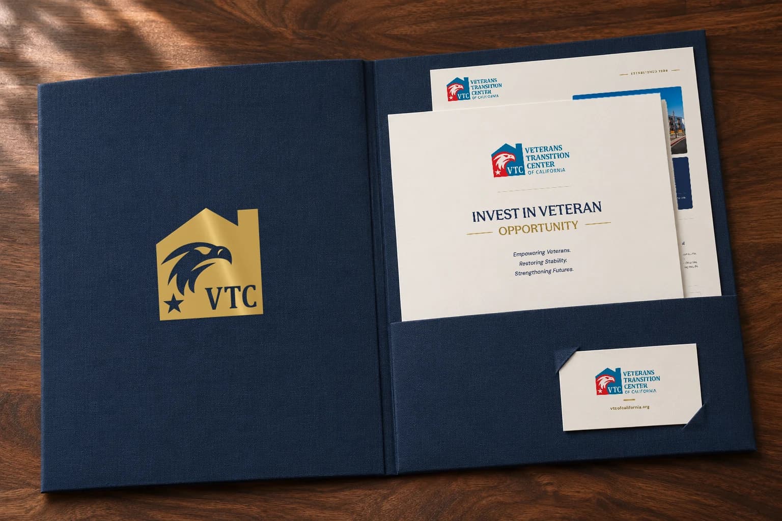
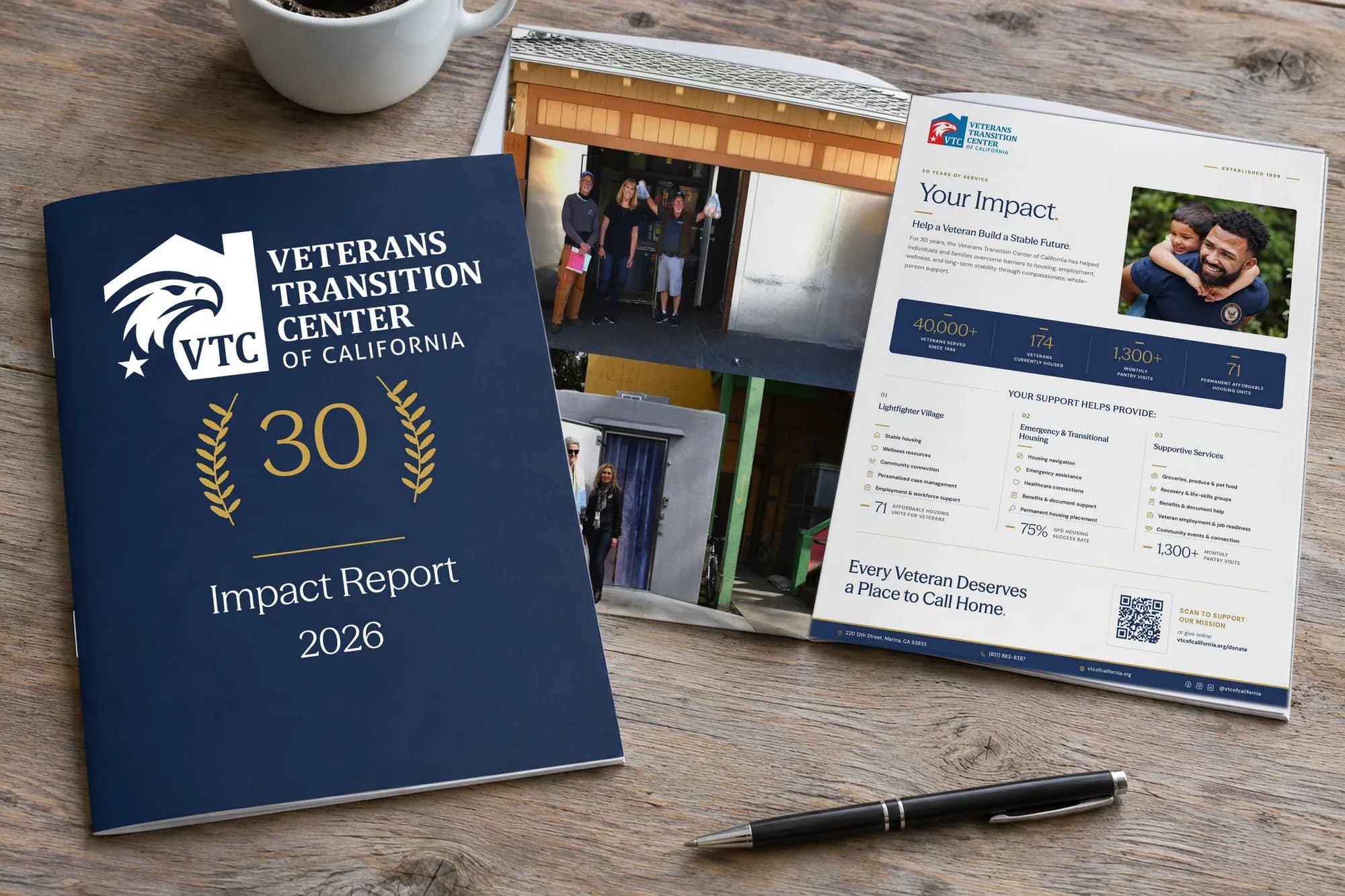
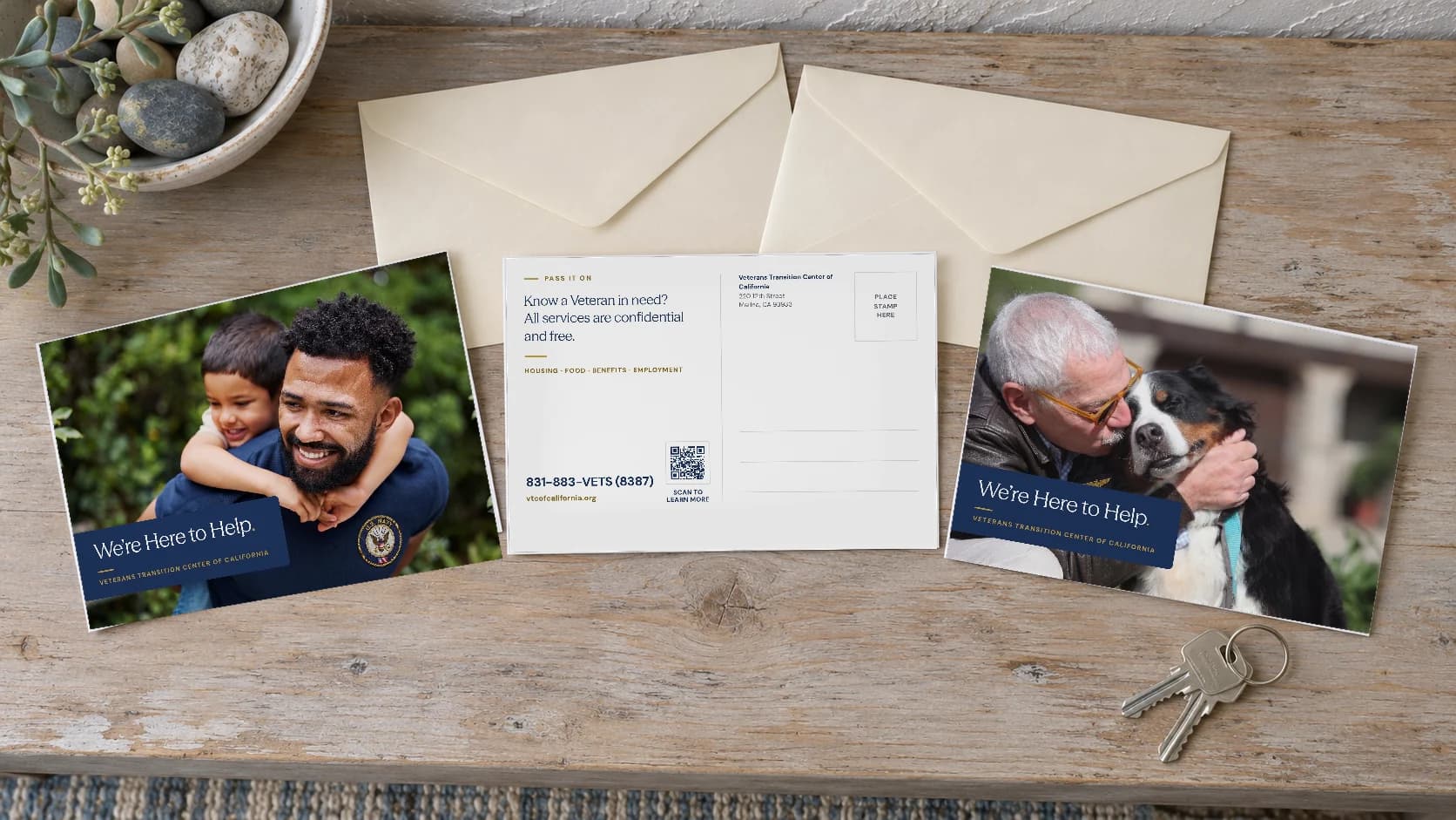
Stationery, a sponsor folder, the impact report, the newsletter, postcards and a certificate worth framing.
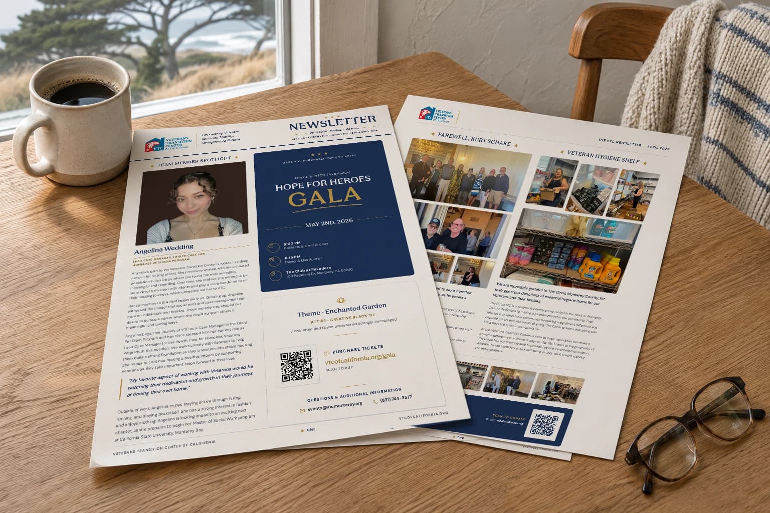
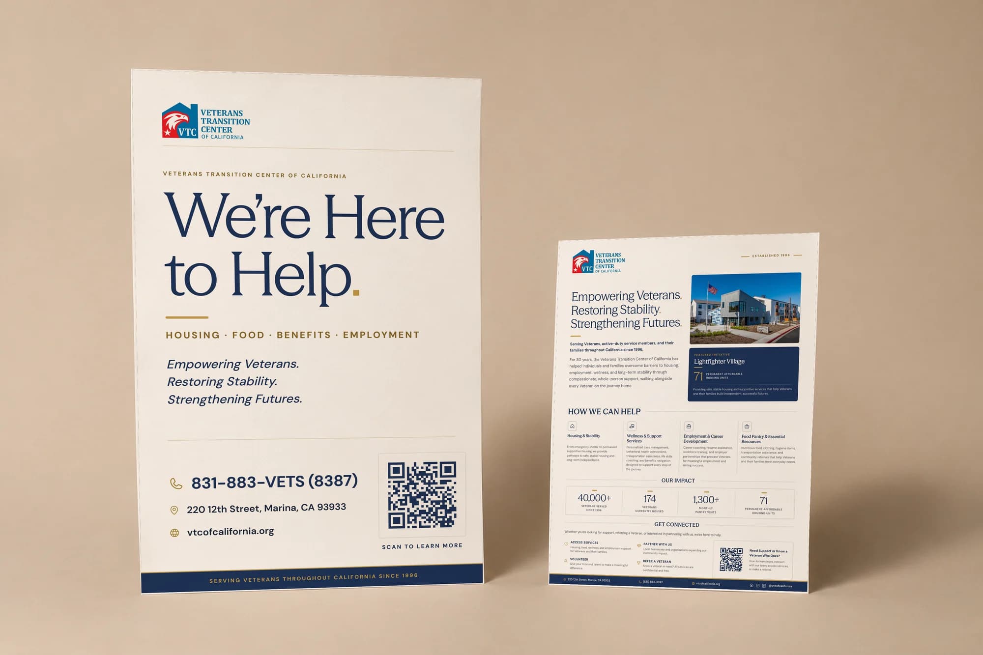
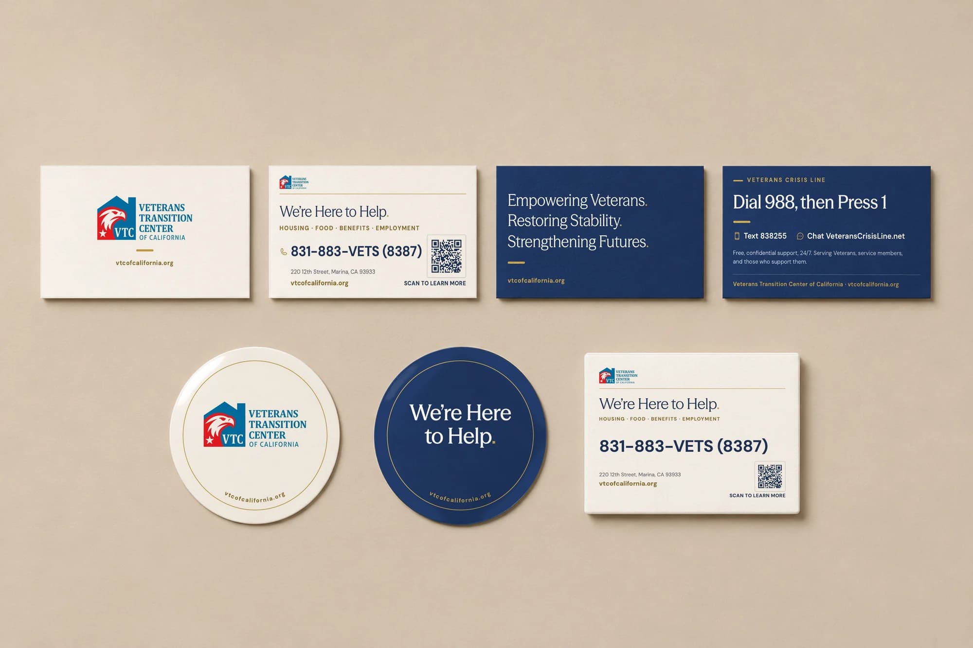
A print kit for the front desk and the whole county
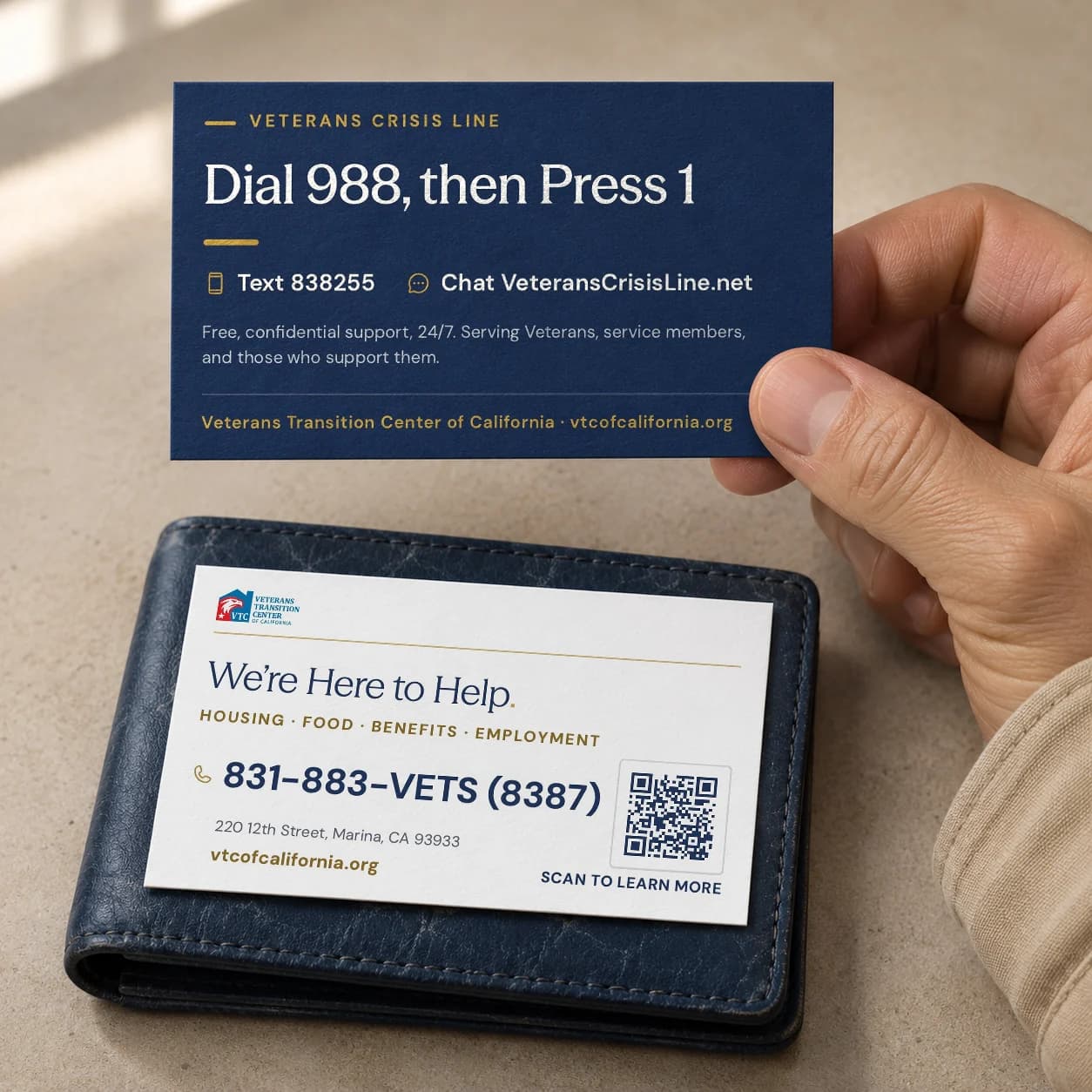
Rack cards for clinics and libraries, door hangers for outreach walks, a trifold for every program, a wallet card with the crisis line. More than thirty-five pieces in all, each one a page of the same book.
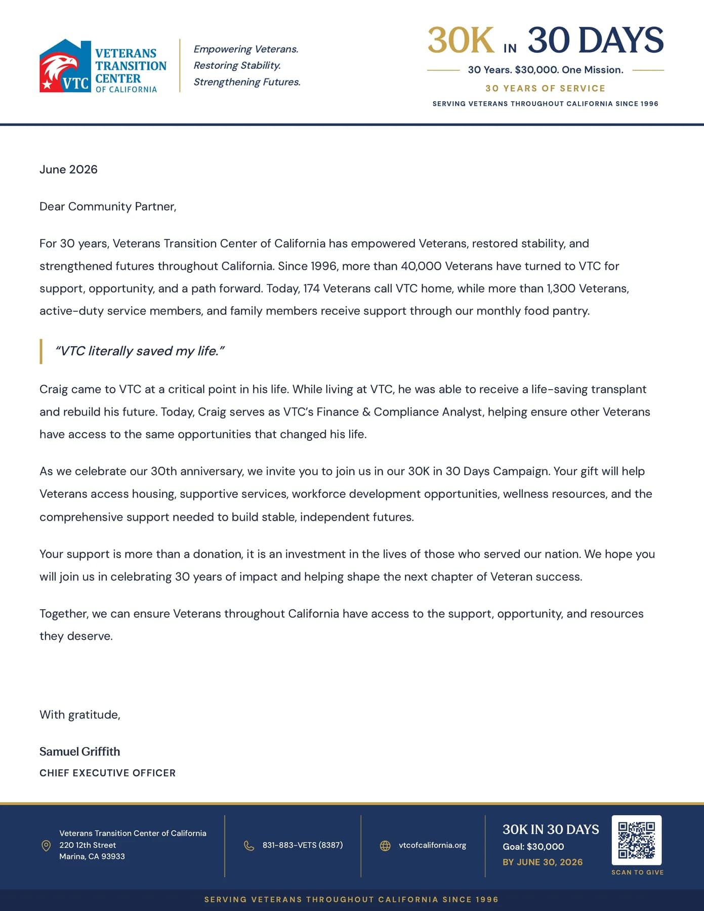
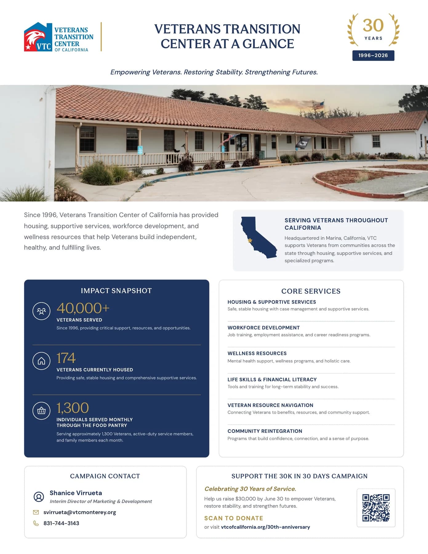
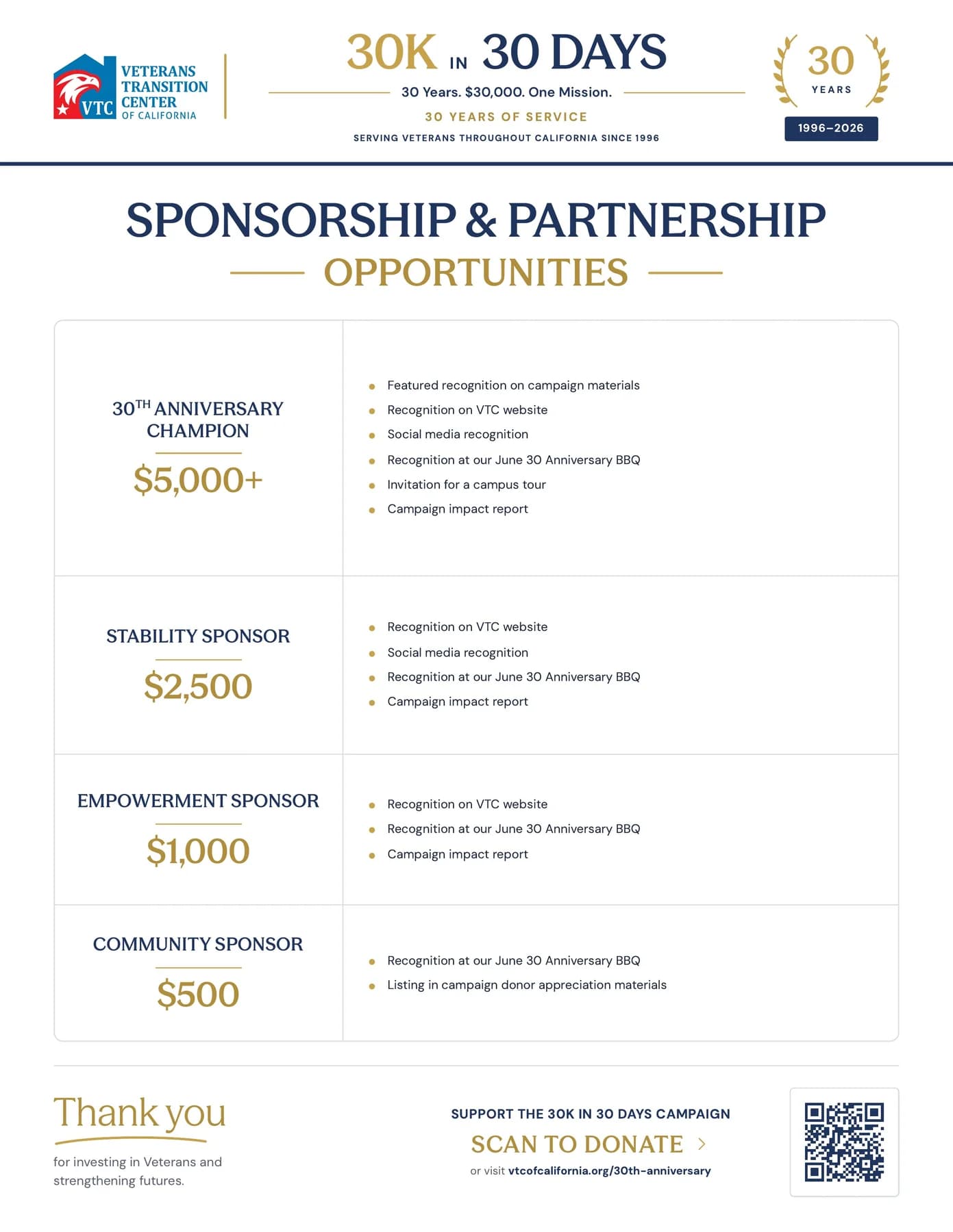
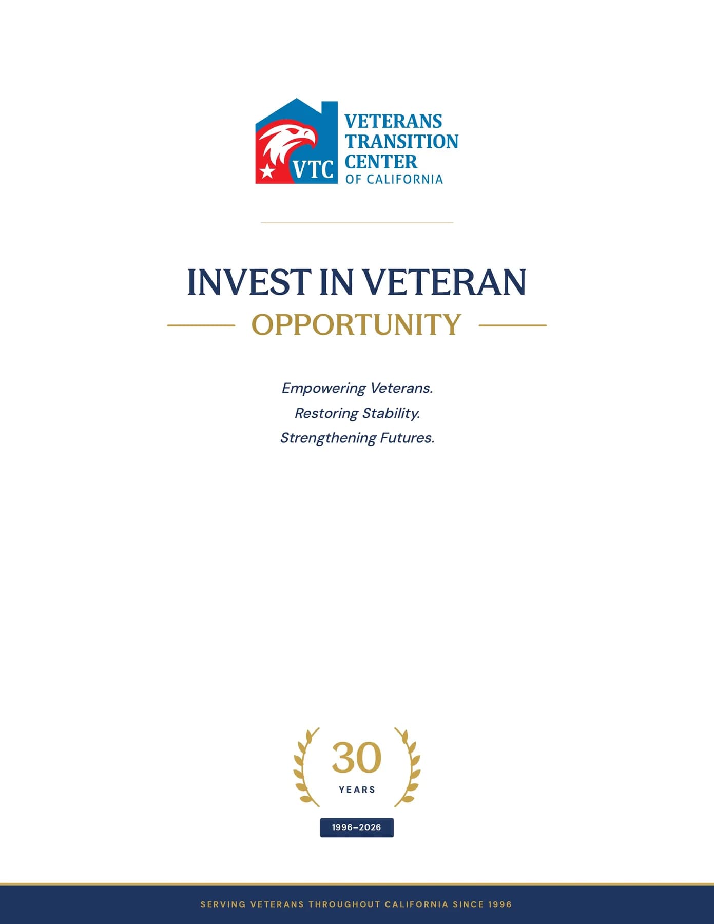
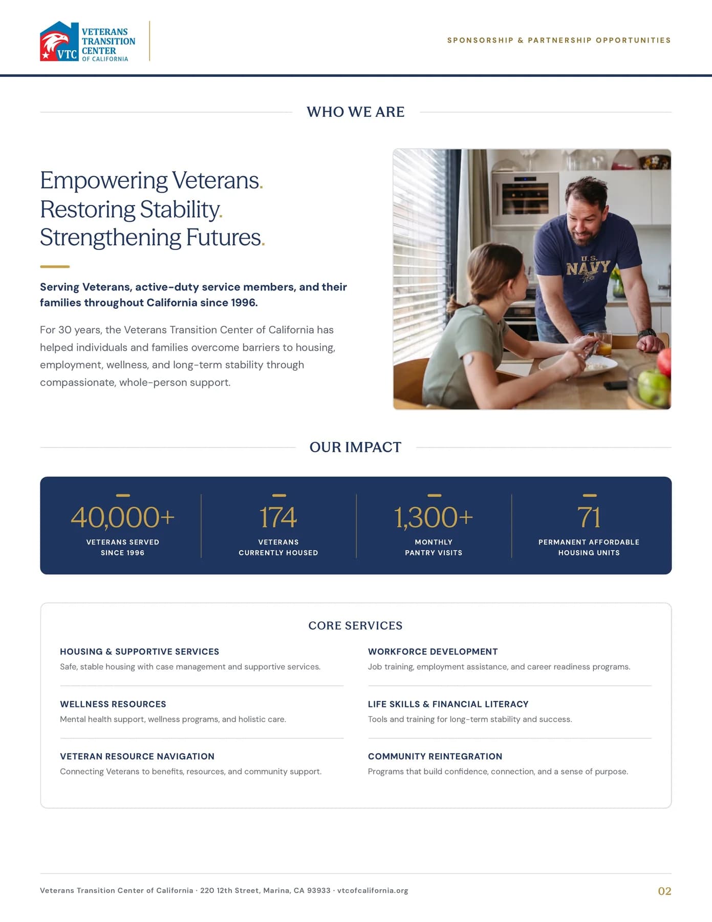
Dressed for the thirtieth
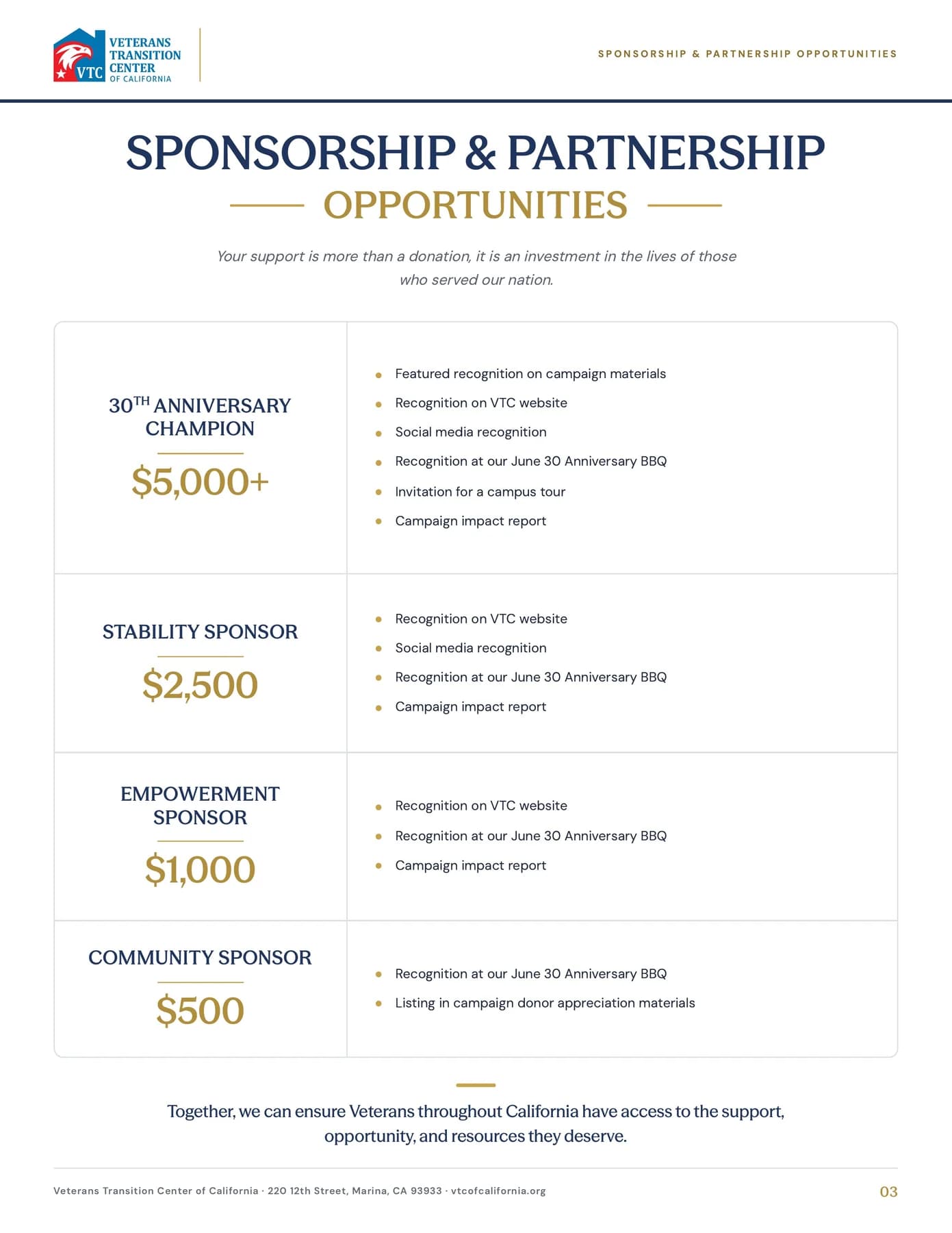
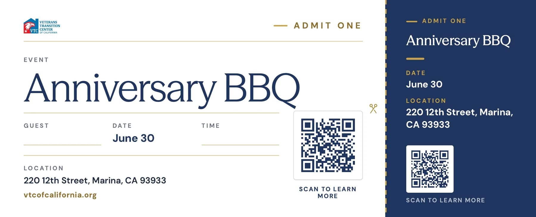
The anniversary got its own layer on top of the system: a gold laurel seal, the 30K in 30 Days campaign packet, a sponsorship prospectus and the tickets for the anniversary barbecue.
What VTC walks away with
- A corporate identity with its rules written down
- Logo use for every ground: full colour, white and navy
- An icon and ornament set: chips, laurels, stars and a swash
- Signage, vehicle and event standards
- A print kit of more than thirty-five pieces, print-ready
- Motion for the badge, the voice and the anniversary